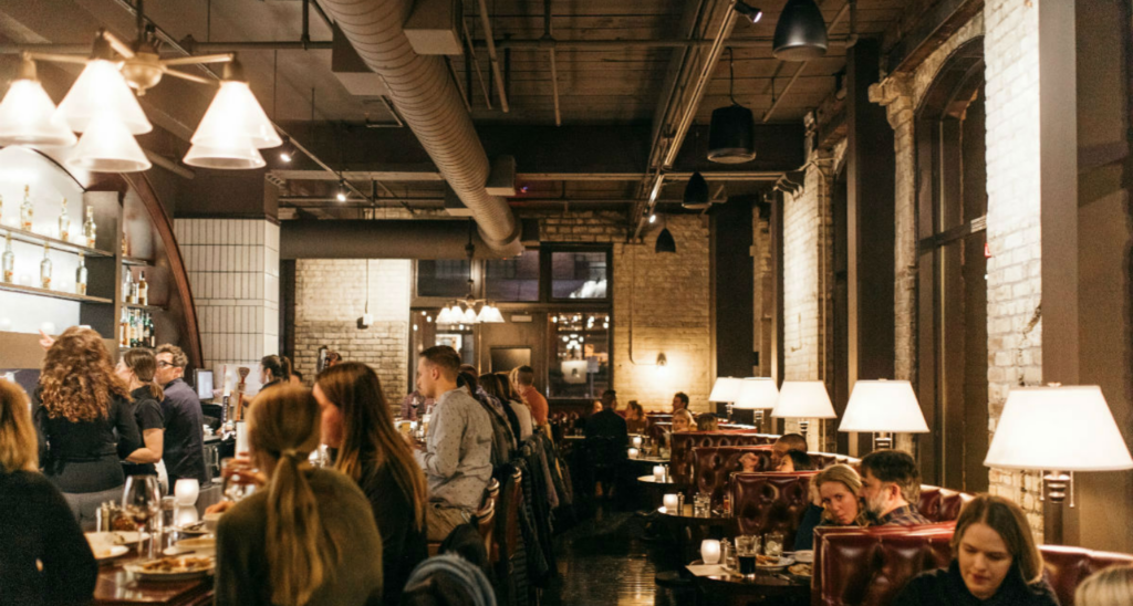
In the restaurant business, menus are frequently updated with specialty dishes, new creations and fresh entrees to attract new guests and keep the regulars coming back. Why shouldn’t the space be treated the same way? In addition to keeping up with ongoing needed maintenance, there are key times in a restaurant’s life when the design should be reevaluated, and eventually, refreshed:
The First Year
After beginning a new restaurant journey, it’s important to keep design top of mind beyond opening week. Check out the reviews: how are guests responding to the overall experience? Check in with your team: has the layout been functional? Does the lighting need to be adjusted? Are the tables and tabletop presentations working? It’s never too early to adjust the details, both small and large. And when you find yourself approaching the one-year mark, take inventory of how your design supports growth and the future. It’s the perfect time to celebrate your success and seize on the opportunity to make the next year even better.
Socca Café at Four Seasons
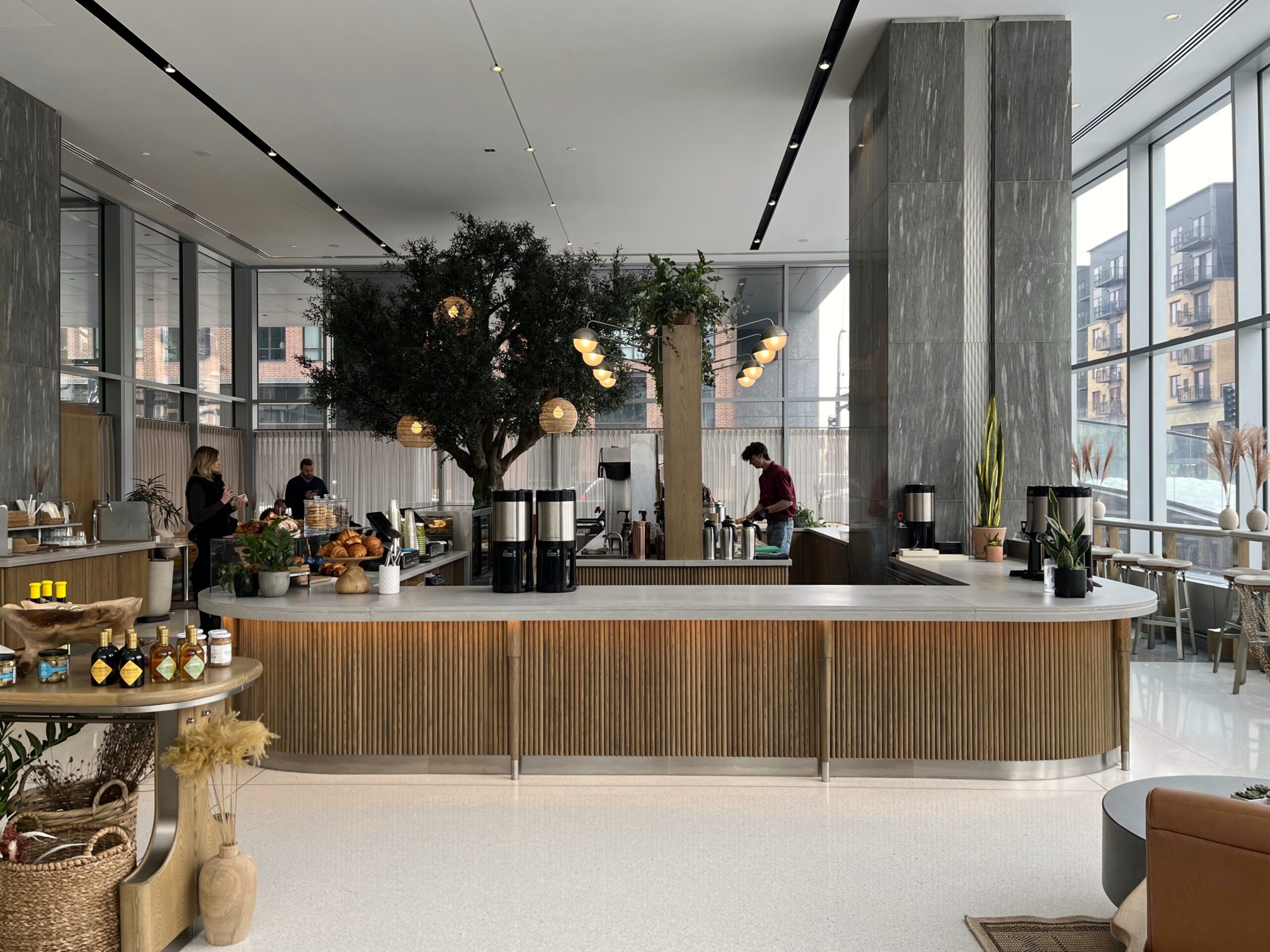
Socca Café opened in the corner of Four Seasons Minneapolis with a strong, Sicilian inspired concept and a menu from James Beard award winning chef, Gavin Kaysen. Yet within the first sixth months, the café wasn’t at its full potential. Being smart business operators, the Four Seasons and Socca team didn’t wait to act. Their analysis concluded that the space needed accessible comfort, more displays and wider offerings, so the team engaged with Shea to refresh the café.
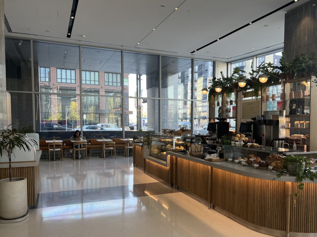
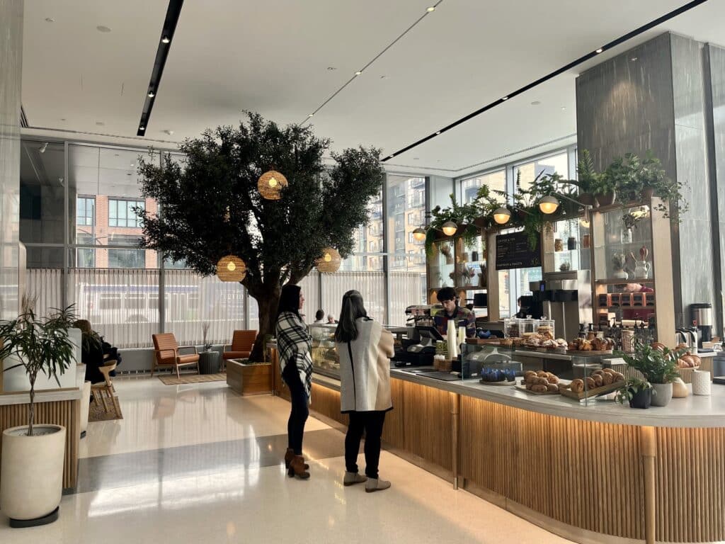
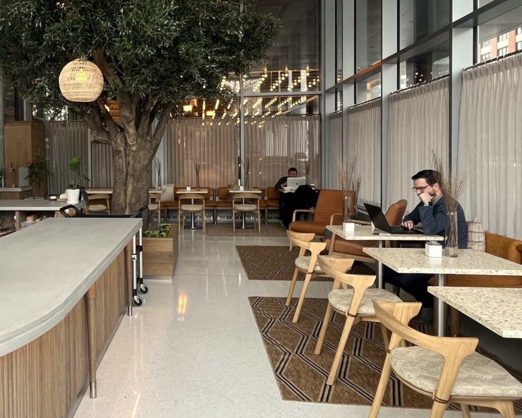
Our Shea and Shea Makes teams started by auditing Socca’s design, including all aspects from layout and functionality to display details. We delivered to the team a list of pros and cons, as well as priority recommendations to meet their strategic goals. We then rearranged the floorplan to incorporate new lounge seating spaces, created a mini-marketplace and a installed a full-size olive tree to help break up the space and add greenery. Custom pieces including new menu displays and an herb drying rack were added, and finally the team finished off the design by adding some furniture, décor, rugs, curtains and cushions to add warmth and comfort. In addition to procuring all of the selected new items – including an entire olive tree – and producing the new signage, Shea Makes completed the entire turnkey installation over just a few days to minimize any downtime.
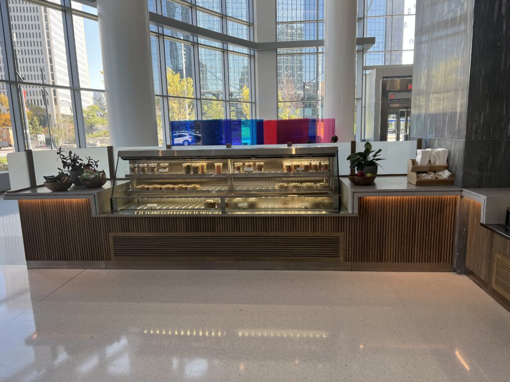
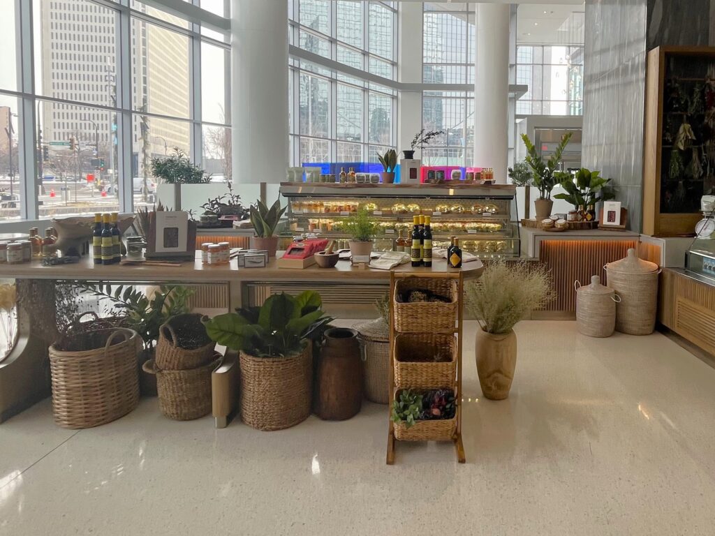
The Four Seasons and Socca Café team were amazed with the end result, and the new, warm atmosphere continues to draw in guests.
Love Pizza
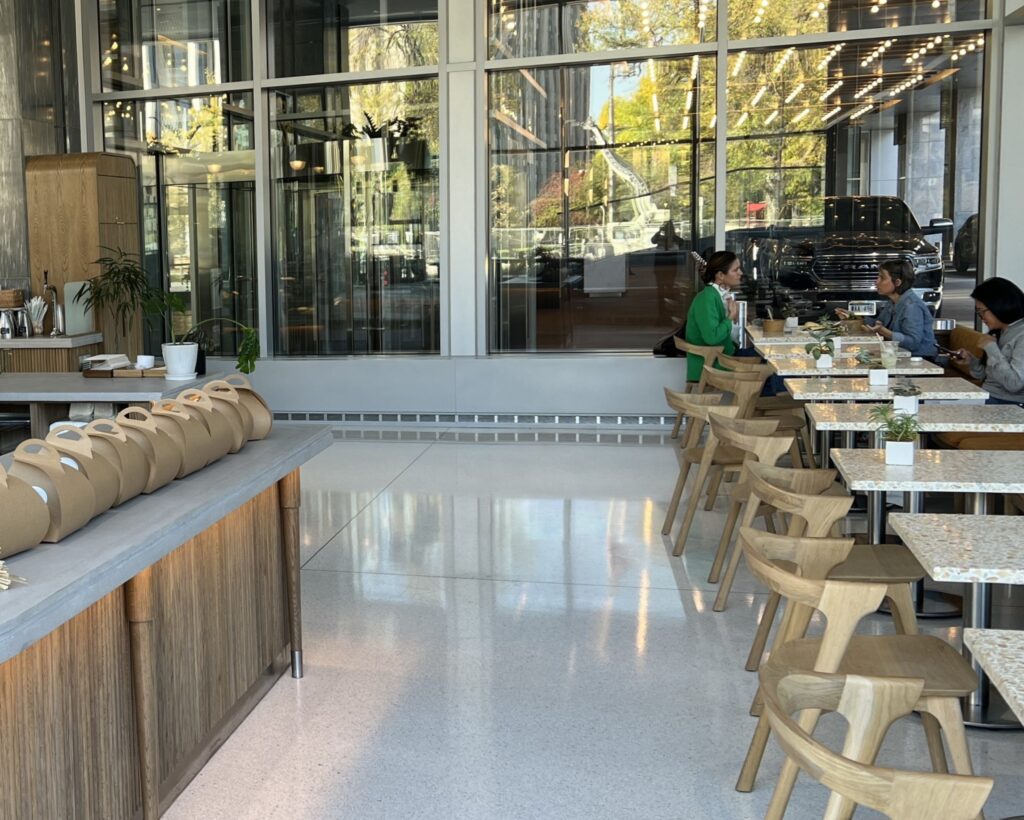
For their first year of business, Love Pizza exclusively sold take-out pizza from their Golden Valley kitchen and storefront. But as they were approaching the 1-year mark, their team assessed the future of their pizza shop and decided their growth plans included offering dine-in services. Reaching out to Shea on a referral, Love Pizza requested our expertise in adding brand appropriate seating to their space. The Shea Makes team took on the project, and after evaluating the space, provided a selection of furniture recommendations to enhance the experience.
The Love Pizza team Shea Makes reviewed options, made their selections, and within a few weeks had the new dining room refreshed and ready to open in time for Love Pizza to celebrate their first anniversary with a new dine-in service. Their team shared they loved the change, and the place has been “bananas” ever since.
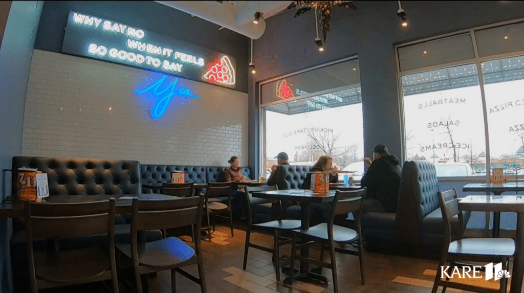
Check out Love Pizza’s dining room on KARE 11
2-5 Years
In the years that follow, it’s important to periodically look at your space with a fresh set of eyes to keep up with needed maintenance and adjustments and continue a great guest experience. Sometimes, even if you’re in the space every day, it’s easy to overlook areas that need attention.
The fifth anniversary is another important milestone to celebrate (never skip the celebration step) and refresh your space. By this point, you continue to welcome new diners, but you’ve also gained a following of returning guests and regulars. Let your guests know you continue to care about them and their experiences in your restaurant by freshening up the atmosphere and updating elements to enhance their visit. This again doesn’t have to be major; it could involve a fresh coat of paint, updated furnishings, rearranging a space or creating an exciting new focal point. Shea audits review all details big and small and provide business and guest-oriented recommendations.
Edwards Dessert Kitchen
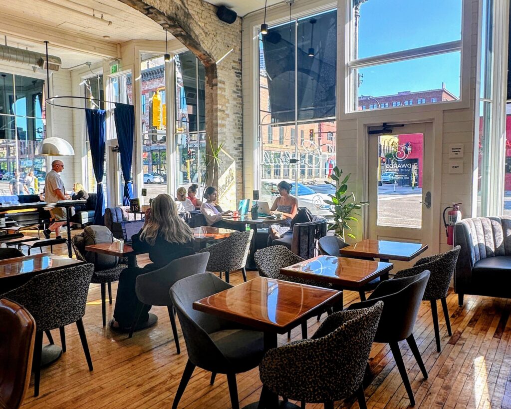
When Edwards Dessert Kitchen was getting ready to reopen post-pandemic (and year 2.5 of business), they took the reset opportunity to engage our team to audit their space. Shea and Shea Makes reviewed the restaurant and made recommendations for improved functionality and overall experience enhancements.
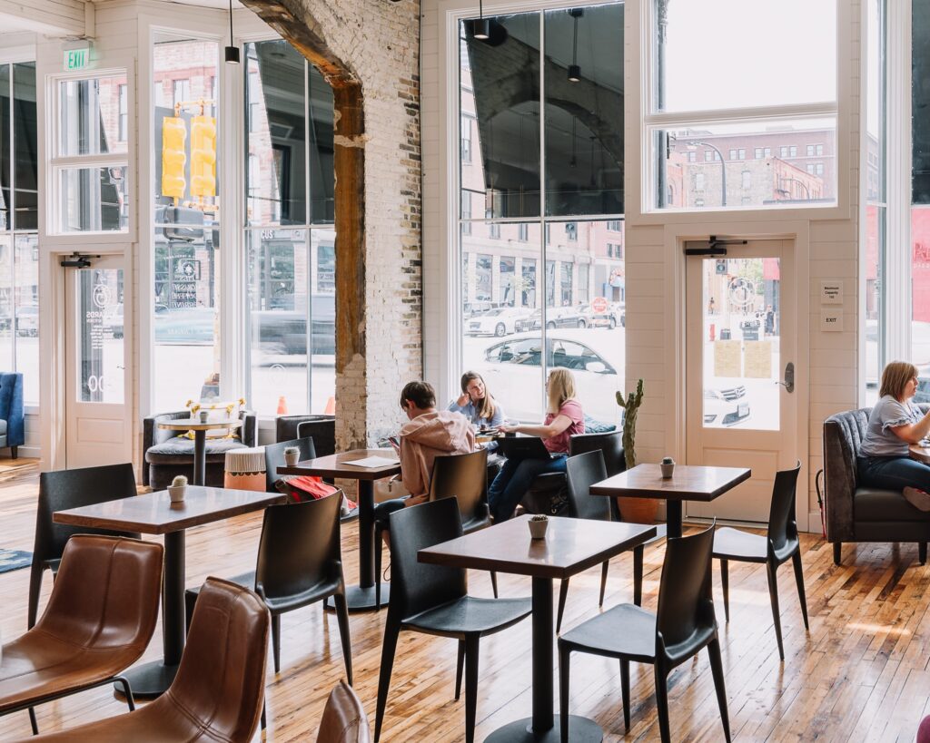
We increased product displays, introduced better stand-up waiting options for guests, relocated the coffee area to provide better pick-up and guest interaction opportunities and rearranged seating to maximize the most popular spots, which included the addition of two circular booths in the front windows.
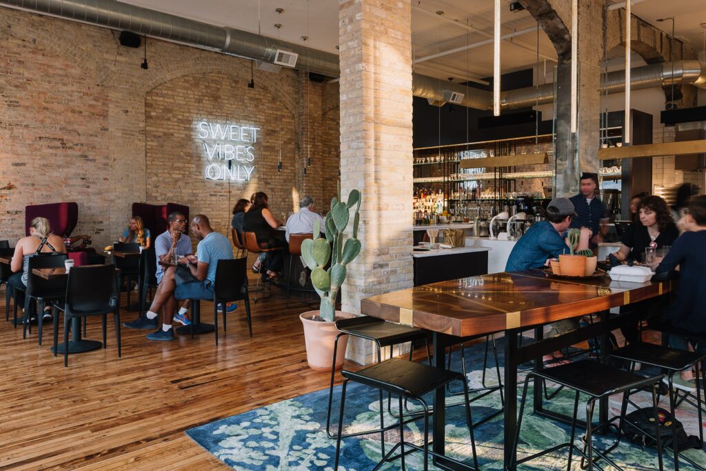
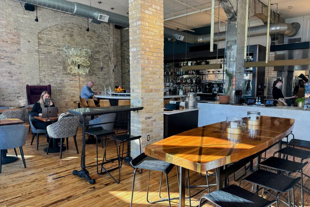
Upon reopening, guests loved the environment even more than they remembered. And the new booths in the windows are the first to fill up.
7-10 Years
Okay, now we’ll use the word “major.” Seven to 10 years into operating a restaurant is the time to start thinking about a major refresh focused on staying relevant: relevant to any menu changes, relevant to new technologies and relevant to consumer trends in the hospitality industry. Like past refreshes, you’ll want to assess future goals and growth plans and how your design supports your strategy.
Mugg’s of Mille Lacs
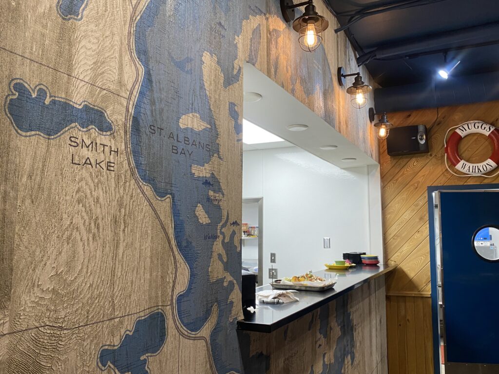
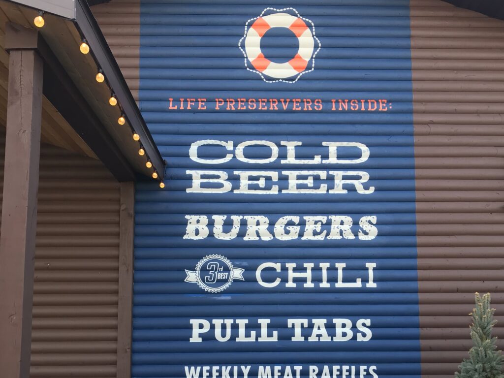
Rob Dubbs purchased Mugg’s of Mille Lacs in 2013, gave the space new décor and a new menu and grew the restaurant in popularity. In 2021 with plans to update the kitchen and expand the restaurant, he and his brother Steve Dubbs used the growth opportunity to engage Shea to refresh the design.
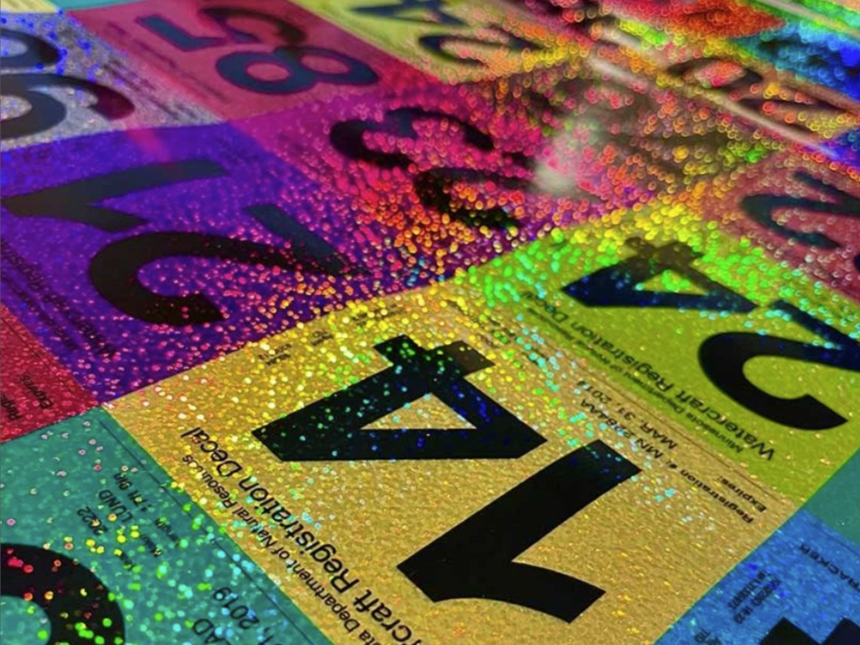
The Shea/Shea Makes teams designed and installed new signage, murals and graphics for the interior and exterior, as well as selected and procured furniture for the new patio. Not only did the new graphics and murals help to keep Mugg’s look fresh, but they also cemented Mugg’s story and brand into the space. The installations and updates transformed the atmosphere, giving the space a fun, new energy and creating new ways for guests to experience Mugg’s of Mille Lacs.
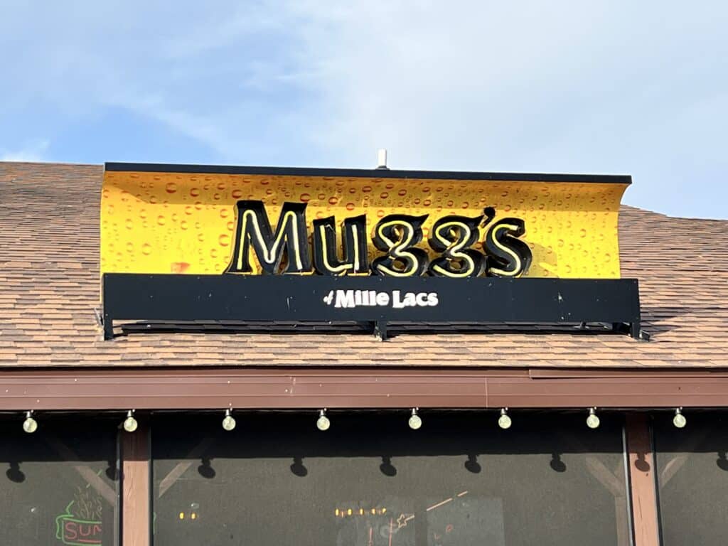
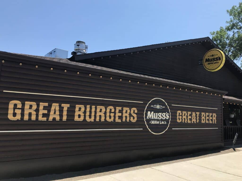
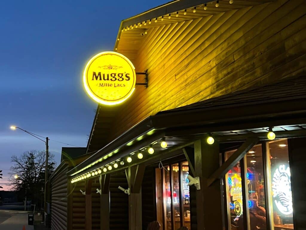
Months later, Steve shared with our team, “The improvements have had a bigger impact than expected. Summer was a MONSTER… Customers are loving the changes, staff is loving it, the kitchen is amazing, and we are now seeing some new employees as a result of the improvements. Bottom line? Revenue YTD is up almost 50% with lots of growth still on the table. Pretty much another Shea success!”
Refreshing your restaurant (or shop, or office, etc.) doesn’t have to be daunting – just look at Socca Café or Love Pizza. Without any demolition or major construction, and help from the Shea Makes team, both restaurants were able to transform their spaces with an eye on the budget and very minimal downtime. When you’re ready for a deeper refresh, like Mugg’s, have fun with it. Tell your story. Revitalize and reenergize the space.
Communicate and market your changes, enjoy the new energy and welcome guests into to a fresh space they’ll want to experience again and again.


