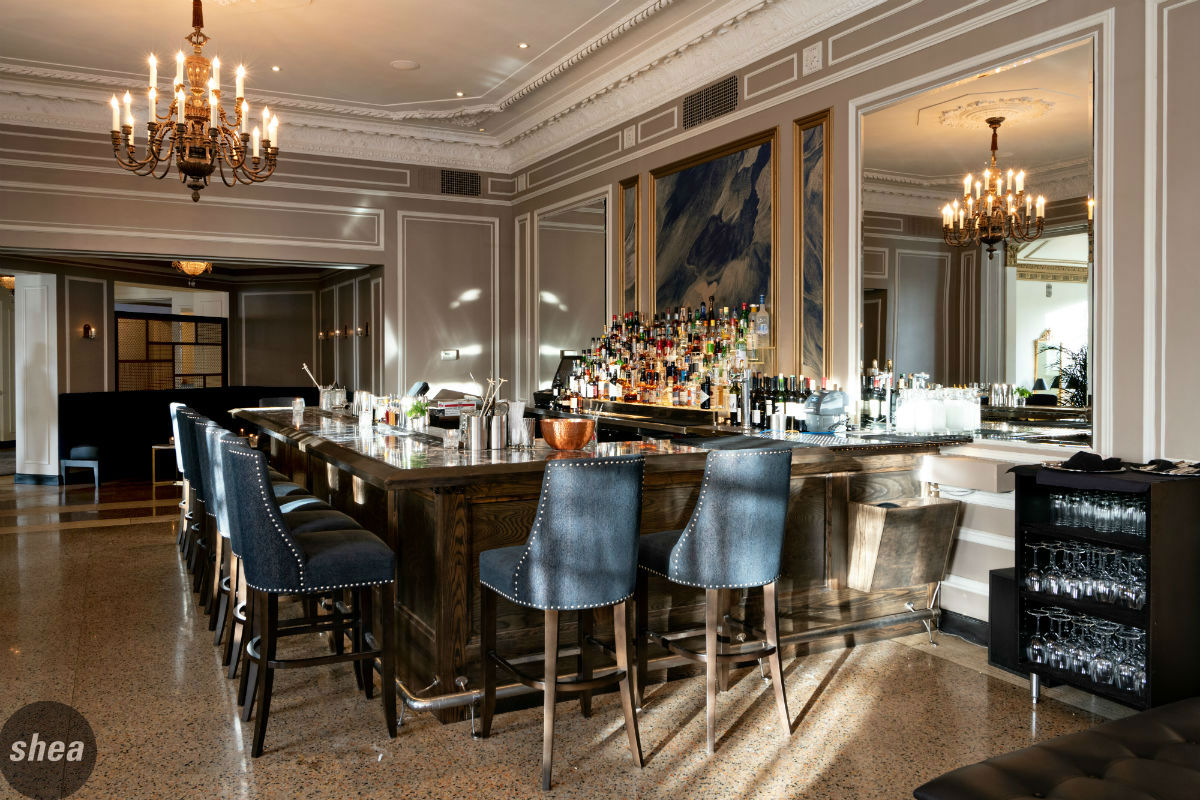
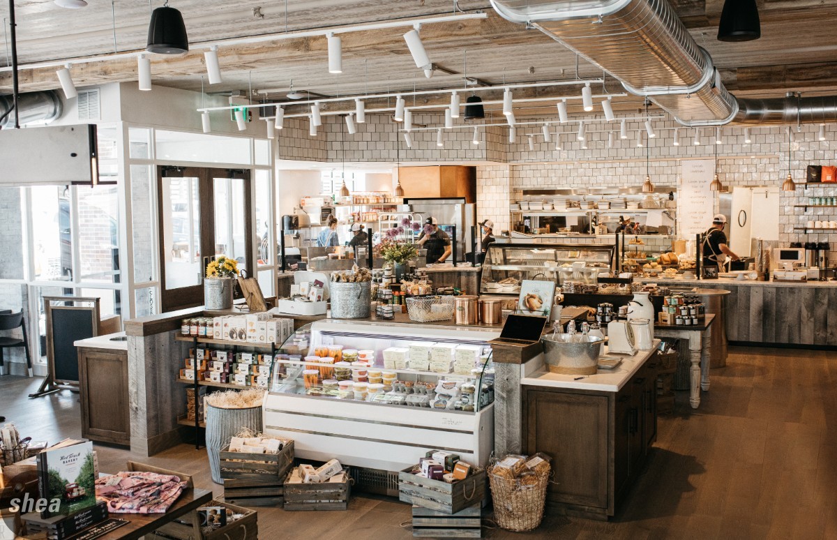
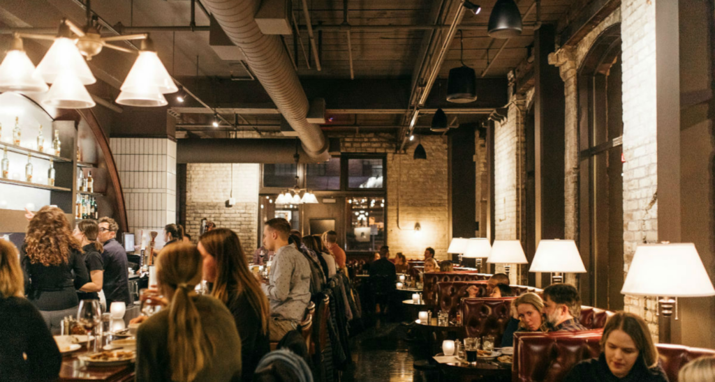
We recently had dinner at a restaurant that’s been nationally and abundantly recognized for its design. This isn’t anything new for us; eating, drinking, and absorbing all over the world is how we learn, so we always pay extra attention to hospitality spaces—not just how they look, but how they function. We don’t just look at the cool materials or wow-factor lights; we analyze how guests and service staff respond to and use the space.
And in this instance, there was a lot to pay attention to. First, the flow out of the kitchen and the dish pit was in plain sight of everyone sitting at the bar, disrupting what should have been a great dining experience (the bartenders and drinks were incredible), and the cross traffic from the service staff was a jumble. Second, on a packed Friday night, the primary dining area had only two people sitting in it. Everyone else had flocked to booths on the perimeter or the bar—with several guests opting to stand in the bar area rather than sitting in the dining space. The very area that had been lauded for its design and looked so notable in pictures was the same space that diners seemed to hate.
Prompting us to ask: With restaurants playing such a big role in people’s lives today, why don’t we hold their designs to a higher standard, especially when giving accolades?
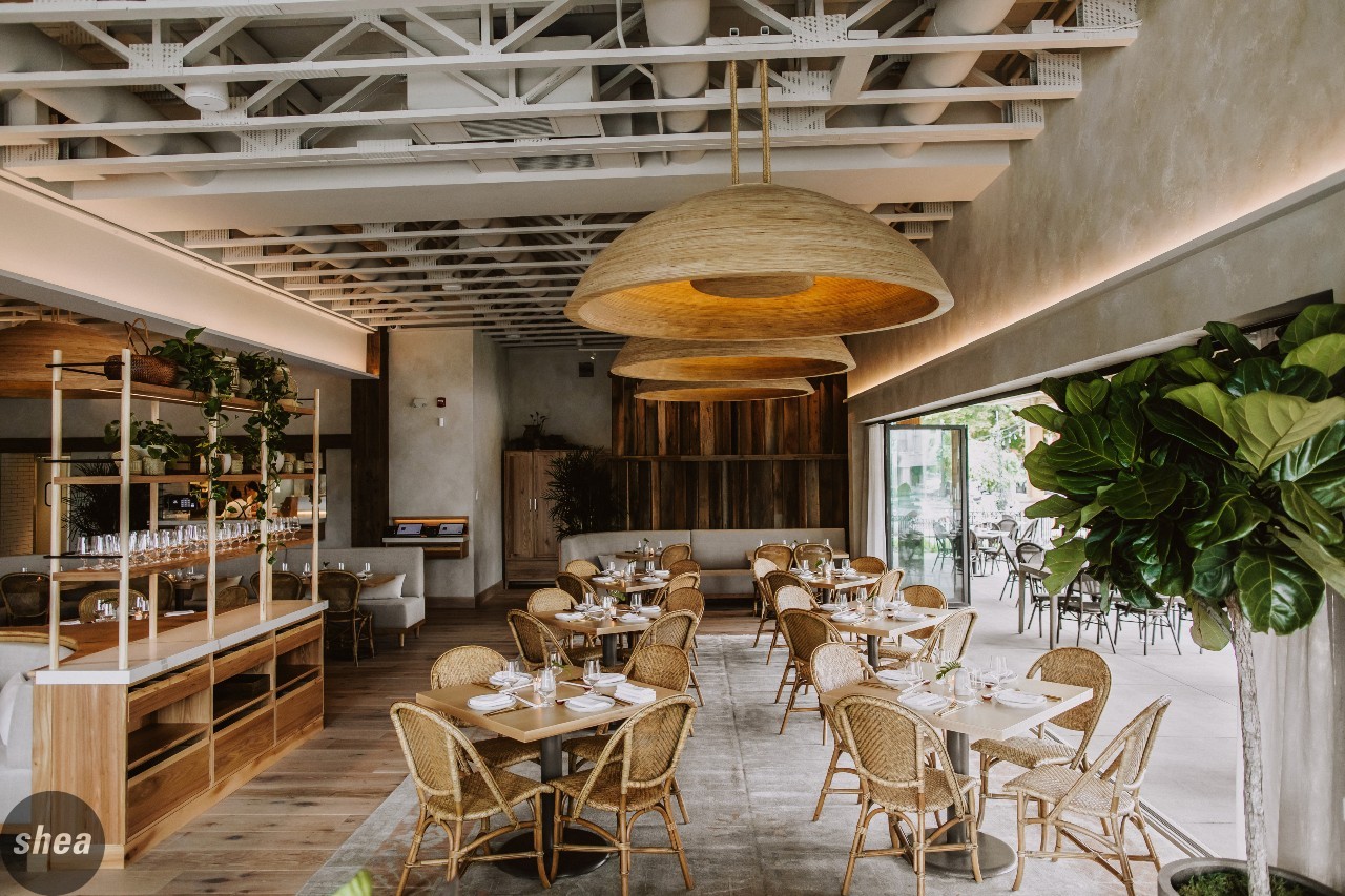 Don’t get us wrong: We love being recognized for our work, because designing spaces that excel in both aesthetics and functionality is hard. Our award wall is an important stop on every office tour, and a source of pride. But what we love even more is an owner who’s successful in business for years, with a space that never feels tired, trendy, or dated. We also love when every different dining zone brings a unique and desirable experience, not just the feeling of “I’ll sit there if it’s all that’s available.”
So what makes a restaurant design award winning? What makes a restaurant design good?
#1: It was designed for the guests.
Design is subjective (thank you, Captain Obvious). When it comes to commercial design, the reason this is an important point to repeat is because it’s not about what the designer “likes,” or their personal style. Nor is it about what the owner likes, or their personal style. If your target audience/ location/ brand/point of differentiation is not THE filter for every design decision being made, that’s the mistake. If a designer ever presents something as an item they “really like,” they need to put money in the business-decision equivalent of a swear jar.
#2: The layout was created for the staff/operators as much as the guests.
Service flow. Locations, layout, and look of service stations. The wrong/right views into the kitchen (spoiler: wrong is looking at the dish pit; right is watching the exciting culinary theater of cooking and plating). The way the doors swing into bathrooms. The setup of bar stations, and the tools of the trade that need to sit on the bar and look great, versus the ones to be hidden under the counter. These things are not boring—they’re vital. Restaurants are living, breathing, working spaces, and that’s part of what makes them fun. Whether the kitchen is the entertainment or the magic is created behind closed doors, these are some of the most popular mistakes that makes seeing what makes restaurants work disruptive rather than supportive of the experience.
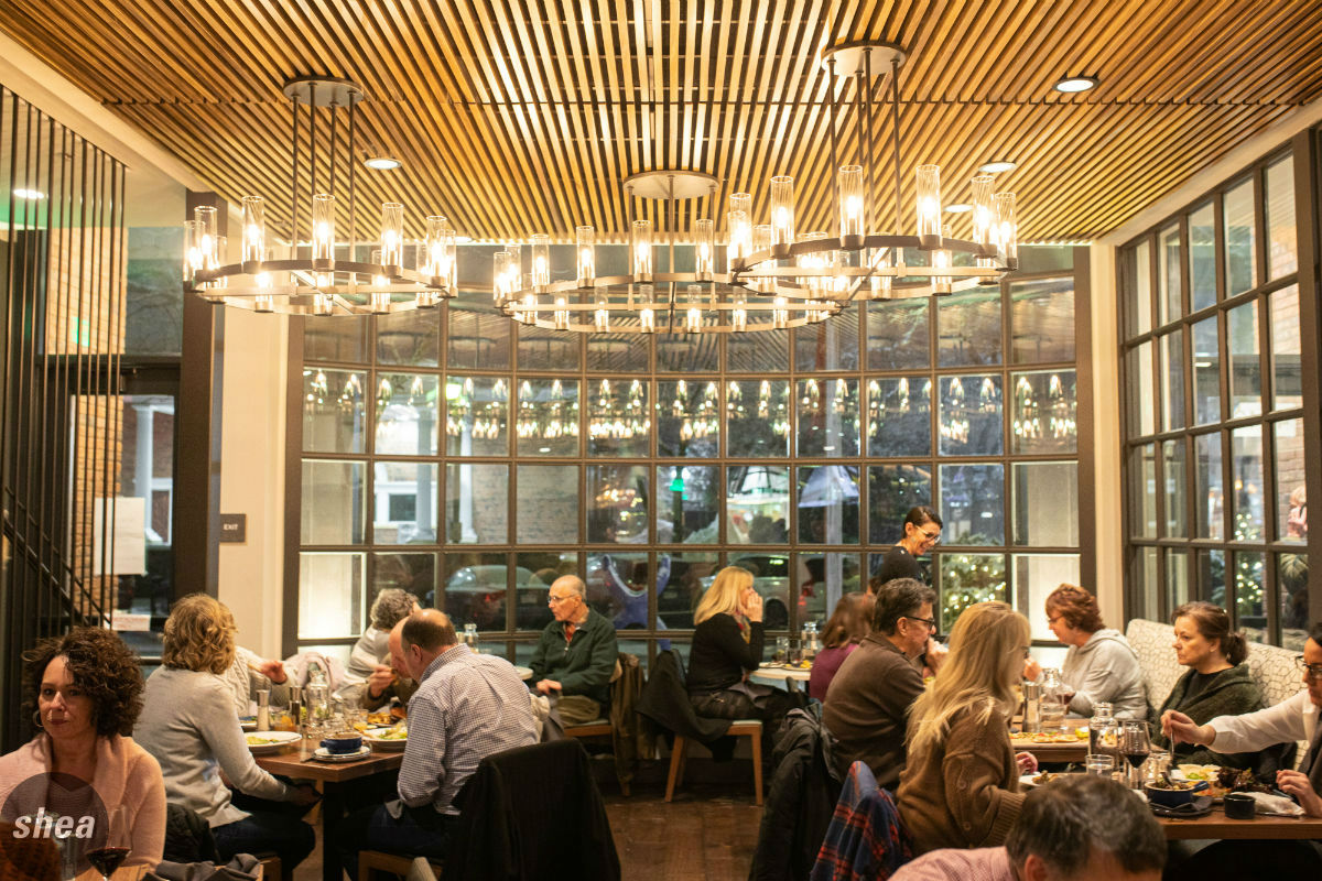 #3: There is no bad seat in the house.
The last seats taken are usually the ones in the middle of a sea of tables, tucked back in the corner by the bathrooms, closest to the entrance, on the long central community table, or at a dining-height table looking directly at a bar-height diner. It can be tough to visualize in planning, but these are spaces that are going to occur in every restaurant, so it’s the designer’s job to make even these feel like first-class seats.
#4: It is not trendy.
Let’s say it: You shouldn’t be able to tell that a restaurant was designed in 2012. Or 2016. Or 2022. Design is not about what’s new or popular today, or the color of the year. It’s not about the shiny new object that just came in, or what some magazine has declared the next new trend (floral wallcovering, blond wood, geometric tiles, neon signs… We see you). The design should be unique to this particular restaurant’s brand, desired guest experience, service style, and menu. That’s not to say there’s no use for these items, but creating a restaurant design means layering curated elements that don’t date a space in its particular time.
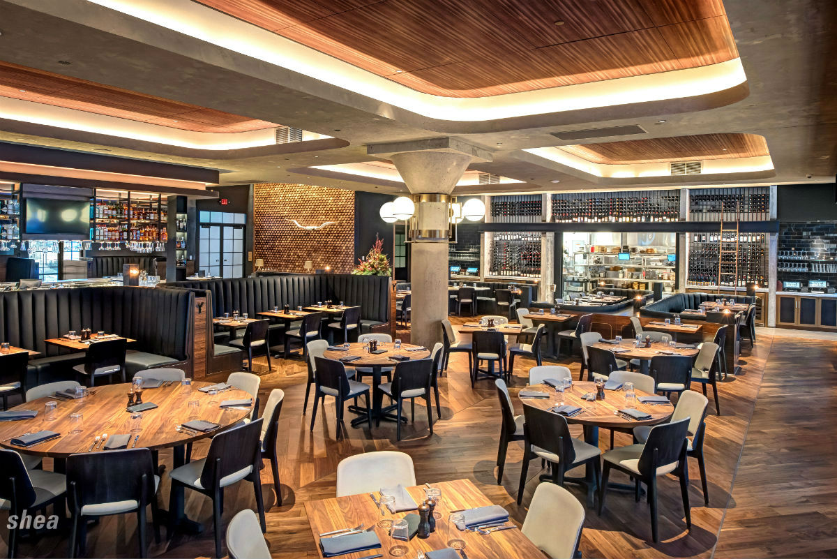 #5: The lighting and acoustics are right.
Lighting is the easiest and most popular way to ruin a space. Any space. Lighting people, not objects. Too bright, too cold, too blue. Not enough zones, layers, and dimming systems. Lighting is the one thing that can create a really bad experience, but most guests can’t specifically articulate. Pay attention.
Closely following in importance is sound. Plan acoustics (as well as music levels and speakers) into the design from the onset. Don’t put yourself in a position to be adding superficial elements after the fact to control the volume-bouncing of sound on hard surfaces.
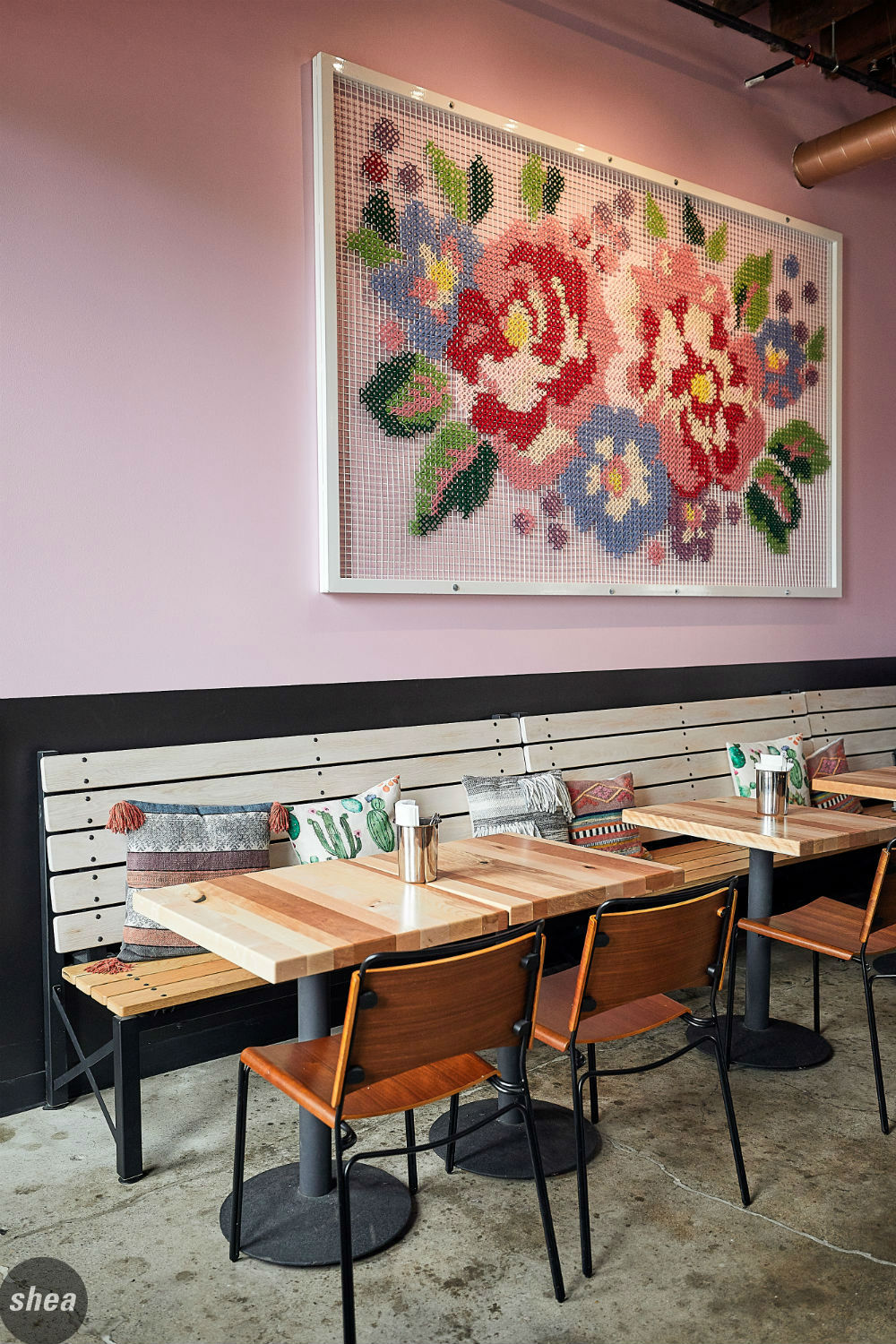 #6: It doesn’t feel decorated.
With restaurants in particular, there is a big difference between an integrated design process where objects, arts, and materials are integrated into the base design, and when they are simply applied or hung after the fact. Start looking around and you’ll see: Does that framed tapestry fit and add to the whole experience? Or just feel like it was hung because the wall needed something? This is a subtle point, but important in creating a cohesive experience—it’s why custom art and décor can be so helpful in really pulling a concept together.
#7: It supports a successful business, and came from a business and brand plan.
Restaurants. Are. Businesses. They’re brands. It’s not just a collection of furniture and décor. It’s so much more than design; successful restaurants start with the right space, the right infrastructure, the right lease, the right business deal, and a solid budget that matches the pro forma appropriately. From there, it’s about creating a brand and concept with soul and a point of differentiation. A good design uses that foundation to create a unique experience in all aspects of food, operations, and space—that’s what resonates with diners, and that’s what should be rewarded appropriately.


