While we’re no strangers to renovating gigantic office towers or creating expansive, multi-level restaurants, there’s something to be said about taking on the challenge of a smaller space. When we work on a space with smaller square footage, whether it’s a quick-service restaurant, an expansion, or a retail space, we have to get creative to ensure that the signature Shea consumer sensibility is present. It’s a delicate balance between adding too little or too much to create the right customer impact. And the results can be spectacular—some of our favorite designs and best ideas are the result of tight spaces.
Sprout Salad Co.
When the original Sprout location opened in RBC Plaza, it was immediately determined that fitting everything in was going to be tricky. The business model is dependent on quick, fresh food, and that means that the kitchen needed to be able to do everything—cook, grill, and bake, but also have plenty of space for customer flow and seating. “We didn’t know exactly how it would come together,” says co-owner Dan Gittsovich. “Being built for speed is hard in such a small space and with the volume that we do.”
With the downtown Minneapolis location doing more than 400 transactions per day, primarily in the short space of two hours, Shea knew that the space needed to be super-efficient, and our design had to work around that efficiency. Moreover, it needed to really drive the new Sprout brand: open, fresh, and modern, slightly industrial and with clean lines.
We jumped into the project with gusto, creating a service system that would allow for plenty of kitchen space as well as seating and a line that facilitates easy customer movement. Aesthetically, we balanced raw cement in the space with pale wood and accents of metal, a perfect combination of textures to highlight the brand’s core values of authenticity and modernity. A wood-slat-covered focal wall boasting the Sprout leaf logo evokes the nature and urban-garden vibe that the brand espouses, and the glass-enclosed storefront makes the space seem lighter and brighter—key, since it’s ensconced within the Minneapolis skyways.
Since building two more locations, in downtown St. Paul and near the University of Minnesota, we’ve refined the design even more—the St. Paul space is even smaller than the Minneapolis location, using the same efficient kitchen and line system but eliminating seating. Customers respond to the brand’s fresh, lively vibe and the way that it’s presented in the design—even in miniaturized form.
Black Sheep Pizza
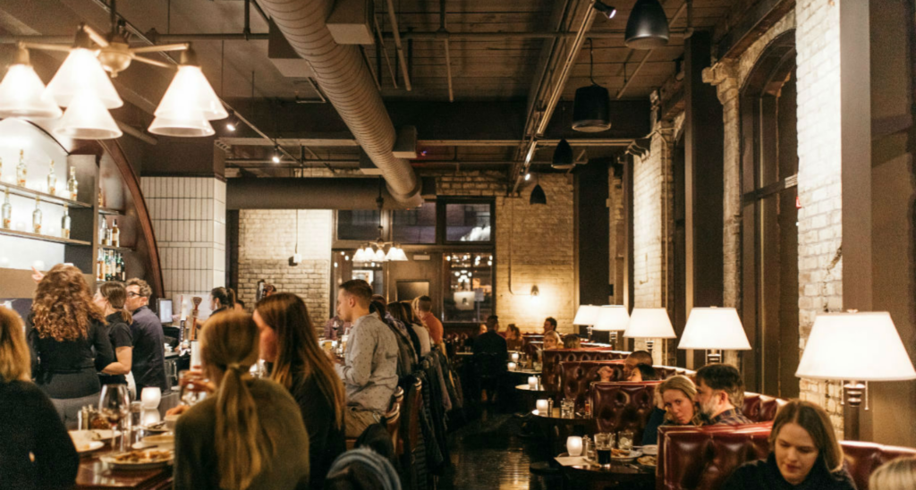
When you want pizza, you don’t want to wait. Especially when it comes to Black Sheep’s creatively topped, coal-fired pies. So when co-owners Jordan Smith and Colleen Doran decided to expand their original North Loop location to double the restaurant’s size, they turned to Shea. Although the expansion was a small one, Smith was adamant about keeping the restaurant’s cozy, lively vibe intact. “We just didn’t want it to feel too cavelike,” he explains.
We started by creating a plan to add a full bar—a feature we’d put in at the Black Sheep Eat Street location, and that Smith and Doran love for the energy that it brings to any size space. We also added a handful of seating options, including more booths and high-tops but also a communal table to really bring in warmth. A new open kitchen shows off the pizza-making action, and in the dining area, a mural in the restaurant’s signature black-and-red palette serves as a great conversation piece.
Although the expansion wasn’t big, we worked hard to make the most of the space. It’s made a definite difference to the Black Sheep team—who love that customers have a bar to wait at and there’s more space to accommodate them. And the nuts-and-bolts features work better, too: Smith particularly appreciates the separate dishroom and additional bathrooms to make operations run more smoothly.
Best of all, Shea was able to maintain the same industrial vibe and connection between Black Sheep and its city and customers. “I like how it really maintained that intimate feel in the restaurant,” says Smith. “You get into your spot and you feel safe and tucked away.”
Milkjam Creamery
Build one of the city’s most happening ice-cream shops in 800 square feet—half of which needs to be for production and freezer space?
No problem.
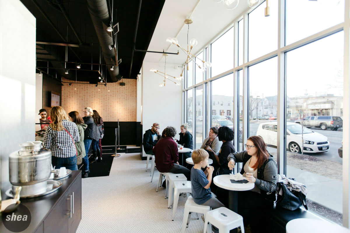
We teamed up with powerhouses Sameh and Saed Wadi to complete their trifecta of restaurants (after remodeling Middle Eastern spot Saffron and designing global-street-food restaurant World Street Kitchen) with a creative sweets shop with some off-the-wall flavors. The challenge came in how to show off the bright, vibrant ice creams in such a small space… And what to do with all of those customers.
“That’s the first conversation David [Shea] and I had—how to make it flow well and make it easy for people to navigate through without noticing it was such a small space,” says Sameh Wadi.
With square footage being tight, figuring out how to queue customers was one of the biggest challenges. We wanted to keep a natural flow of people, but give some guidance so that they wouldn’t clump around the counter peering at the brightly hued ice cream flavors—so we created a roped line that would allow customers to spill out the front door, and added a TV screen featuring the different flavors of the day.
“People want to see the ice creams,” says Wadi. “We thought of the display case as a sales point and put the TV on so that they could look at the choices.”
Another challenge was keeping the shop light and bright, accomplished by removing the awnings from outside the store to let in as much sunlight as possible. Shea also used primarily white materials with touches of gold throughout to magnify the space while adding a touch of glamour—a color combination of which Wadi is particularly fond, especially with the addition of the feature wall to bring in an extra dose of brightness. “We wanted to keep a classic feel to it, but also introduce a little humor, a little playfulness—that’s how we ended up using the wallpaper with all the different Milkjam symbols,” he says.
As for customer reaction, the blocks-long lines say it best. The clean, bright design at Milkjam lets the bold ice-cream flavors really shine through and is unlike any other space in the Cities.


