October 22, 2025
A brand is far more than a logo or color palette; it’s a living system that defines how a concept expresses itself across every touchpoint. When we create a brand for a client, we deliver more than a a logo. We develop a fully-fledged identity that translates the concept from big experiential moments to functional signage to decor that’s steeped in the brand personality. It’s a comprehensive toolbox for building a complete and distinctive experience.
While clients may use this toolbox to shape their digital presence through websites and social media, our role is to design the built brand experience, crafting how guests and the brand interact.
The toolbox includes logos, typography, and color, but those are only starting points. They act as anchors from which we build an environment that extends the brand’s personality into every detail from signage, packaging and materials to spatial design elements, ensuring a cohesive and immersive experience at every consumer interaction.
Take three recent Shea projects for example: Jack Rose Social Club, Schmitt Music and Pints & Paddle.
Jack Rose Social Club
A brand collab for a new bar, casino and restaurant concept in Sioux Falls’ Steel District development
Restaurant owners Kirby Muilenburg and Bryant Soberg partnered with Shea to design an experiential space for their new concept and collaborate on the development of the brand.
Goals for the brand identity:
Inject a fresh, youthful vernacular into a uniquely South Dakota heritage that is textured, layered and lived-in | Be bold and strong but also comfortable and approachable
Brand Assets:
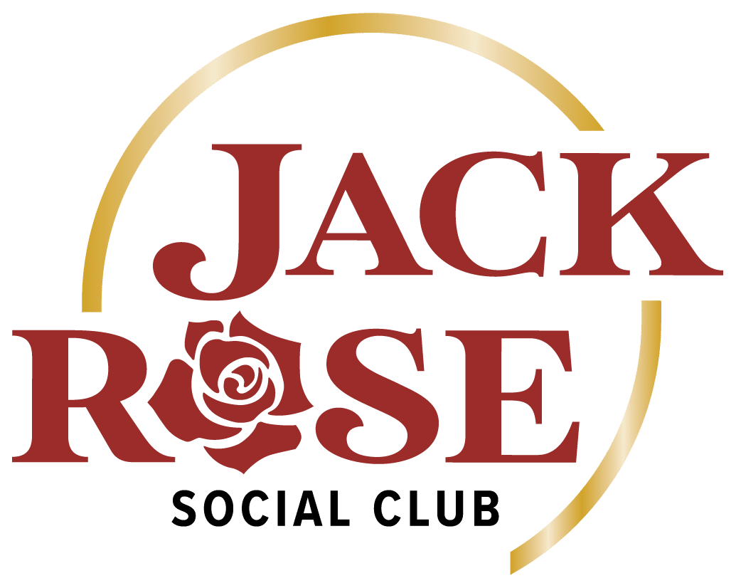

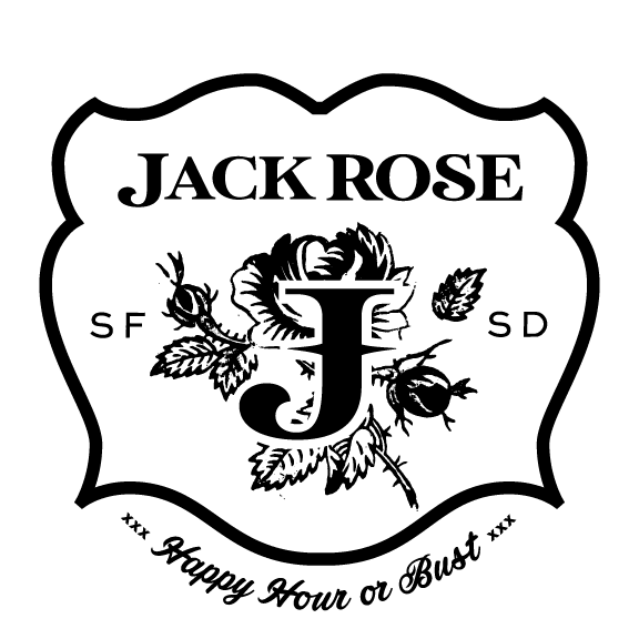


A sturdy typeface, earthy color palette, and dramatic pattern build a rough, wild-west attitude with dimension and texture. A distinct badge and 3D-style gold rose provide additional brand expressions for special uses.
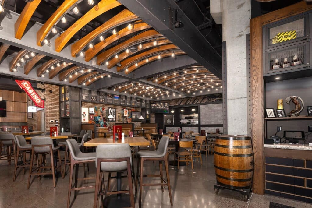
Extended into the space:
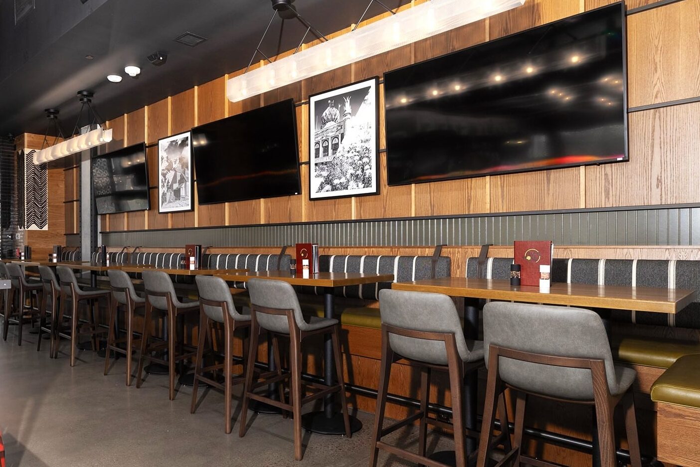
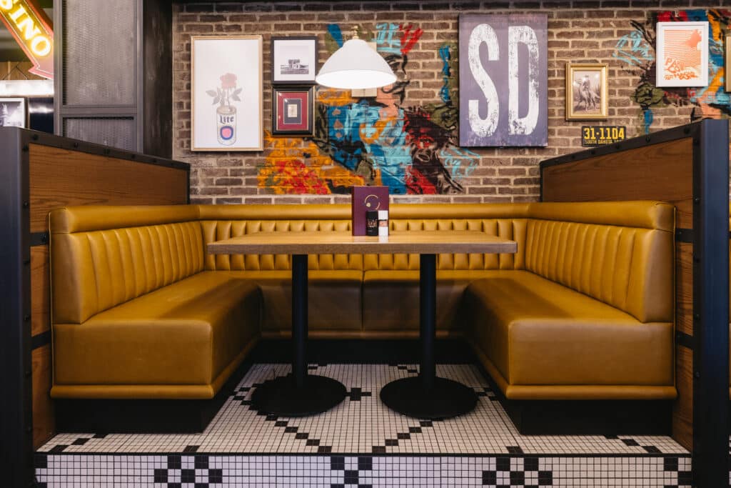
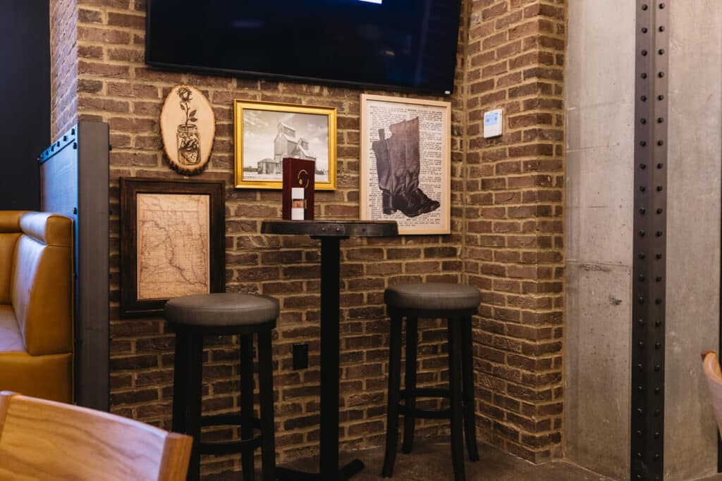
South Dakota photos, Jack murals and wild-west nods layered into the decor
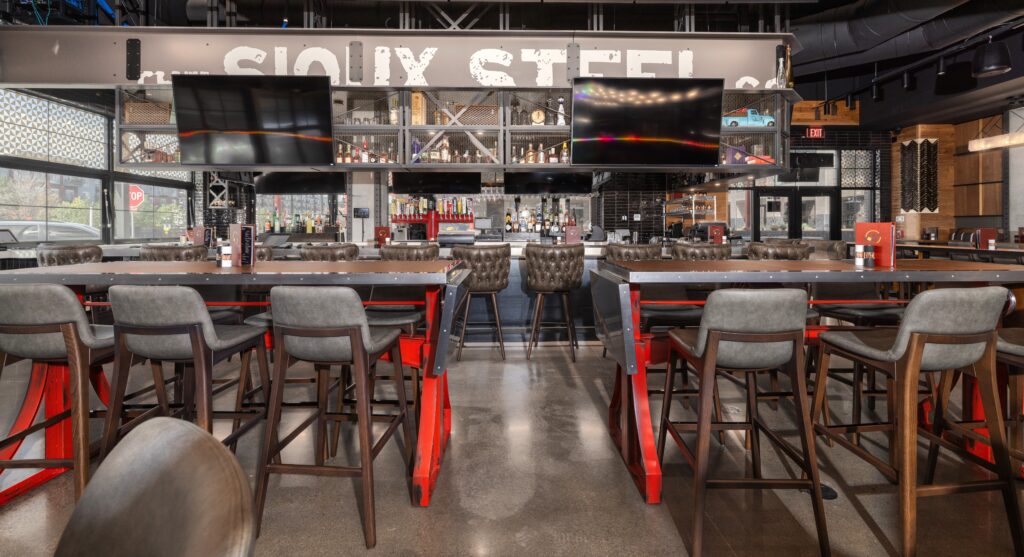
Custom tables and I-beams lend to the rugged personality with a South-Dakota-true sense of place
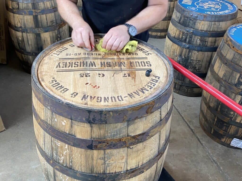
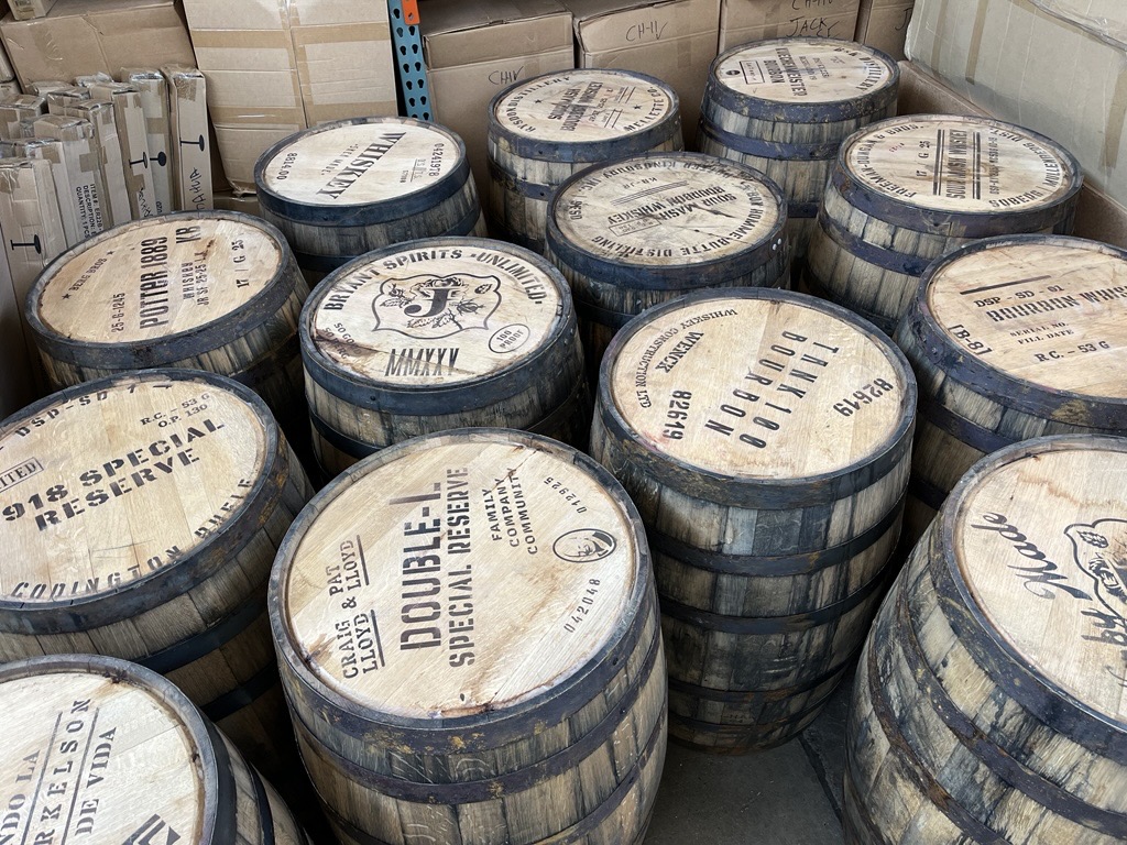
Stenciled barrels bring texture, graphics and dimension to life upon entry to Jack Rose – each one is unique and acknowledges a project contributor
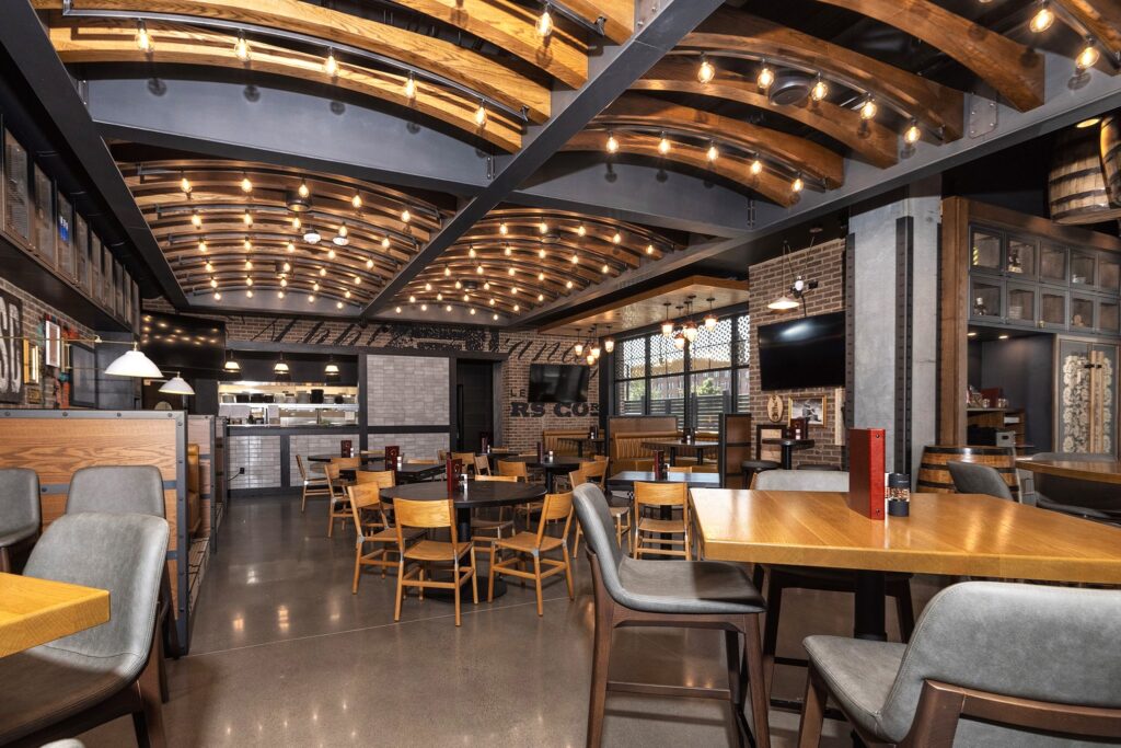
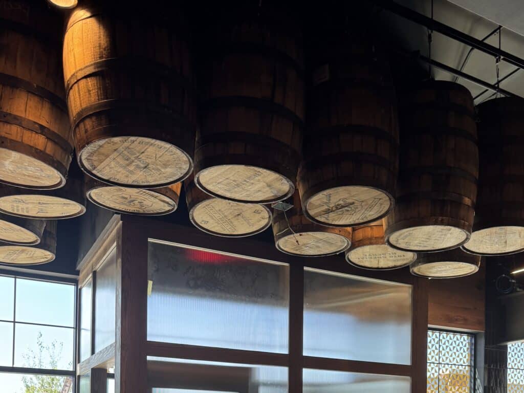
Ceiling cloud by SheaMakes pairing earthy wood-tones with lively lighting
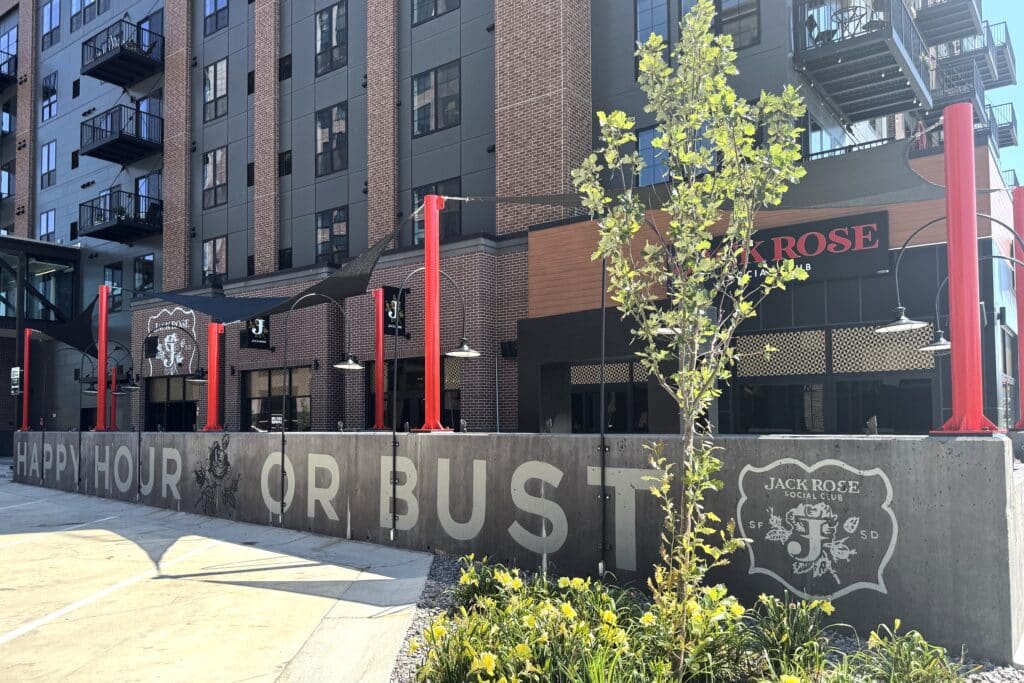
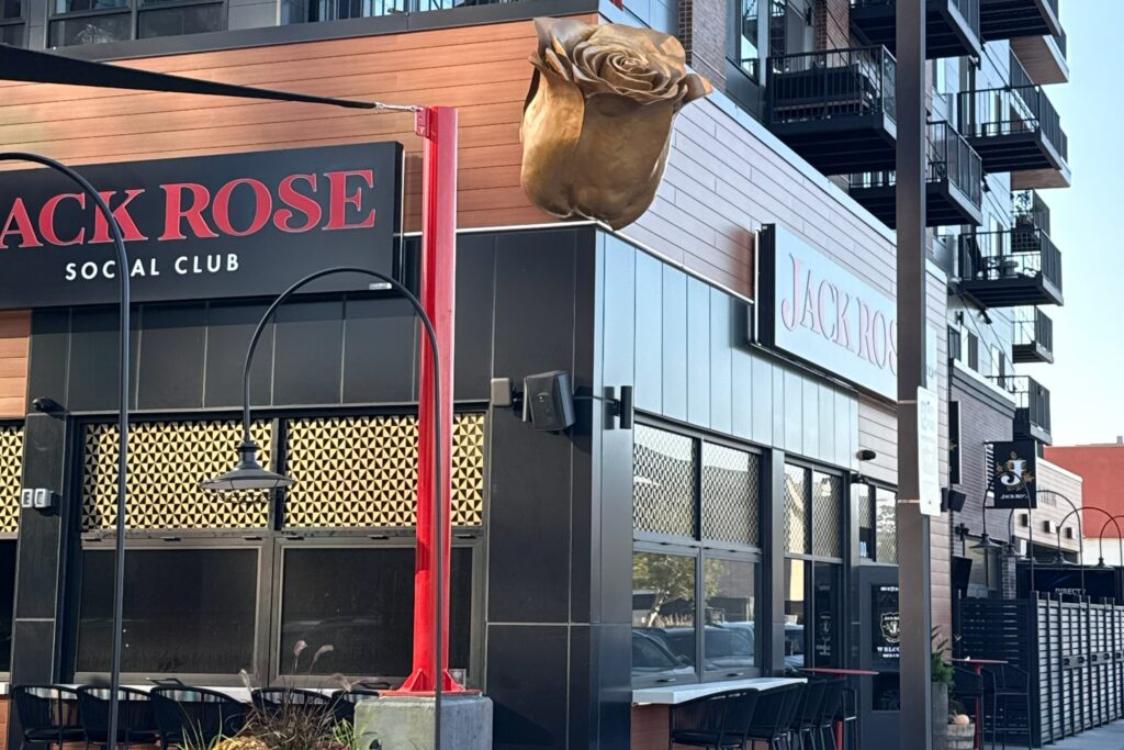
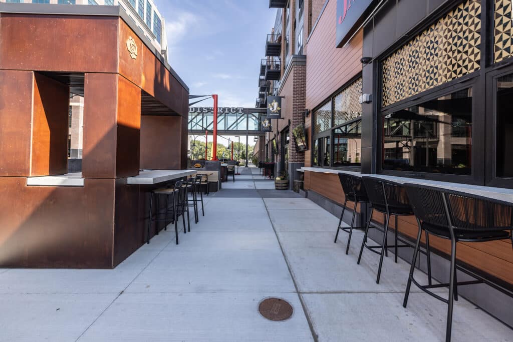
Signage, graphics, patterns and 3D rose expressing the Jack Rose story from the exterior and patio

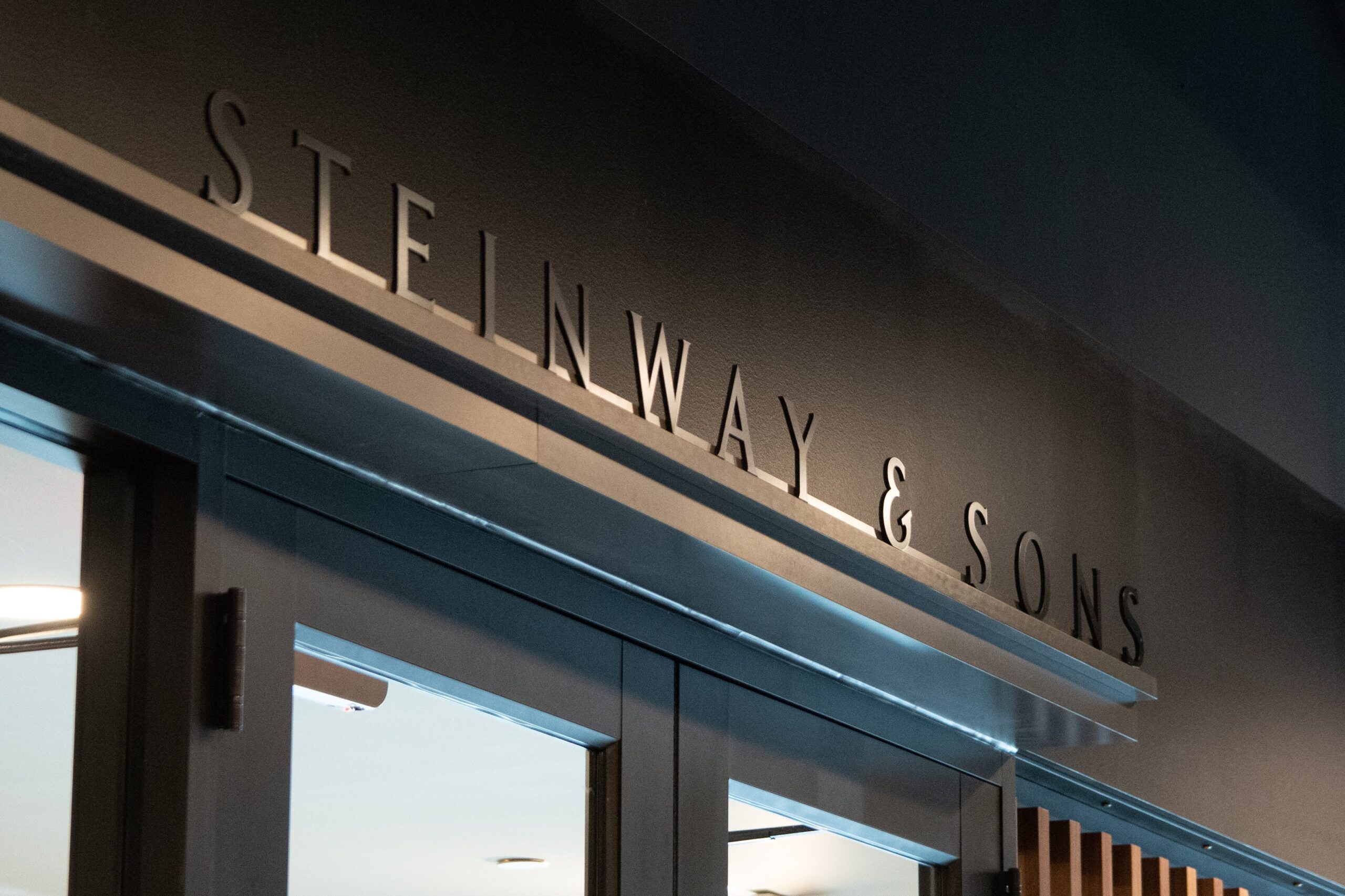
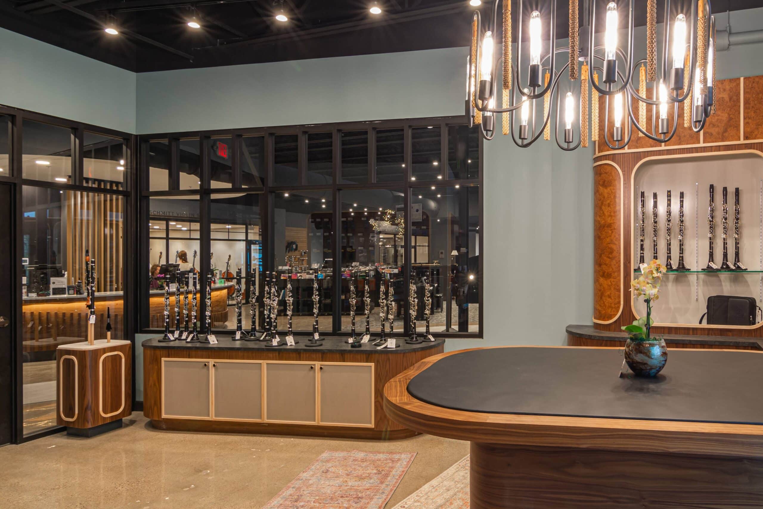
Schmitt Music
A brand refresh for an over 125-year-old music retailer transitioning to the next generation of family leadership
With 5th-generation leader Peter Schmitt newly at the helm as CEO, the iconic Schmitt Music partnered with Shea to design a new flagship store, as well as redesign their long-time logo and brand identity.
Goals for the brand identity:
Bridge Schmitt’s history with today’s diverse audiences | Differentiate through expertise | Convey the joy that comes from a personal connection to making, not just consuming, music
Brand Assets:
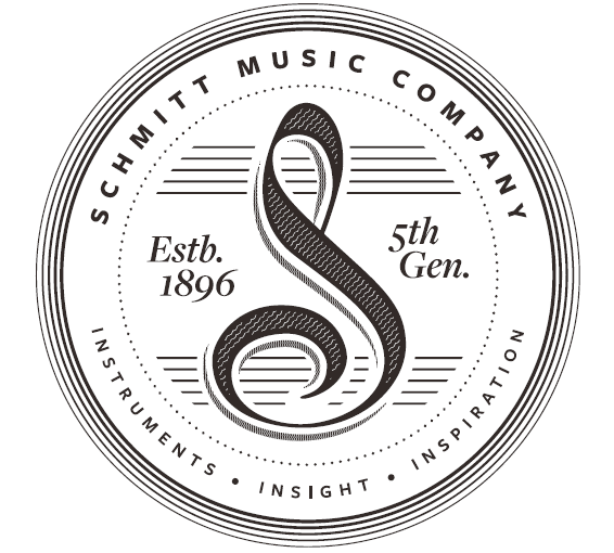
As a go-to instrument provider for musicians of all levels and unique abilities, the refreshed brand was designed around timelessness and neutrality. The brand already has such a rich history, so the logo, wordmark and main color palette stay out of the way, allowing the instruments, products and consumers’ personal music journeys to take center stage.
Extended into the space:
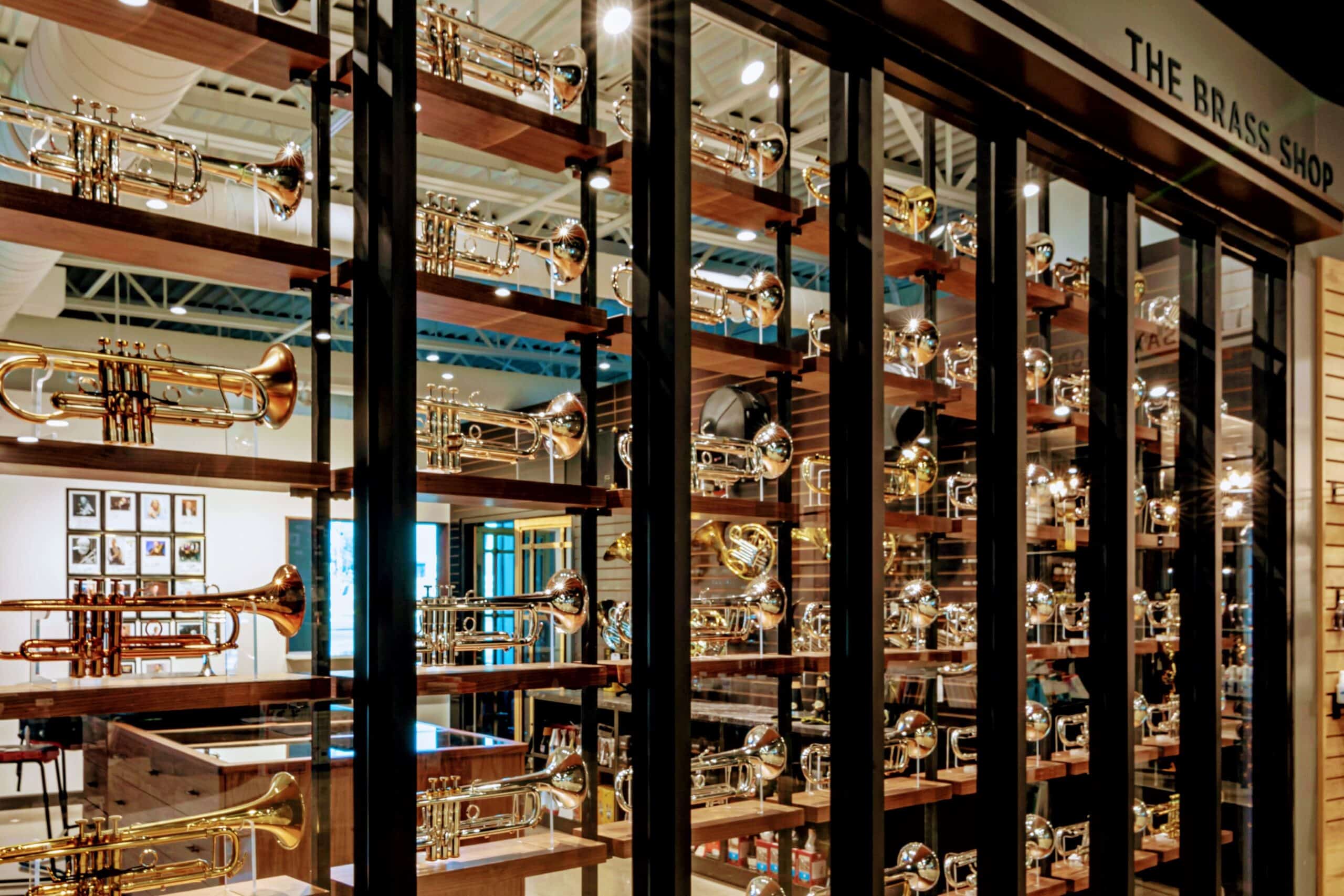
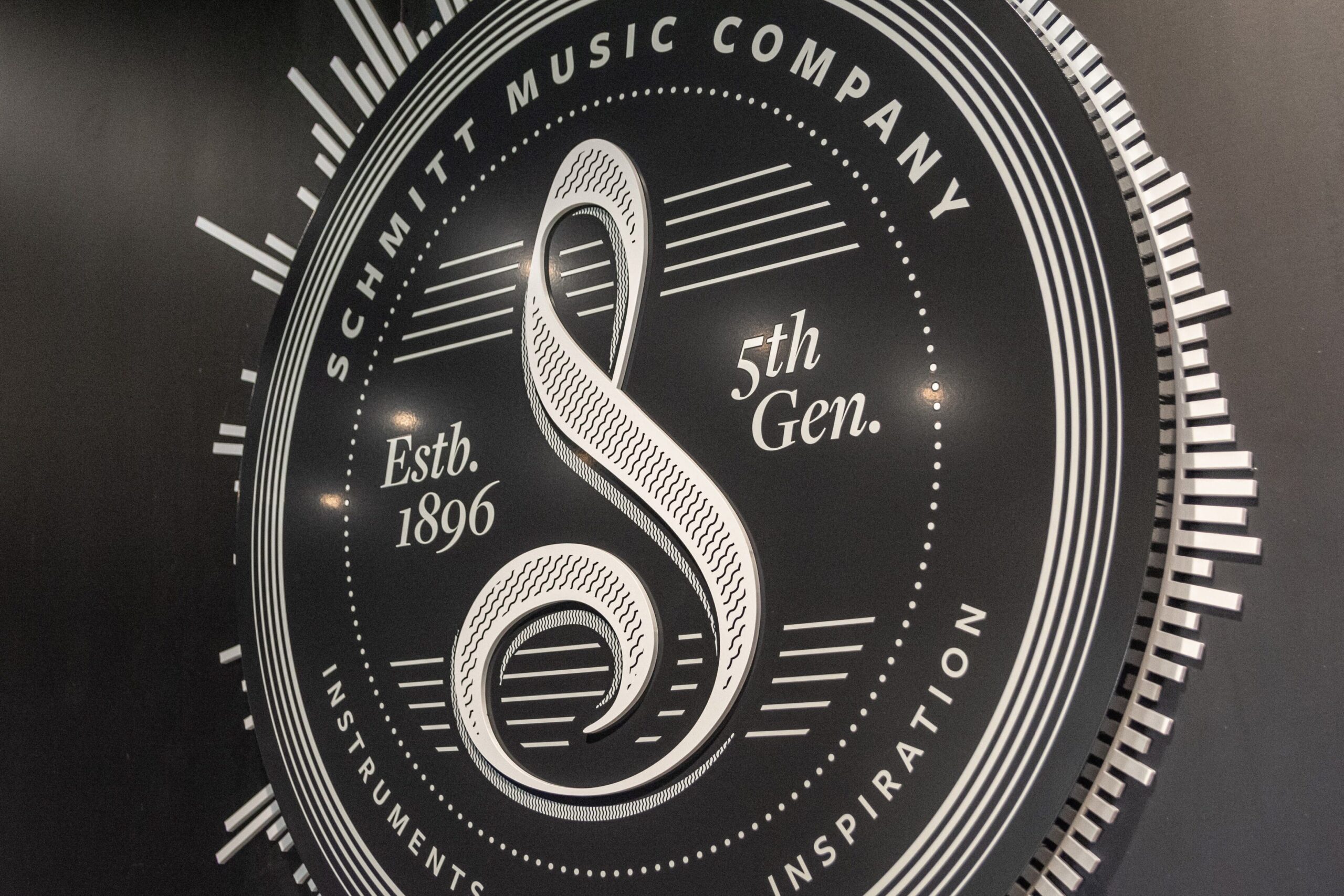
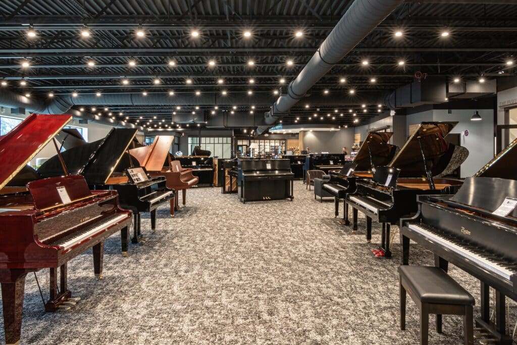
Instruments take the spotlight in a timeless setting, a special-use seal displays the heritage of the brand
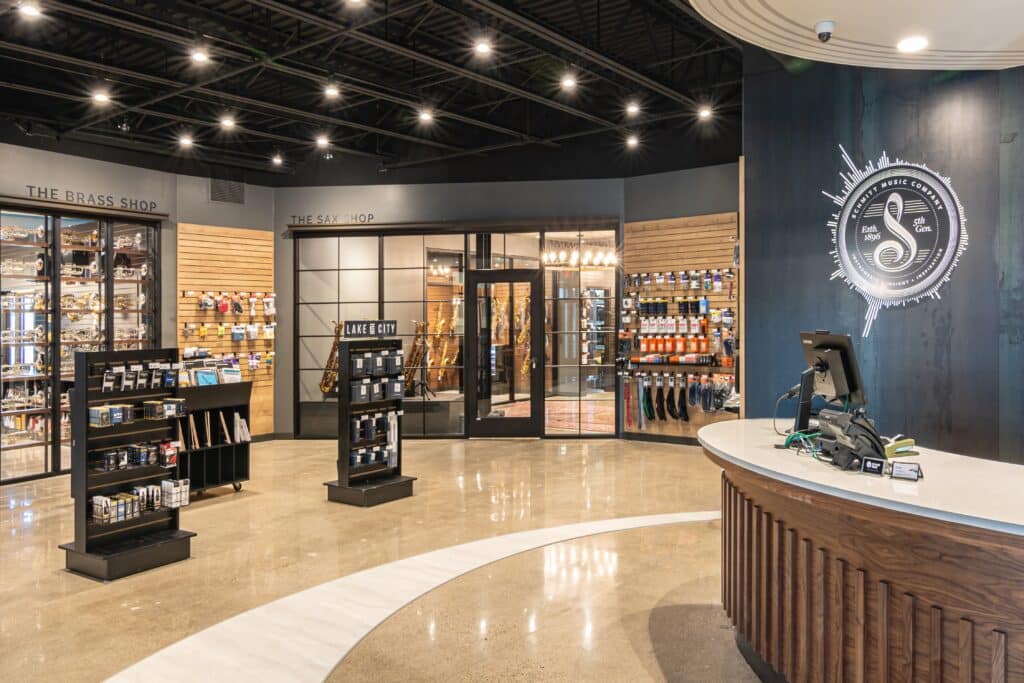
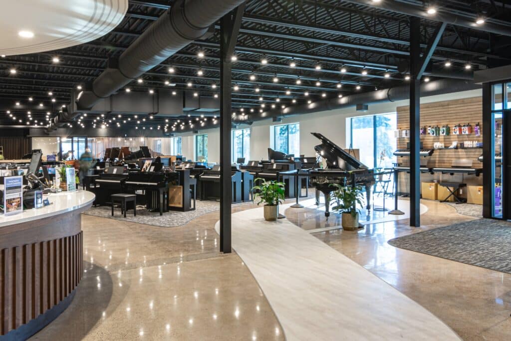
Treble clef flooring detail leads from the entry and wraps around the front counter
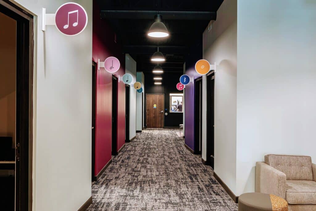
Neutral gallery signage allows each gallery interior to develop a unique brand extension, practice room signage brings in a light pop of the brand’s secondary-use colors
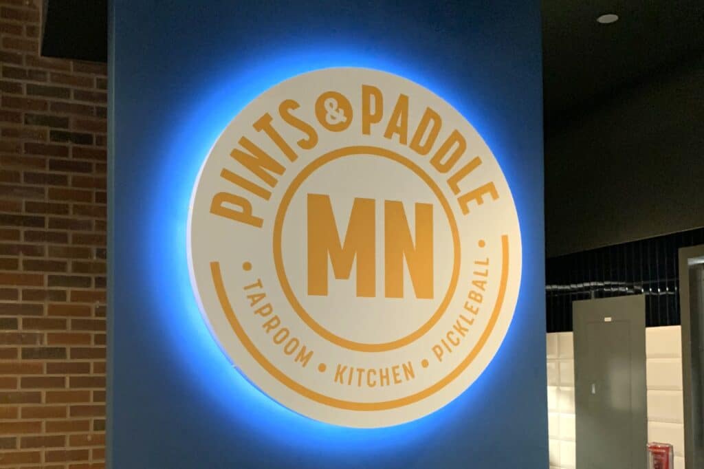
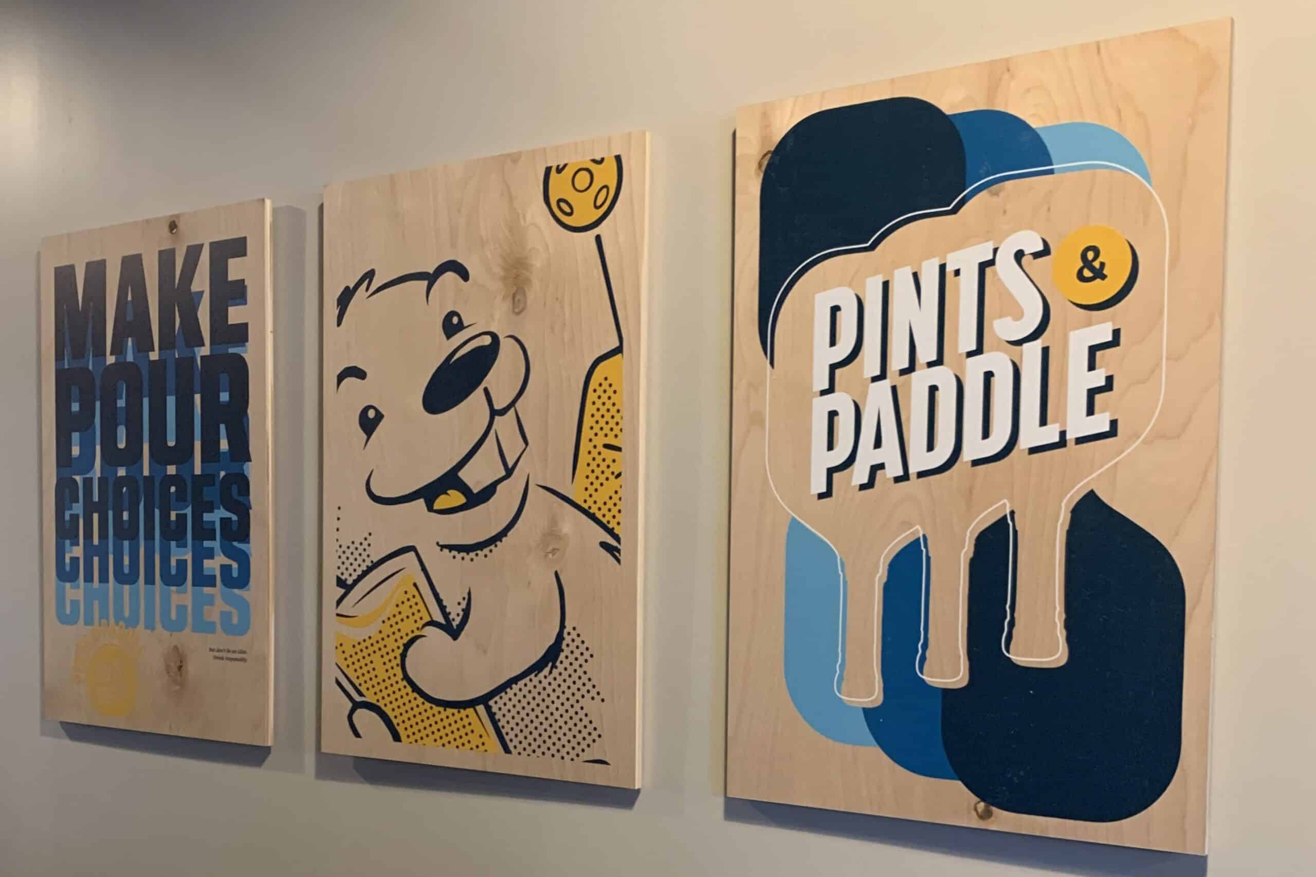
Pints & Paddle
A from-scratch brand for an experiential concept that combines pickleball with a taproom, restaurant and entertainment from husband-and-wife duo Tim and Tammy Skaja
Goals for the brand identity:
Be inviting, experiential and flexible | have a playful energy | nod to both pickleball and taproom
Brand Assets:
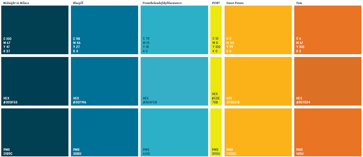
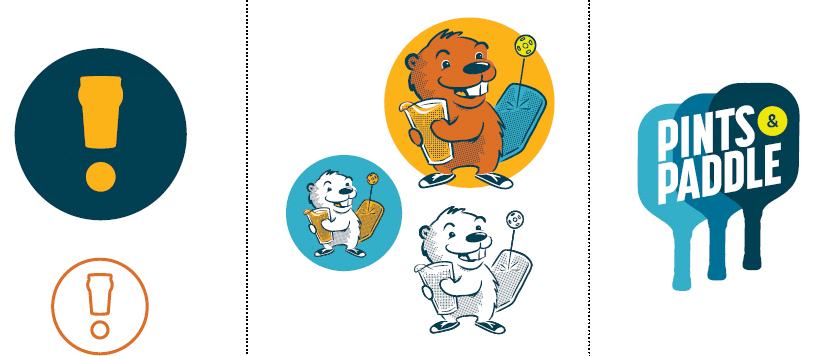
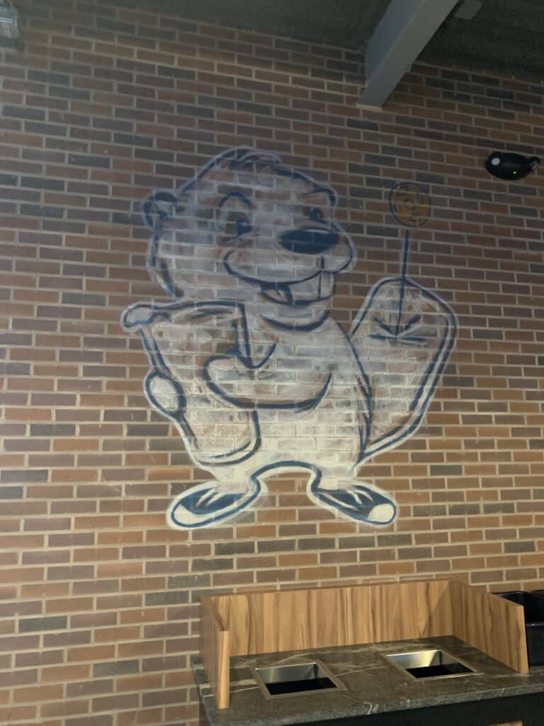
“Your Serve” ties the dual pickleball and taproom concept together and engages guests as they decide how they want to experience Pints & Paddle their own way. The logo itself is simple; it’s clear, bold and welcoming. Richly-hued colors inspired by P&P’s home state of Minnesota bring in the playful energy with a lightly-retro flair. Visual assets of the “exclamation pint,” Paddy and a 70s-style paddle graphic provide additional anchor points for pulling the lively brand into its space.
Extended into the space:
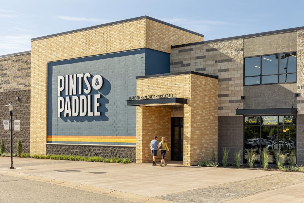
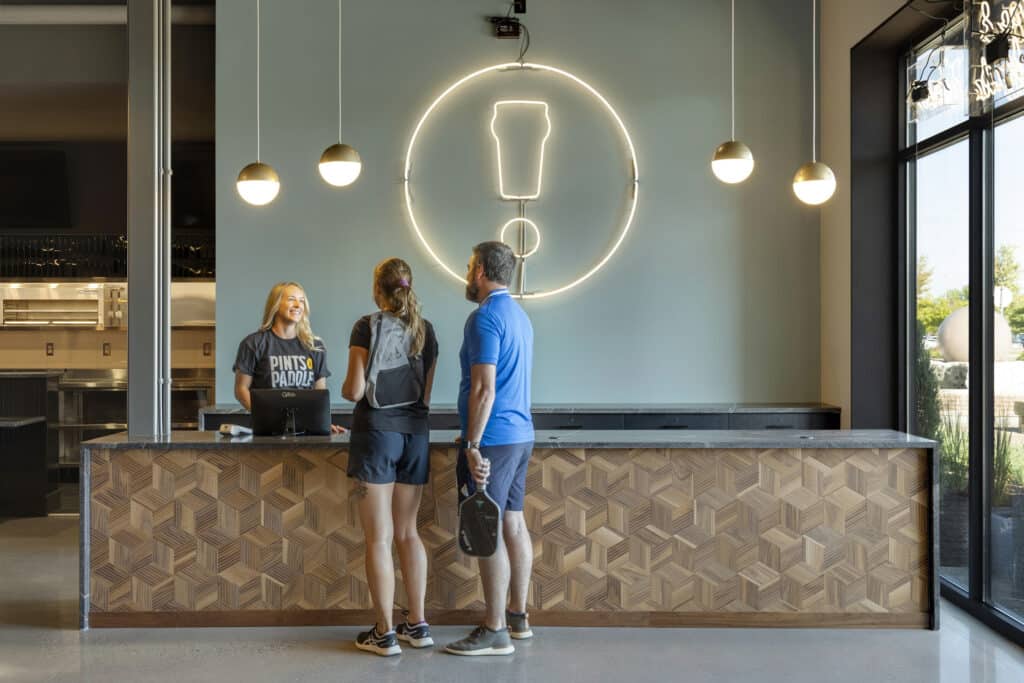
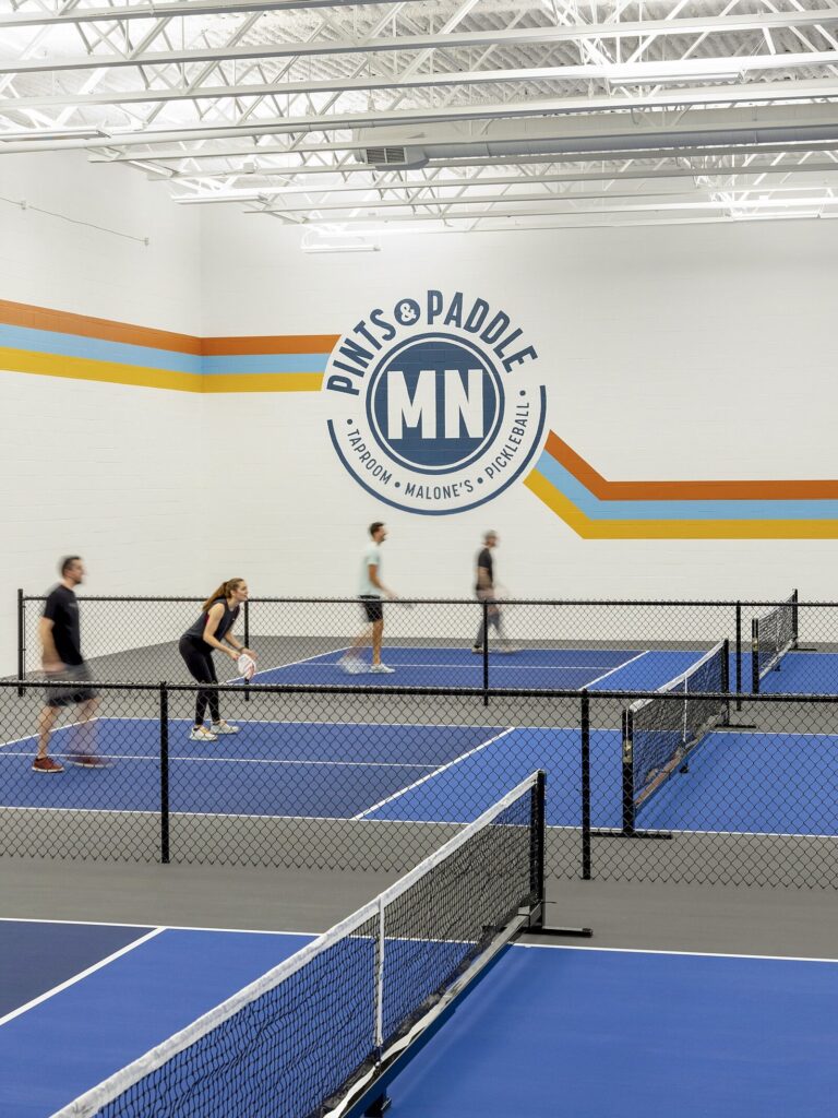
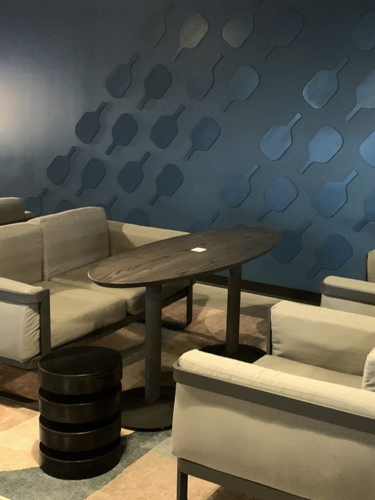
Bold application of visual assets from exterior and entry to the taproom and courts
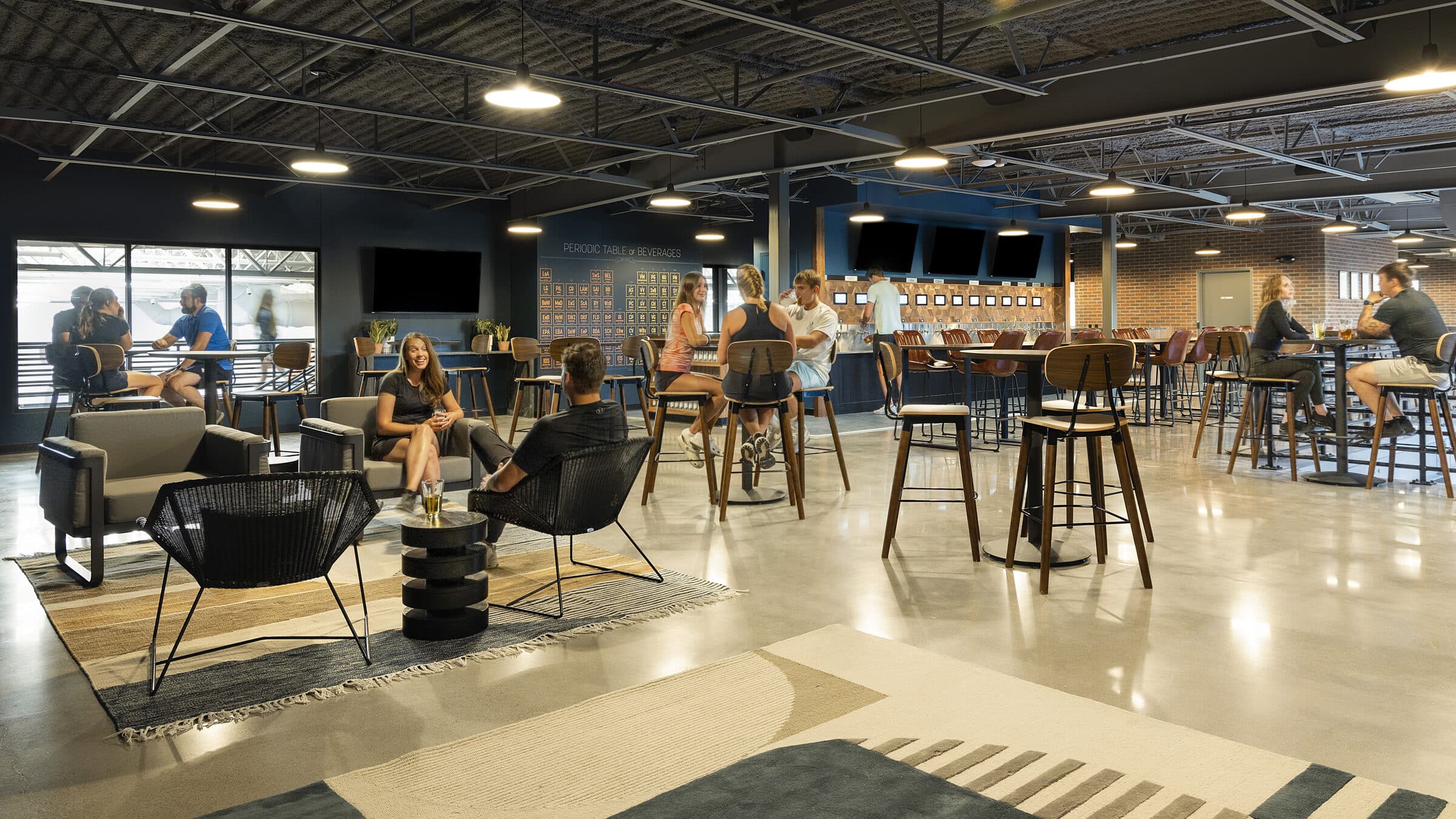
Flexible gathering spaces, comfortable community seating and custom Periodic Table graphic
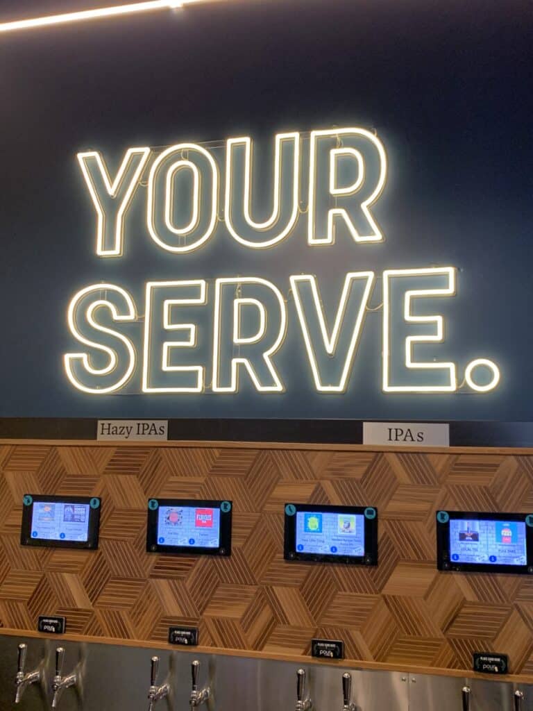
Varied signage and decor showcases the flexibility of the brand assets and create a lively atmosphere
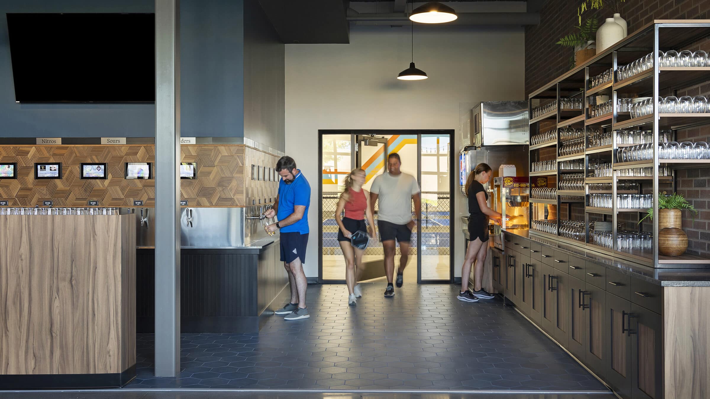
Sightlines to the courts’ branded murals carry the “Your Serve” mentality from court to taproom

Jack Rose, Schmitt Music and Pints & Paddle show that brand and environment are inseparable; something Shea has believed in for over four decades. A brand doesn’t just live on a screen or a sign, it lives in the experience. Brand is woven into a space through layers of graphics, furnishings, textiles, finishes, art, and décor to create environments that don’t just represent a brand’s story but express it through authentic, unexpected, and memorable moments. We create spaces that don’t just represent a brand but embody it.
Because the best brands aren’t just seen – they’re experienced.