At Shea, we pride ourselves on staying on top of what’s happening in design and industry news so that you don’t have to – and we pull what’s smartest and most forward-thinking together to save you the time of sifting through it all. It helps us keep tabs on what’s fresh, inspiring, and happening in the world – and we make a few headlines of our own, too.
Our team recently celebrated our 45th anniversary by sharing a toast and reflecting on our history and the next 45 years to come. Tanya Spaulding, Principal and Partner at Shea, summed up the history here for you to continue the celebration.
The Biggest Trends Driving the Hospitality Industry This Year
We’re not sharing design trends – Shea actively avoids “trendy” – we’re sharing Hospitality Design’s round-up of what’s happening across the hospitality industry based on data and consumer choices. They’ve compiled six notable shifts the hospitality industry has taken in 2023 to remain competitive.
Schmitt Music Hits a High-Note with Latest Store Concept
Schmitt Music wins a Shop! Design Award
Visual Merchandise and Store Design (VMSD) highlighted Shea’s design of Schmitt Music’s flagship store in their reoccurring Design Detail feature. Cori Kuechenmeister, Director of Design at Shea, detailed the unique features of their new store. In other Schmitt Music news – Shea recently won a Shop! Design Award for our design of their new flagship.
15 Best Tequila Places to Drink Tequila Around the US
Food & Wine shared a nationwide list of the top 15 places to drink tequila, and Minneapolis’ Escondido made the list. Shea designed Escondido in partnership with Centro Restaurant group, the lounge can be found tucked into Centro & Vivir’s Northeast Minneapolis location.
Hoteliers Make Big Investment in Midscale and Extended Stay
Travel Weekly details the growth of midscale and extend stay offerings from large hotel groups, providing an accessible range of options that speak to travelers on varying budgets or traveling for business. The article notes that this is a shift from a previous industry focus on luxury and lifestyle hotels. Hospitality groups are now working to diversify their offerings for consumers, including a new market of Gen-Z travelers, and to compete with short-term rental properties.
Interior Design Magazine released their annual design firm rankings based on a survey sent to firms nationwide. Shea ranked as both a 2023 Rising Giant and a 2023 Giant of Hospitality. Rising Giants represent the must-watch growing design firms, and Giants of Hospitality are the top design firms nationwide in the hospitality industry.
What Makes a Logo Feel ‘Normal’?
Using the recently unveiled new Pepsi logo as a case study, Fast Company dives into consumer responses to “weird” vs. “normal” logos, what that really means, and which route companies should go down in their design choice. Ultimately, as Shea knows from our marketing and branding experience, it comes down to the company the logo represents, the story they want to tell and the feelings they want to evoke.
New announcements & upcoming openings:
Gai Noi from Ann Amed Opening May 23rd
MSP Magazine & the Star Tribune give a sneak peek into Chef Ann Ahmed’s upcoming restaurant, Gai Noi. Ann shares new details around the menu, inspiration, and one new detail we’ve been eagerly waiting to learn: the opening date. Gai Noi will open May 23rd in Minneapolis’ Loring Park, this is Shea’s third restaurant-design collaboration with Ann, the first two being Lat 14 and Khâluna.
19,000-person amphitheater planned for Shakopee
A live-music and entertainment development planned near Canterbury Park in Shakopee, MN centers around an amphitheater with the capacity to hold 19,000 people. Shea is partnering with Swervo Development on the architecture and design of the amphitheater, which is set to start construction this spring with hopes to open by summer 2025.
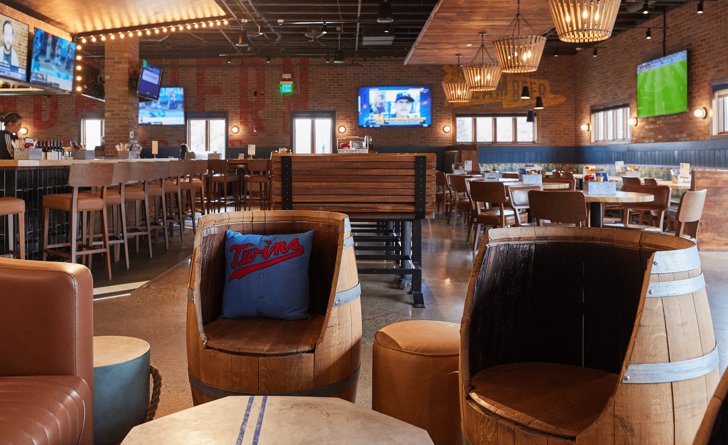
Northern Taphouse coming to Woodbury, MN this Fall
Shea is teaming up with Lincoln Hospitality again, and this time we’re bringing Northern Taphouse to Woodbury in the site of the former Perkins.


