Many brands use a prototype design to roll out consumer-based concepts, one after the other, each a carbon copy of the one before it. It’s a time-tested effective solution for rapid expansion; if the goal is to give the exact same consumer experience, regardless of unique location. For fast food in particular, the strategy of complete consistency works well. For other consumer brands without thousands of locations, brand recognition is also a must, but so is differentiation and community connection.
The sweet spot is to treat each of these unique locations as a collection of restaurants, even sharing the same name. Establish a strong brand experience in each but build in enough flexibility in design to create locations that are unique to their community.
How we create restaurant collections, the new generation of prototypes:
Step 1: Create strong brand touchpoints
Creating a strong brand is first and most important, complete with name, colors, signatures, style and attitude. Is there a sense of humor, a signature color, a swagger? Then, does that brand attitude translate into the space? A large central bar, an open and interactive kitchen, a signature large format statement (like a light fixture), artwork? Those elements should remain in every location because it’s what creates the brand experience. The attitude, style and brand touchpoints in the space is the glue that will hold a collection of restaurants together and is the starting foundation for every new location.
Northern Taphouse
Shea brought the third location of Northern Taphouse to a Plymouth, a Minneapolis suburb, with a goal to create brand touchpoints that could be added to previous locations and used as the basis for their future growth.
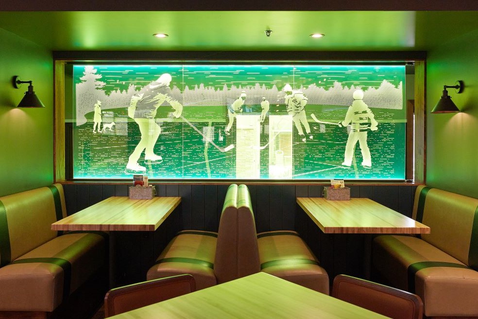
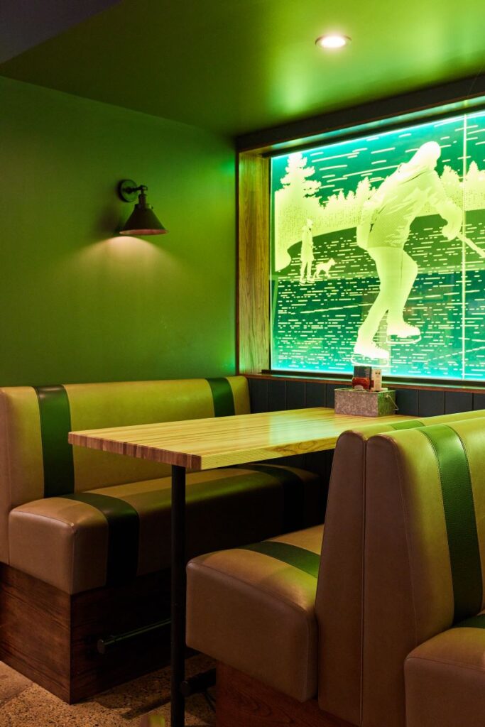
In our partnership with the ownership team, Lincoln Hospitality Group, we established elements and focal points that better differentiated and strengthened their brand and its connection to consumers: playful murals on both the exterior and interior walls, an engaging host stand, and many sporty design elements including custom furniture, photos, décor and a unique acrylic dividing wall depicting a pond hockey scene.
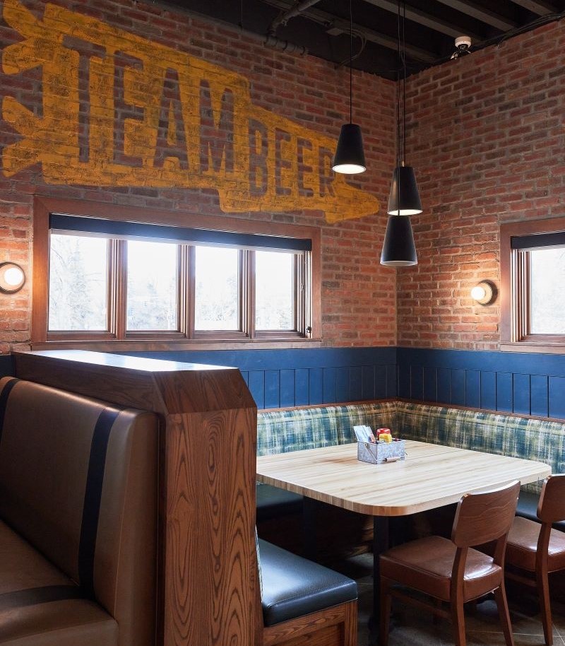
When Lincoln Hospitality was ready to bring the concept to Woodbury, MN, we again partnered to design the new location. Guided by our established touchpoints, we were able to complete the design efficiently and with cost-effective solutions, while still incorporating unique features: a baseball card collage tabletop, graphic track lanes over the concrete floor, and custom pieces. The result is a new experience unique to the Woodbury community that is still easily identifiable as part of the Northern Taphouse collection.
Plymouth
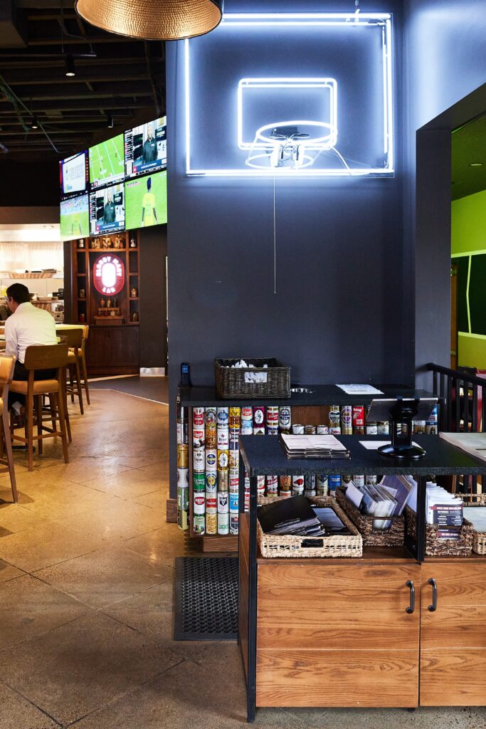
Plymouth
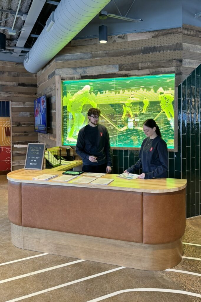
Woodbury
While both the Plymouth and Woodbury location feature an engaging host stand – key to the brand – each have unique interpretations. The Woodbury stand repeats the pond hockey acrylic, also found in Plymouth.
yum! Kitchen + Bakery
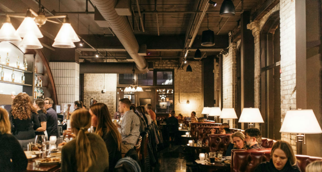
Shea and yum! first teamed up over 17 years ago to design their very first location in St. Louis Park, introducing the brand’s signature bright atmosphere, bold open kitchen, and unique displays showcasing freshly prepared foods and baked goods. Pretty quickly, the kitchen and bakery became well-loved, and our partnership continued with new locations in Minnetonka and St. Paul.
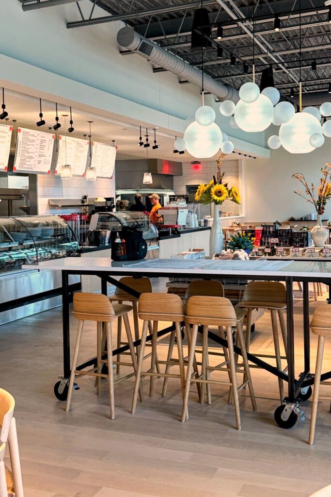
In October 2023 – 17 years after the first location – yum! owners Patti and Robbie Soskin opened their fourth location for the Woodbury community. The biggest location yet, Shea’s design of yum! Woodbury captures the light and bright atmosphere yum! is known for, with their iconic open kitchen, fresh displays, and signature red and light blue brand accents showcasing the staying power of strong brand touchpoints.
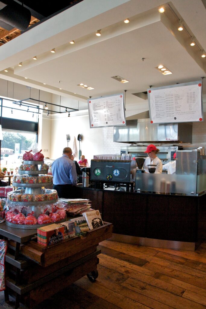
Saint Louis Park
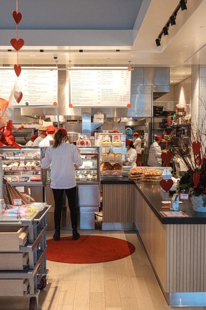
St. Paul
Woodbury
Step 2: Know the growth goal and financial model
Many restaurant owners embark on a new concept journey with a business goal. Will there be five locations or more? Will the concept expand or contract its size and offerings depending on location or real estate, or will the menu and size always remain similar? Will it start as an urban concept that needs translating to suburban markets? Will all locations be in the same region, or will it expand to other states?
Whether or not all those dreams come true for the owner, it’s critical to design even a first location knowing its future opportunities and the ownership goals. Often, the first location has the most uniqueness, but what are the parts of that first location that are vital to future success?
Centro, Vivir and EveryWhen Burger Bar
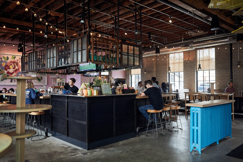
Centro’s inaugural location was in a warehouse-type neighborhood boasting of urban grit. It was a bit younger and hipper, but with the menu and concept from inception, Centro had the magic that would allow it to grow into other city neighborhoods and beyond.
Partnering with owner Jami Olson, we created a brand that communicated itself with a loud, fun attitude: bold signage, pink walls, reclaimed window overbars, complete with a pink bunny as a mascot.
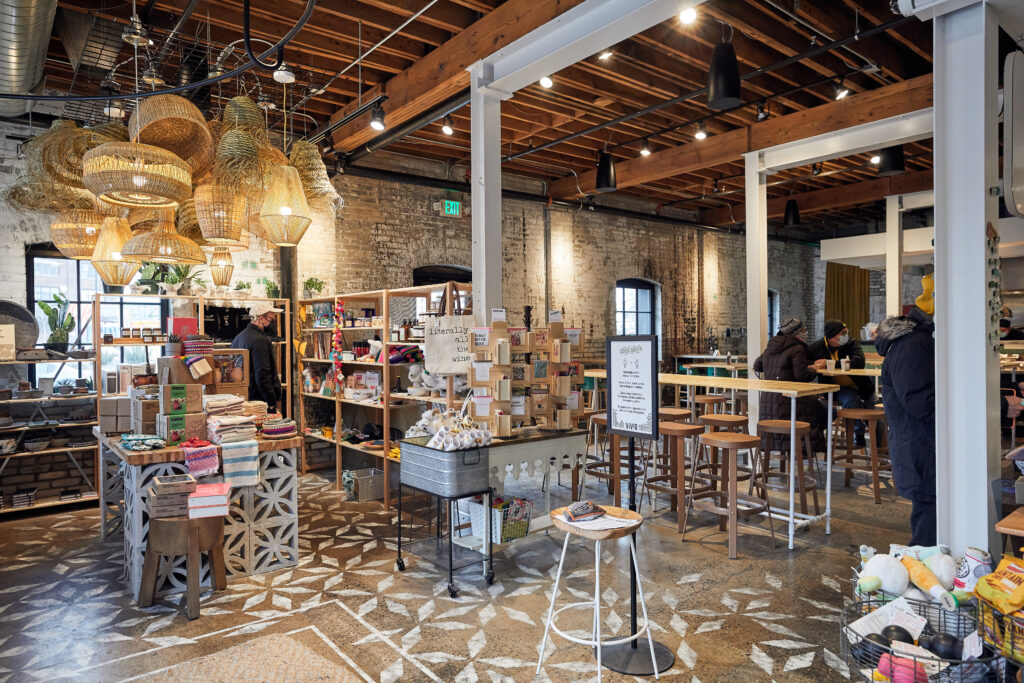
Based on the success of this first Centro in Northeast Minneapolis with its high-energy, fast-casual taco concept, the space next door became a growth opportunity. But, instead of just expanding Centro and changing the compact, energetic vibe, the owner’s goal was to create a complementary but different brand within the collection. So, we introduced the sister concept, Vivir. Vivir, a hybrid Mexican market, café and bakery features touchpoints connecting to the overall Centro brand but is also has its own style.
Centro Northeast
Vivir
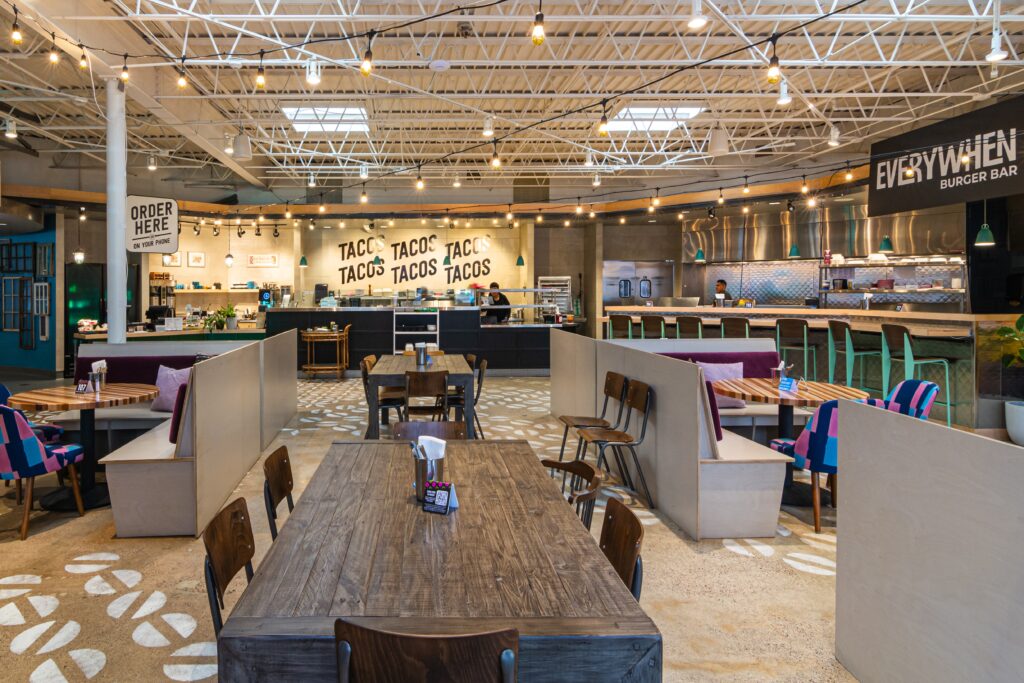
Ready to expand, Centro Restaurant Group team selected a much larger space on Nicollet Avenue for their second location, with a footprint that would allow for even more expansion. So, we introduced EveryWhen Burger Bar. What more could consumers want than two fan favorites – burgers and tacos – under one roof? The space again includes the key Centro touchpoints, complete with a fun attitude, but weaves together the new sister brand of EveryWhen Burger Bar. The unique, food hall-like floor plan allows for individuality of both and seamlessly marries the concepts in the space.
Now the business had strong brands that could co-exist in larger real estate opportunities but were each strong enough to exist alone depending on market opportunities. Centro’s third location in St. Paul’s Highland neighborhood had a market opportunity for Centro and EveryWhen to live together, giving EveryWhen space to grow its brand, while still blending with Centro.
Centro’s fourth location is underway in a suburban market. In this opportunity, the strong Centro brand will be flying solo.
Centro Nicollet
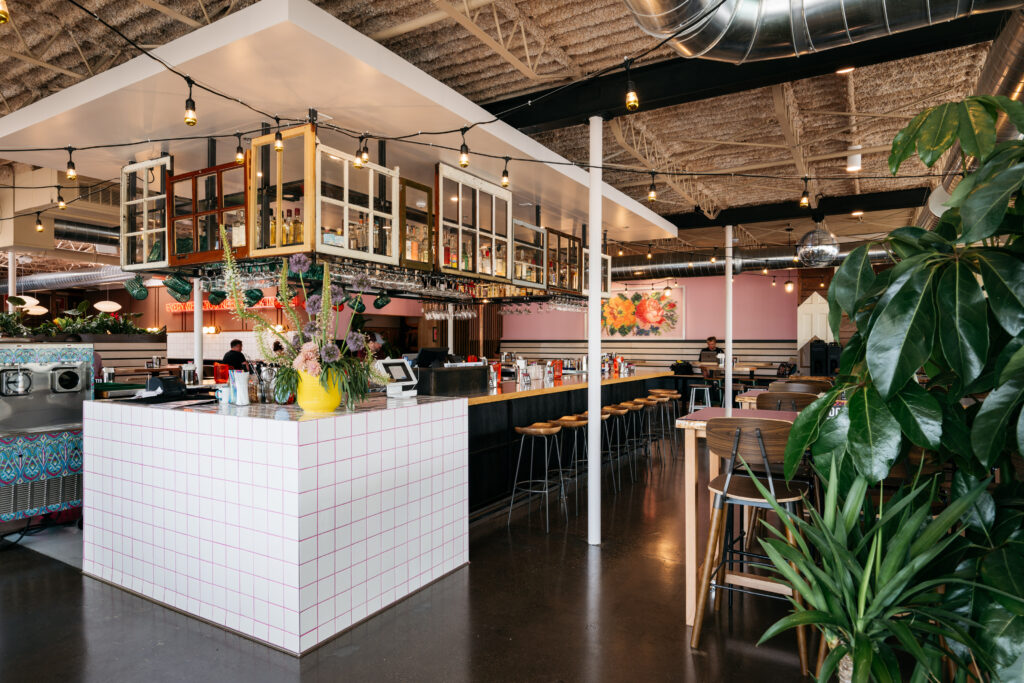
Centro Highland
Step 3: Tailor locations to their market
Even if we’ve previously designed 100 locations of the same concept, the 101st design will still start with the basics: know your audience. Every urban core is not the same and every suburb is not the same. And demographics alone won’t give enough information to know the day-to-day details of how the consumer base behaves.
Our strategic approach includes observing and learning from our neighbors and our surroundings and digging into the nuances of each community including schools, attractions and gathering spaces along with behaviors of community members. All this in addition to discovering what other restaurants and bars are nearby, and what can we offer that’s new and unique? This approach is critical to tailoring each brand appropriately.
Hazelwood Food + Drink
Nova Restaurant Group knew they had a concept with growth potential, so they partnered with Shea to design the foundational location for additional growth. Their team was not looking to grow beyond the Twin Cities market, but it did want to strategically expand throughout the region. Knowing the variances between each market, our team first established the essence of the brand: a bright, airy mainstay with a contemporary, open interior aiming to become a weekly neighborhood hangout. The design was complete with a center bar highlighted by a large custom fixture and direct sightlines into the entire kitchen, including a rotisserie as a focal point. From there, we created personality traits to dial in for each market.
Shea brought the second location of Hazelwood Food + Drink to Bloomington in close proximity to the Mall of America and many hotels. The audience for the location was much wider than just the local neighborhood, challenging us to ensure the local ownership and the restaurant’s from scratch uniqueness comes through, including more showcase of food prep. The brand attitude, which ensures Hazelwood doesn’t feel like a chain, includes custom lights and one-of-a-kind artwork showcasing its personality.
In St. Louis Park, we brought in a few more modern touches and flanked the seating to allow for sightlines of the bar, kitchen or outdoors. From there, we refreshed the original Tonka Bay location to be more connected to the concept created for Bloomington, but with the most relaxed and approachable seating and layout to keep its unique neighborhood vibe. In Woodbury, with a unique building location, we separated the bar and kitchen a bit more to create two distinct energy zones.
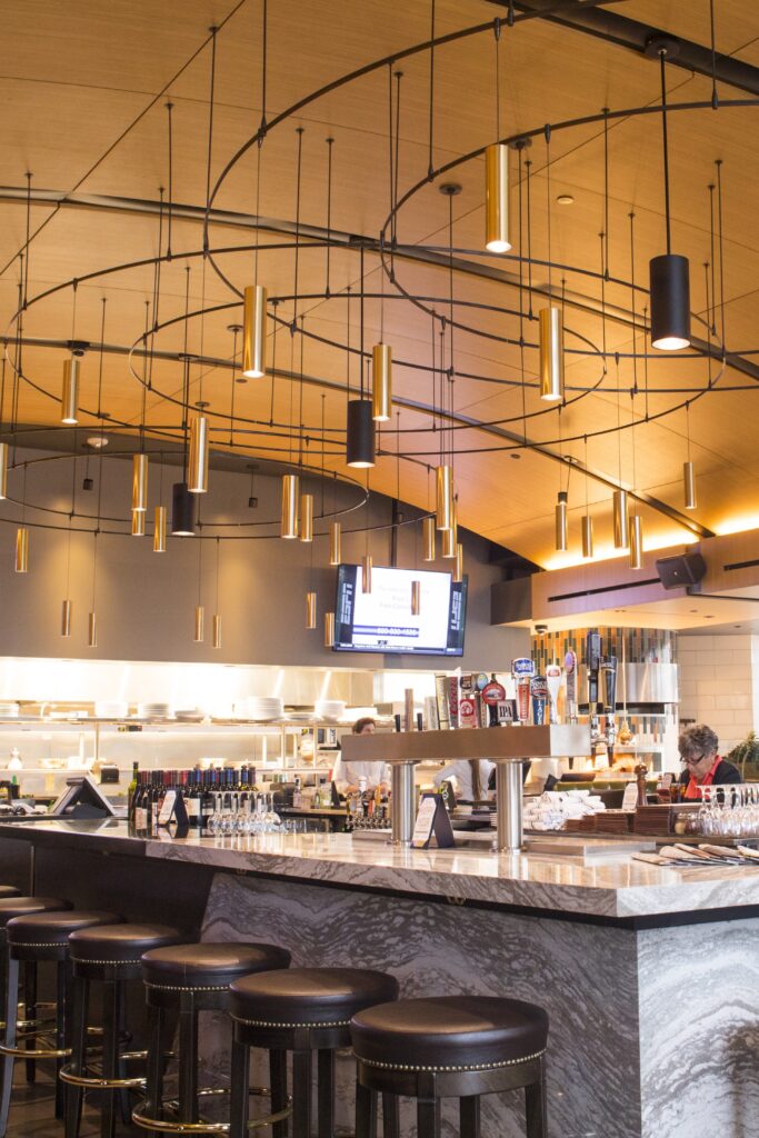
Bloomington
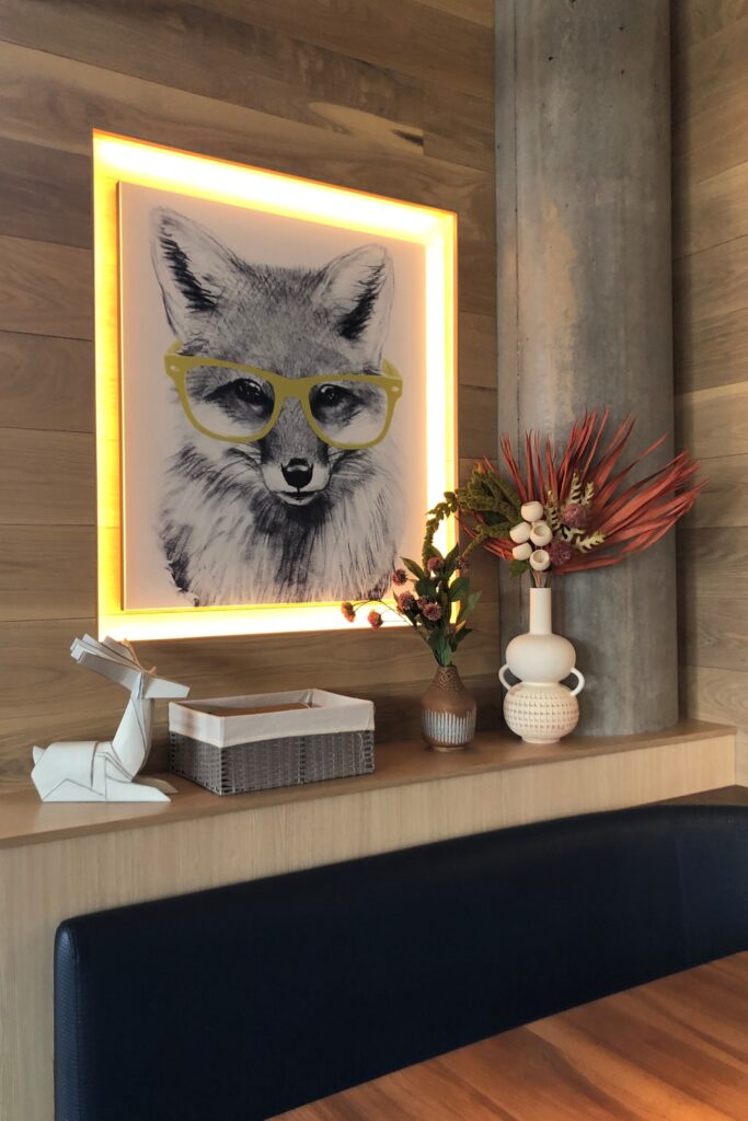
Saint Louis Park
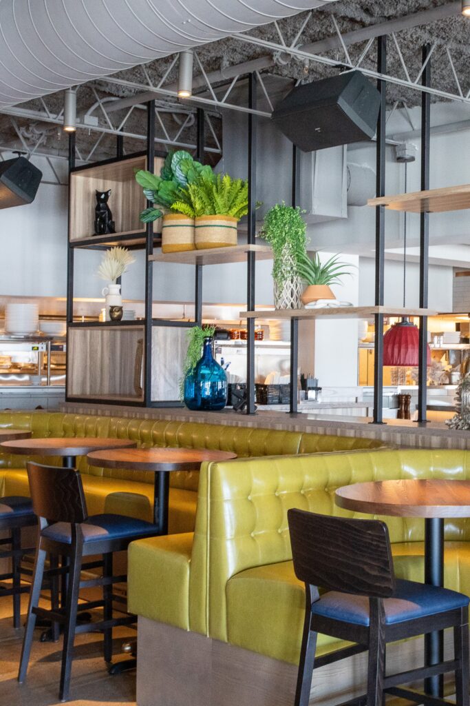
Tonka Bay
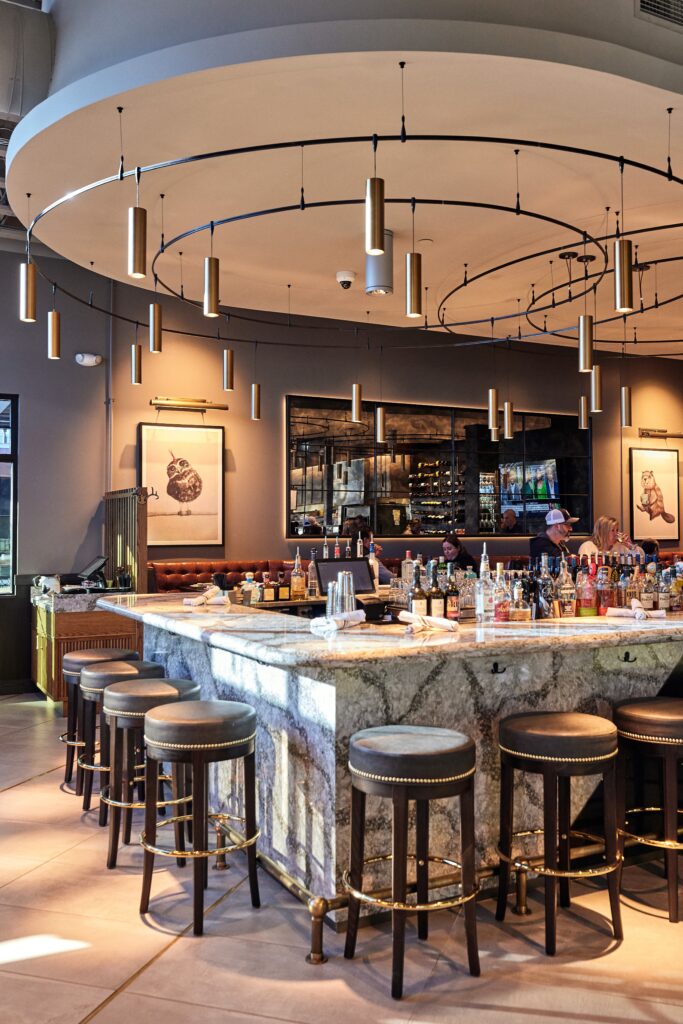
Woodbury
yum! Kitchen + Bakery
As we moved through our partnership with yum! Kitchen + Bakery from St. Louis Park, Minnetonka and St. Paul to Woodbury, each market allowed us different opportunities. The St. Paul location allowed us the unique opportunity to introduce a bar with an overhead wine display, looking directly into their open kitchen. In Woodbury, we were able to expand upon the bar design, creating a unique bar with much more prominence for guests entering the location.
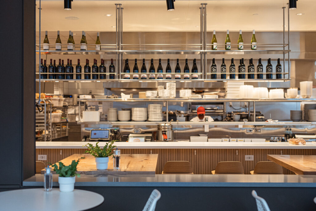
St. Paul
Whether it’s with Northern Taphouse, Centro, Hazelwood, yum! or one of the many other concepts we’ve been a part of – the key to creating a successful multi-unit collection starts with strong, unique elements that work together or can take on different roles depending upon growth opportunities. With established touchpoints and design elements, each brand has created a well-loved, recognizable image for themselves that’s still cost effective to implement in each new space. It’s not reinventing the wheel every time, it’s using pre-established elements in the most successful way.
The flexibility to design around key touchpoints creates unique experiences for brands within each new market they enter, while adapting to innovations within their concepts. And, it keeps us excited about what’s to come.


