At least once a month, we’re asked to discuss the biggest trends in restaurant design. Depending upon the audience, we’ll politely pony up a response (hi, reporters and clients), but in reality, we hate, hate, hate the word “trend.” By definition, trends are fads quickly beat within an inch of their lives by social media.
In the design world, there’s nothing worse than something that immediately becomes dated or—worse yet—something that dates the design. Take a spin around an “Industrial Chic” space and make a bet with someone that it was designed between 2013 and 2015. Pay us a commission.
That’s why we hate, hate, hate trends.
Instead, we’re choosing to break down the so-called soothsayers’ predications and trends with our own opinionated views: What’s here and now and may or may not be sticking around, and how that relates to creating a branded restaurant experience.
-
World domination of veggies.
Vegetables have banded together to form an army, and it’s formidable. As much as we (okay, maybe just me—I think “plant-based protein” is an oxymoron in every sense of the word) roll our eyes at the ever-present V on menus (for vegetarian or vegan), they’re not going away. Labs have even made our “meats” motherless. Sadly, gluten-free also seems to have staying power. What’s life without a baguette?
So why does it matter to us? Menu design. It’s our job to ensure menus don’t look like periodic tables. How do we do it? Simplicity. Simple menu designs fare much better than over-designed menus packed with icons and art and a collection of colors and more than two fonts. Restrain yourself.
And even though it seems like every grape or lettuce leaf needs to have its own ancestry.com report, don’t use the menus to provide painstaking details. Web sites and service staff are much better ways to put your passionate commitment to hyper-locality on display.
-
Flavor is no longer made in the USA.
Essentially all new-to-us foods and flavors are coming from everywhere but the US. (Maybe that’s because we now bottle a delightful blend of ranch dressing + ketchup and call it an innovation.) Culinary inspiration now comes from Africa, the Eastern Mediterranean, Korea, and the Pacific Rim, often boasting the bonus of good gut bacteria. Whatever happened to the days of anticipating eating excessive fried food and drinking too much? Flavors and inspirations will always be cyclical and will come and go. This year’s batch will likely make way for a new crop of flavors.
Do menu flavors affect restaurant design? Yes. It’s our job to create a brand that meets the chef’s level of desired experimentation, whether it’s embracing the flavor of the moment or sticking to the tried and true. The more simple and universal the backdrop and space, the more it allows for evolution, and selling a different dining experience to repeat guests. For example, don’t use heavy fixed Moorish design if the chef’s love for Moroccan flavors will someday surrender to Korean tastes.
-
Fine dining is not dead.
You can find great food now more than ever. Chefs are more talented, more creative, and more understanding that consumers have come to expect the highest-quality execution and sources in their food. But diners want that experience on their own terms, and that indicates not a trend, but a fundamental shift in dining: more casual spaces, more approachability, less stuffiness, better bar dining, and more variety in seating.
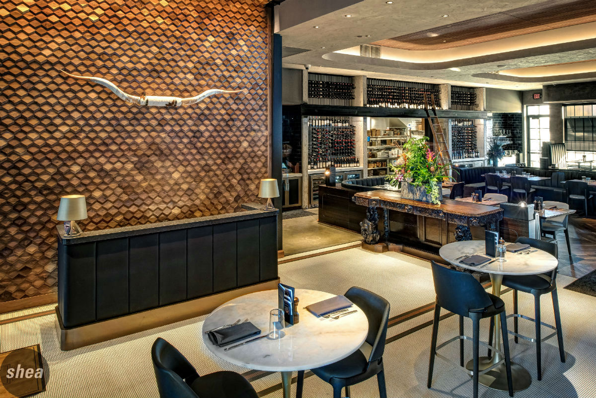
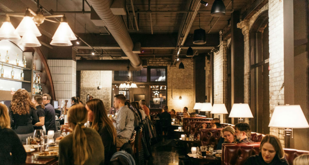
This is the cornerstone of good restaurant design. Create physical focal points first (open kitchens, bars, wine rooms, captain’s station… Whatever fits the brand). Then break up the space into emotional zones, using lighting, textures, a combination of hard and soft surfaces, and subtle cues to indicate different dining experiences throughout a single restaurant. This is where true hospitality-design talent will shine.
-
Isn’t everything environmentally friendly and sustainable?
Like veggies, the new focus on all things environmentally friendly is here to stay. But, oh, how we hope they learn to make a paper straw last at least halfway through a drink before dissolving into mush in your mojito. And maybe take-out or take-home packaging that doesn’t stain your clothes?
How does this cultural shift affect what we do? It is no longer a “suggestion” to use reused, recycled, or recyclable products in all design; it’s the rule. But here’s the thing: You don’t need to vocalize it and overstate it and use it as your marketing message. Just quietly do it. You’re not that special any more.
-
The overcrowding of (not in) food halls.
Yes: They’re the next-generation food courts. And like the food courts of the John Hughes and 90210 era, they’re being overbuilt with intense speed and without enough thought.
Yes: It’s a great concept to get a lot of options and talent under one roof as a destination dining spot.
Yes: It’s even better to use it as an incubator for new or up-and-coming chefs to cut their teeth.
Why will food halls hit a brick wall? Because they’re moving too fast, without solid business and operations plans that will allow them to sustain themselves over the long haul. Who will operate? Who will be in charge of master leases? Who pays what for the space? How much space is shared versus individualized? How much infrastructure is too little and how much is too much?
As designers with a marketing-based ethos, it’s our job to help determine answers to these questions, not just deliver a cool-looking design (which, without proper consideration, will inevitably include an oversized mezzanine that costs too much money and no one uses). We’ll be seeing a lot of turnover and scrambling in the next few years to determine the next step for a lot of the current food hall real estate.
-
How many more breweries and distilleries can there even be?
Simple. This is today’s pub. The new town square. The social gathering place for all ages (people bring their babies. If they brought their babies to an actual bar, they’d be shunned for life. Have you seen Sweet Home Alabama?) Breweries will continue to open, although their pace will slow and we’ll start seeing more distilleries and even urban wineries jump into the game.
Breweries will need to be experiences with the ability to adapt, offering more and different events, pop-ups, entertainment, food options, etc. We create spaces that have a distinct point of differentiation and, thus, a sustainable place in the market. Places that just serve drinks (because they think their beer is just that good) will see the competition increase to the point that evolution will be the key to survival.
-
Restaurants are all getting smaller.
Consumers perceive smaller restaurants to be of higher quality, and that’s been mostly true due to sheer math—kitchens produce for the people who are there. What is also true is that there’s so much competition in most markets that really big spaces (5,000 square feet and more) are tough to fill consistently, and the cost of labor is increasing too much to sustain a staff for a restaurant that large. If large spaces are not properly broken up (with zones and private dining), on a Monday in February they just feel empty. No ones likes an empty restaurant.
Design, real estate, kitchen design, and operations have to be in lock step when selecting a space that makes economic sense with kitchen size, number of seats, and overall rent. Maybe that’s why restaurants are getting smaller—everyone’s getting smarter (although they’re still going into the restaurant business, so who knows).
-
And lastly….
Please stop over using the following solely because you think it’s a great trend to follow:
- Edison bulbs
- Schoolhouse lights
- Stick-and-globe lights
- Floral wallpaper
- Murals
- “Millennial Pink” (or anything labeled by a certain generation—really?)
- Neon
- Brass
Yes, we’ve used all the above, sparingly and appropriately, but singular, overused design details don’t have anything to do with a well-designed restaurant experience. And these are the things that date space the most. Some of these elements can be used thoughtfully, when you’re creating authentic focal points that add to the experience and using great lighting tones to set the stage. And, please—design. Don’t just decorate the space by picking what seems to be cool, of-the-moment stuff.
And if we update this post in 2020, get ready to see that list revised with dark teal at the top…


