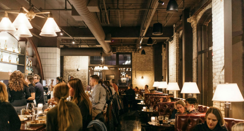
Design is not about trends. Design is not covering everything in Pantone’s Color of the Year for 2020 (it’s Classic Blue, by the way) or knowing whether metallics are still in vogue. It’s not even about the finishes you choose, or those really cool chairs that you use to fill the space.
In the real estate market, design can be an exceptional business tool.
The design challenges we face in that market today have completely evolved. Now, we have a lot of big, vacant spaces to fill with unique venues and ideas—but at the same time, we have a lot of aging spaces and concepts across the board, from office tower common areas to country clubs. And many people are eager to look for the latest trends as solutions to all of those challenges: How many of us are sick of hearing about co-working spaces or food halls as a quick fix?
That’s where strategic design comes in as an essential business tool. It’s a focused, big-picture look at the entire opportunity. More importantly, it’s always putting yourself in the shoes of the target audience.
 Assess the Basics
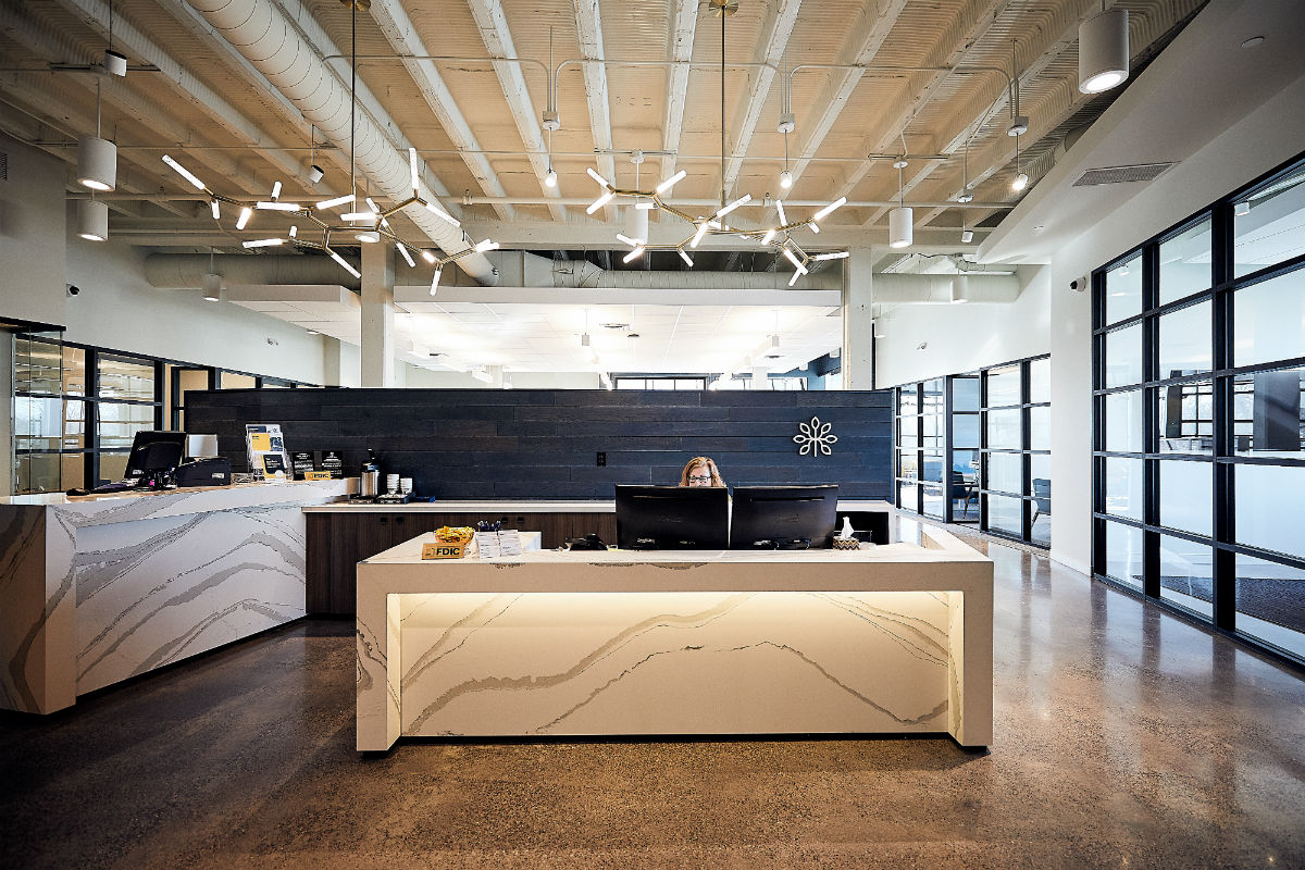
When you’re assessing a space and opportunity, the first and most critical thing to do is to walk through the entire space from beginning to end, whether it’s retail, restaurant or office. Where do you park? How do you approach? What is the first impression? What about the entrance? Once inside, where does your eye go first? Is there a landing zone where people can adjust and get comfortable in the space?
And it’s not just about what it looks like; it’s about how the space makes you feel and what stands out to each of your senses. Is it dirty; does everything function; is it well maintained? Walk in like the target audience and walk through the entire experience, paying attention to every detail so that you can use that assessment as your foundation.
 Functionality is Key
Eye candy is easy. There’s never a problem picking a wow-factor light fixture, notable furniture, or artwork that becomes a talking point. It’s easy to create a pretty rendering to win a project.
What isn’t easy is understanding spatial relationships and functionality. What looks good on a rendering may not work in real life, and understanding that is key to successful space design.
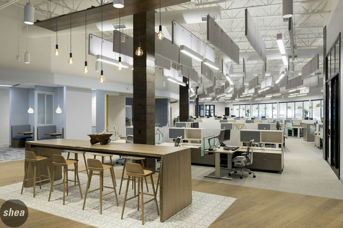
 Especially when you’re dealing with big spaces, it’s critical to break them into smaller zones. In each of those smaller areas, it’s important to strategically answer how it will be used. Not how you want to force people to use it, but how it will actually work. Equally important is knowing how they’ll all tie together.
And within those spaces, how does the space function? Does it need to be easy to maneuver around? Does it need to be ultra-durable? Is the lighting lower or brighter in this area? Is it easy to get in and out of the space? If it’s furniture, how does it sit, and how will it hold up? Most people tend to focus only on how furniture and fixtures look, but it can be guaranteed that they’ll start to notice function if they’re tripping over curling corners on that vintage rug or feverishly trying to patch tears in booth upholstery that wasn’t made for a high-traffic seat.
It’s really easy to get sucked into the pretty big-picture overview, but the devil is in every little detail.
Lighting Can Be a Killer
Lighting can destroy the best spaces, and lighting can also save an experience.
Sound like hyperbole? Not really. Lighting grows more and more complicated every day, mostly due to LED lights. They’re efficient and last forever, but they can be horrible in a space if not used correctly. With lighting, it’s about creating layers. The first rule of thumb is to light objects, not people. Next is to ensure you have the right zones of light with the right dimming systems.
Then it’s about picking the right temperature of lights, and balancing workhorse lights with decorative fixtures. It might cause a headache for contractors and electrical engineers, but choosing the right lighting is truly key to creating the right experience.
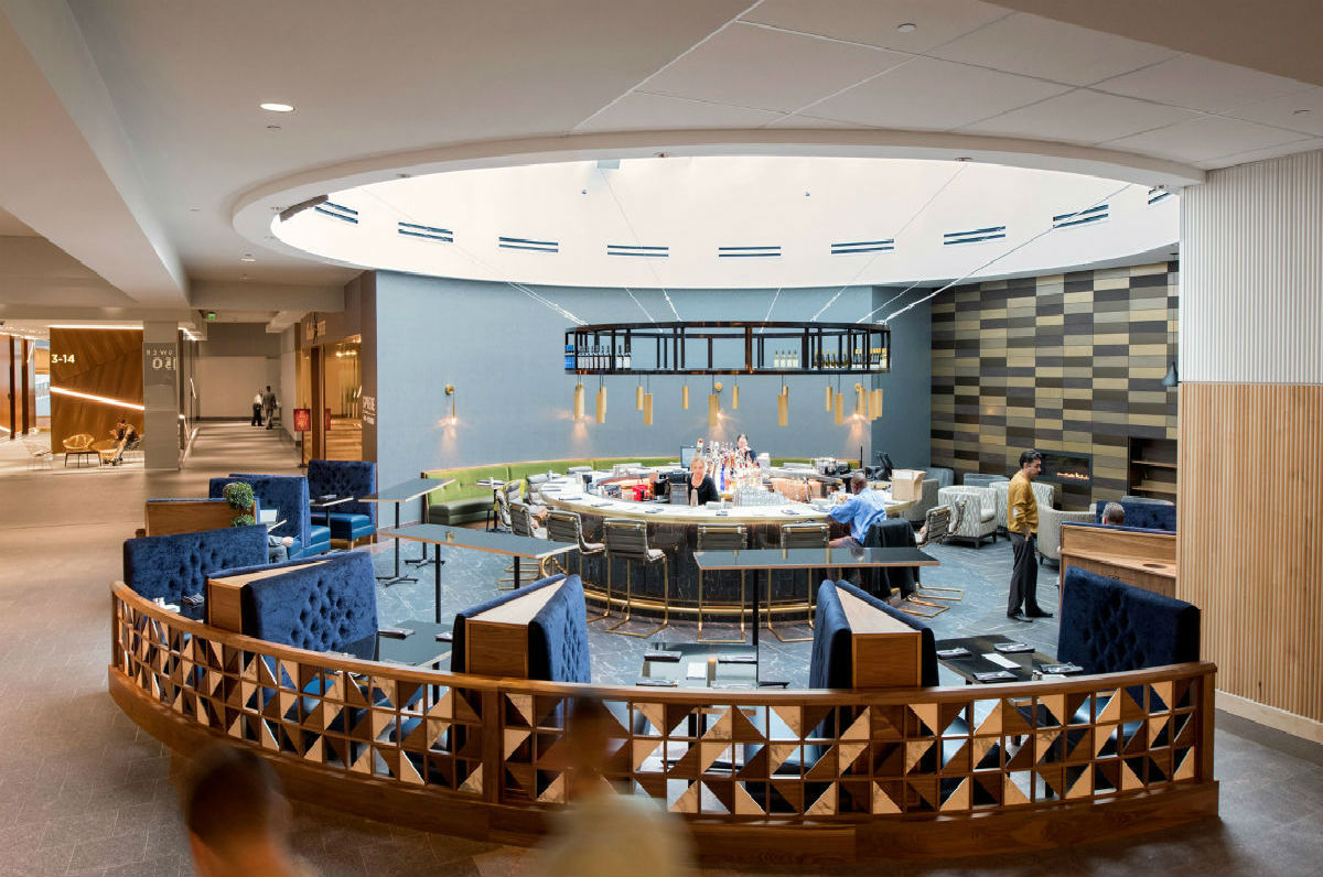 Don’t Just Fill Space; Create Energy
Good design is all about cross purposing and creating energy zones—and this is where hospitality, workplace, and retail design all come together.
 No space is “just” one thing anymore. Retail stores are no longer just about selling things. Offices are not just places where you punch in and out on a regular schedule. And hotels and restaurants are not just about rooms and food; they need to offer places to work and shop as well.
When we’re faced with a large office common area, we challenge ourselves to create spaces that will inspire people to use them in different ways, while also bringing in the food options and amenities that workers crave today, like we did at Fifth Street Towers and 100 Washington in Minneapolis. Where and how does it make sense to put meeting or gathering spaces? Where and how can be offer hospitality vibes and food on a higher level?
What about entertainment? More and more, we’re looking to get creative with how we look at spaces, employing everything from hotel-like comforts to fun programming ideas (these range from trivia areas to golf simulators—whatever’s right for that audience). Employees today are looking more than ever for spaces to engage and interact, but still need them to be balanced with heads-down quiet areas.
Country clubs are another great example of places looking to create this all-in-one experience. With clubs around the country approaching Shea with worries about declining membership and future generations, we’re looking at how those people are spending their free time. What do nights and weekends look like? Where are they going, and what are they doing? How can we bring that all under one roof, creating compelling areas that appeal to everyone, from families to couples and friends having cocktails? And, most important, it has to be done in a way that puts it on par or higher than the restaurant and hotel spaces that are attracting them now—all while making sure the space doesn’t look like their parents’ stuffy club.
When a giant retail environment like Macy’s is looking to reinvent itself, they’re looking to draw people in and get them to stay longer. We look to workplace and food for design influence that will achieve these goals.
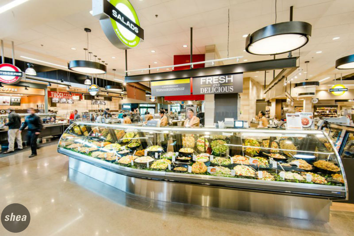 With every passing decade, Americans spend less on things and more on services and experiences. But they still need those things, so the trick is to give them an experience. With today’s mobile workforce, offering places to take a call or spend an hour working is essential—and it can be needed in the unlikeliest of places. The experience, the amenities—these are the things that will help bricks-and-mortar retail stay strong even as online shopping continues to be a huge factor in today’s lifestyle.
And then there’s food. Food is still a critical amenity to offer in every type of real estate, but it has to be restaurant-quality to make a strong impact. Grocery stores are more competitive all the time—it’s not about where you’re buying your Ruffles, really, it’s about the experience people are having while they buy them. Are there ready-to-eat spots or coffee shops within the store where they can stop? Are the aisles wide? Is navigation simple?
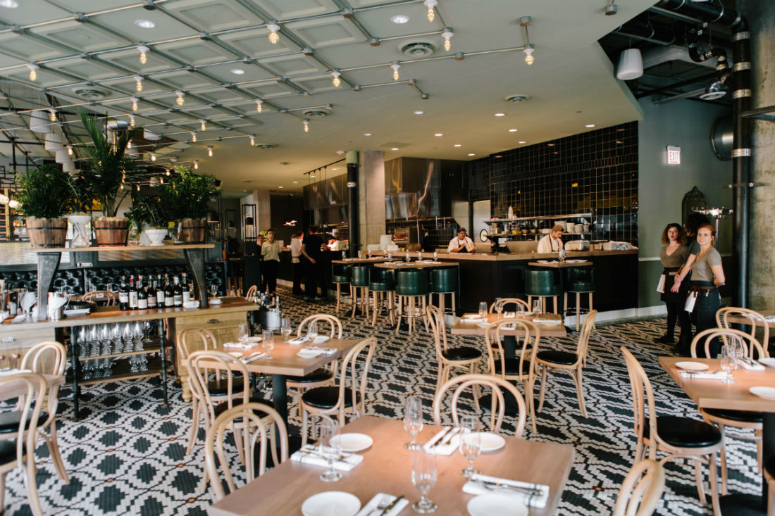
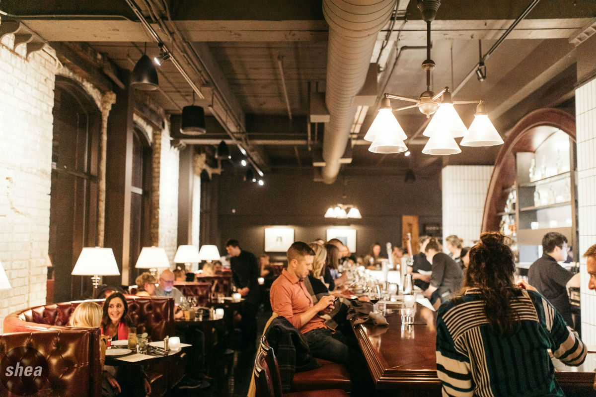 Lastly, restaurants—which can be the most challenging of all. New restaurants are getting smaller, adding more culinary theater, and increasing bar seating, even in fine dining arenas. So when we’re faced with repurposing or repositioning a large restaurant space, we use the same approach: Break up the space into zones, maybe even into more than one food offering (but, no, creating yet another food hall is not necessarily the answer). Provide a lot of energy and interaction in some, and more intimacy in others. And, to beat a dead horse here, always err on the side of functionality: Put power ports and purse and coat hooks everywhere. It’s the quickest way to keep people happy.
Creating strategic design is about balancing what people want and need in the everyday with what’s aspirational. Using functionality as your guidepost, design can be a powerful tool that keeps existing tenants, attracts new tenants, and draws people in to spaces that don’t just look good in a picture, but caters to what they’re looking for.


