How do you get a group of women to make their girls’ night out reservation at a steakhouse? Or get a guy into a full-fledged salon for a haircut? At Shea, we make it our business to invite, engage, and deliver—and that means inviting, engaging, and delivering to everyone who wants to take part in any space, challenging stereotypes along the way.
Since we go beyond creating spaces at Shea to create full, cohesive experiences, every touchpoint needs to be inclusive. So we make our spaces welcoming for all: steakhouses that don’t feel like boys’ clubs and salons that don’t feel too feminine or pretentious. Our recent work with the Stoney River collection of steakhouses and longtime partnership with Gent Cuts & Grooming exemplify how we work with clients to craft experiences that invite rather than exclude.
Stoney River
Stoney River, a collection of 10 steakhouse-style restaurants around the country, was purchased by J. Alexander’s in 2012 and in need of a prototype design and brand personality refresh to go along with the new ownership. The Stoney River brand was heavily inspired by nature and lodges, and a traditional, stone-and-fireplace-heavy design aesthetic had taken that point as far as it could. Some recently remodeled locations had a stronger focus on quality materials and sleeker finishes, but there was still room to build upon the brand’s point of differentiation to create more overall energy in the space. Furthermore, even the renovated locations seemed dark, and overall, the brand needed to take a softer, more universally appealing approach to design.
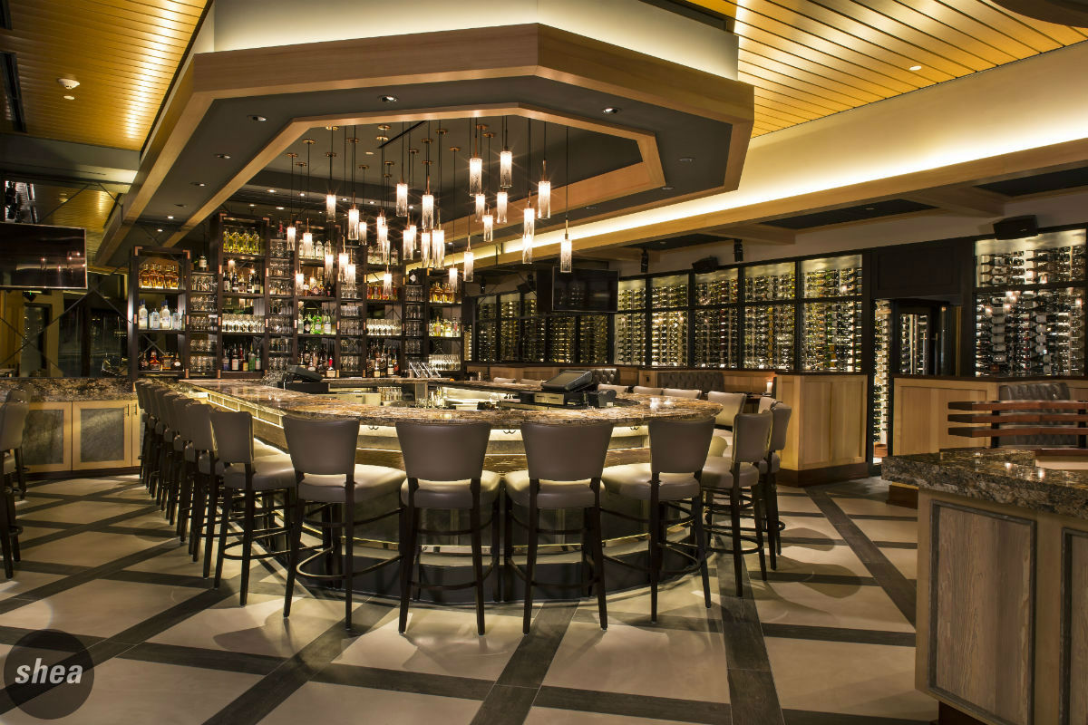
Shea’s solution was to take a more contemporary, female-slanted approach to the mountain-lodge vibe already established by the brand, moving it into the next generation to contrast clean simplicity with natural, mountain-inspired elements. We wanted to create the ultimate 21st-century steakhouse using sleek natural materials such as quartz and limestone, but to give it a light, clean touch with more curves throughout.
To implement our plan, we needed to determine what touchpoints and focal elements we could bring into the space that would create an experience that would have more finesse without alienating the core Stoney River audience. Levels of light that would paint the space more gently and the use of softer colors and fabrics topped the list. Mixing traditional steakhouse-inspired elements, such as leather, with lighter touches like mirrors and millwork would also downscale the traditional steakhouse masculinity. Adding more curves in design throughout the space—rounded booths, a horseshoe-shaped bar with curved edges—also brought in softness.
The newly built Germantown, TN location embodies exactly the fresh, clean direction that Stoney River wanted to move towards. Pale leathers and soft, rounded booths fit in among copper chandeliers and floors with contrasting patterns. As more existing Stoney Rivers adopt a similar aesthetic and new restaurants crop up around the country, Shea’s less-aggressive steakhouse design is sure to make the brand one known for its female-friendliness.
Gent
Shea’s partnership with Gent began in 2011, when we were approached by clients looking to build a barber shop for men that would create its own niche, between high-end salons and low-end service providers. They were looking to build a completely unique space, one that combined the classic, old-world comforts of a barbershop with future-forward amenities in the upscale Grand Avenue neighborhood of St. Paul.
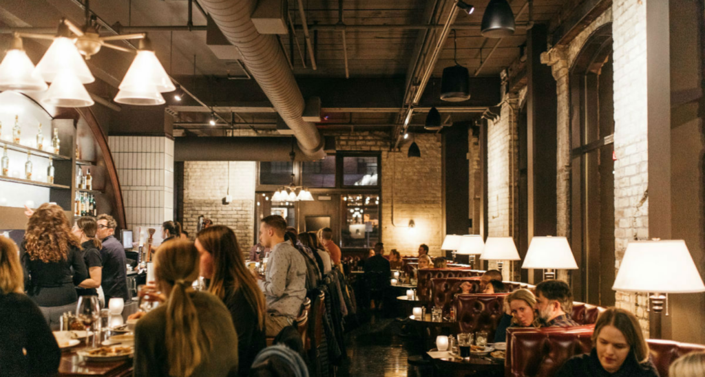
We saw no reason that women should have all the luxuries when it comes to personal care and pampering, so we partnered with the clients to create a design that would appeal to the everyman—luxurious without seeming overdone, and masculine but stopping short of macho. We achieved the aesthetic through the use of traditionally masculine materials and shapes—dark leather, club chairs, and mahogany millwork all helped to create the desired lounge-like effect. The authentic, rich materials convey the feeling of casual luxury. The resulting space plays with traditional gender roles and gives a safe place for guys to get groomed, and a great place for their partners to be entertained while waiting.
The concept proved to have legs, and Gent expanded to two more locations: one in the Minneapolis skyway, and one in Edina. The Boyles also launched a unisex hair product line in 2012 to be sold not only at Gent but in other, more traditionally female-centric salons as well. By working with Gent to create a name, logo, and identity system for the family of products, Shea had the opportunity to present its branding and packaging capabilities in a new medium.
We created a full brand identity for the line, from name (“Pomp,” as a nod to the pompadour style popular for both men and women in the past) to packaging (sleek, unfussy, and clean) to labeling (like Gent, drawing inspiration from English design). The finished products are perfectly in keeping with the Gent aesthetic: sleek and chic enough to look at home in anyone’s medicine cabinet or shower, regardless of gender.


