Gone are the days of dingy dining rooms and standardized décor. Shea’s approach has always been to create hotel restaurants that are more than a convenient place to grab a bite while traveling—eating there should be a true experience to be savored. Shea creates hotel restaurants all over the country that combine creative food with great design to add an extra element of luxurious fun to traveling. Even moreso, they’re destination spots for locals, too.
Mercy at Le Meridien Chambers
Mercy isn’t a hotel restaurant that hides in the shadows, tucked inside and away in a room off of the lobby. It announces its presence at Le Meridien Chambers Hotel in Minneapolis with aplomb, with boldly patterned navy-and-yellow doors and a turquoise sign displaying the Mercy moniker proudly on one of downtown’s busiest corners. And the Shea design doesn’t get any more timid once you step inside.
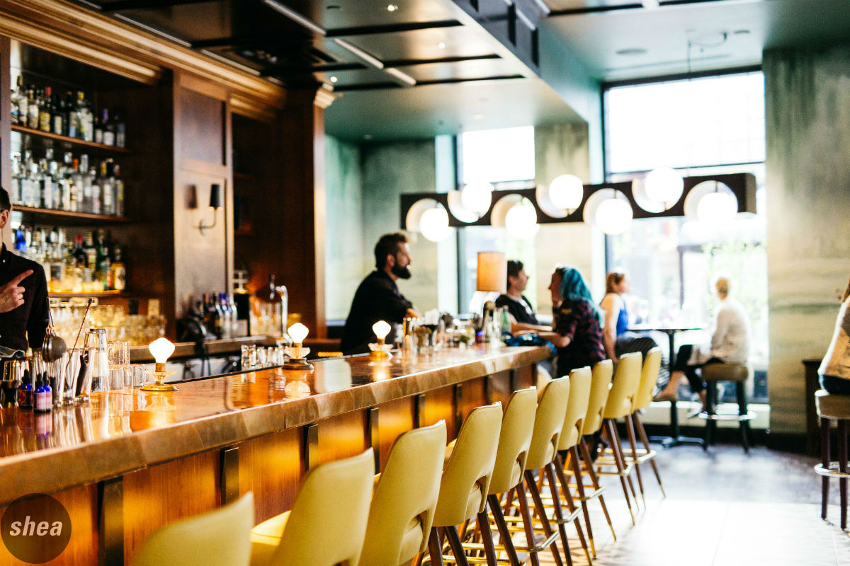
The space mixes elements of the outdoors with modernity, an aesthetic in keeping with chef/owner Mike Rakun’s comfortable-yet-creative style. Several modern custom light fixtures featuring globe pendants set in sleek metal highlight the dark-wood tables and booths upholstered in locally made Faribault blankets. In the bar area, patterned tile makes a definite statement against bright yellow midcentury-inspired stools and the glowing backbar.
At center stage in the restaurant is the oyster bar, covered in rich blue tile. Energy flows from the cooks cracking open shells and pulling dishes out of the wood-burning oven, all on display to diners around the room. Those blue tones are echoed in a wall-size mural evoking tones of the ocean, while other walls are covered in deep gray stone.
The design gets even more luxe in the lower level, where a library lounge welcomes guests with a bar and several cozy nooks to sink into. Shea combined soft, plush finishes with structured leather, and bold patterns and hand-knotted rugs emphasize the space’s welcoming nature—along with the bookshelf-lined walls and vast wine collection.
The attention to detail doesn’t stop at Mercy’s doors; its patio (surrounded by the hotel on three sides and ensconced in climbing ivy) is a hidden jewel downtown. Boasting a wood-covered full-island bar, the patio also features plenty of space for lounging and seating for diners, as well as an outdoor firepit to keep guests warm long into the night. It’s the perfect space for socializing, always bright and energetic as it absorbs energy from the city just steps outside the gates.
The Circular at the Hotel Hershey
Hershey’s historic Circular Dining Room was Hotel Hershey’s flagship restaurant, representing an iconic American dining experience from years past. When Shea began working with Hershey to evaluate its future, it became clear that the restaurant didn’t just need design modifications, it needed a brand overhaul—one that would allow for that same sense of Americana but in a completely reimagined way, and would bring the dining room back to destination status for both resort guests and locals.
Shea set out to revamp the brand and restaurant as an approachable, authentic, stylish place to celebrate everyday special occasions, but moreover, as a true showpiece for Hershey. We drew inspiration from the restaurant’s moniker to create a circular, central bar in the dining room that would be the dramatic statement needed in the space, while removing the restaurant’s past unapproachable formality.
The focus was on energizing the dining room, keeping its scale but creating more intimate dining zones with dividers and lighting to break up the space. Shea’s approach was to maintain the grandeur of the room, but with a focus on impactful elements that create a great guest experience: windows to the outside gardens, the culinary theater of a bar, an open wine room to show off the restaurant’s vast collection, and a dessert station that would promote interaction and celebrate what Hershey is all about—celebrating the decadence of chocolate.
The legacy of the Circular at Hotel Hershey was restored with its 2013 remodel, maintaining its status as an iconic American restaurant but bringing new energy to the space. This increased approachability ensures that the Circular will be a feather in Hershey’s cap for future generations.
Patina 250 at the Westin Buffalo
Delaware North needed an incredible front door when they built their new headquarters on Delaware Avenue in downtown Buffalo, which would house their offices as well as a Westin hotel—one that would give a “wow” first impression. We worked with Patina Restaurant Group, Delaware North’s food-and-beverage partner, to create a restaurant concept that would stand apart from the rest of the Queen City’s dining scene. The result was approachable, aspirational design in an almost residential style that would draw hotel guests, Delaware North employees, and locals alike.
Our goal was to create a restaurant that would blend modernity and opulence to really up the hotel-dining game—not just in Buffalo, but nationally. We began at the heart of the restaurant, in the open kitchen, where life and elements of food theater reach every different dining zone in the restaurant. A horseshoe-shaped marble bar with a dramatic overhead lighting fixture makes a strong design statement whether guests enter from the street or the hotel, and soft lounge seating and tables bridge the gap into the main dining room. There’s a space for every occasion, from the enclosed booths ideal for intimate evenings out, to the low lounge tables perfect for post-work drinks, to a private dining room lined with wine bottles for corporate dinners and special occasions.
We also wanted to celebrate the history and essence of Buffalo as a burgeoning metropolis. We used rich materials and furnishings to give the space an upscale, cosmopolitan feel, bringing a sense of sleek modernity to the restaurant as a whole. And the design incorporates plenty of local flair, featuring unique cast-plaster work and custom pieces created by a collection of Buffalo artists, a reclaimed millstone that once ground grain at one of the region’s historic mills, and a coffered ceiling reminiscent of the one crowning Buffalo City Hall—all tributes to the town’s ongoing Renaissance.
Fire & Grain at Hershey Lodge
Being able to satisfy guests for all dayparts is key to a hotel restaurant’s business model. As Hershey’s primary food and beverage design partner, Shea also evaluated Lebbie Lebkicher’s, the main-lobby restaurant at the Hershey Lodge resort that was being underutilized as a primary restaurant space. The large hotel hosts a huge variety of guests each year, from convention guests and business travelers to families, and while it was beloved for its breakfasts, the Lebbie’s concept didn’t bring anything new to visitors—or to locals.
Shea proposed a completely new brand and space—a diner-meets-pub concept that we nicknamed “From Breakfast to Beer” to bring the dated restaurant into its next phase. Dubbed Fire & Grain, it’s a contemporary American restaurant putting twists on familiar comfort foods all day long, transforming itself from a breakfast joint in the morning to a lively bar come happy hour and nighttime.
A welcoming entrance is the first step to beckoning diners to any restaurant, and when the restaurant is in a hotel lobby, that entryway needs to serve as a bridge between the two spaces. Shea also introduced some elements of the restaurant’s interior to its entrance, including wood paneling and doorways. Moving the host stand outside of Fire & Grain draws attention to the space and serves as a hospitality touchpoint, while hip new signage introduces the brand and becomes a lobby focal point.
Sliding doors over the backbar turned out to be the key to the new design—during breakfast, bottles are hidden out of sight, covered by writeable mirrored sliding doors appealing to families, who have ample seating opportunities in zones set farther back from the bar. But come happy hour, the backbar is on full display for locals and business travelers. And all day long, guests have the opportunity to gather at the huge curved bar to nosh on familiar favorites.
At the heart of the design is the restaurant’s open kitchen, newly expanded into the dining space to increase capacity and bring a fresh element of culinary theater. The new bar extends to the kitchen, a great focal point for the space and letting the warmth and energy spill from the cooking area into the rest of the space, an element echoed by a showstopping stone-set fireplace.


