There’s nothing more disheartening than seeing a good concept that should be thriving—walking into a restaurant that offers a good menu but a tired, stale overall experience. At Shea, we excel at breathing new life into existing concepts and aligning physical space and desired brand. Any restaurant space needs basic annual maintenance to take care of wear, tear, and stains, but in order to send a message to your guests that you’re still paying attention, it’s important to do a deeper refresh every five to seven years. Shea’s success is dependent on that of our clients, and we take pride in creating a return on their investment that makes a real impact on the business. Reimagining a space is proven to bring unforeseen business results—just take a look at how it impacted the projects below.
The Veranda at The St. James Hotel
Shea has partnered with the team at the historic St. James Hotel in Red Wing for a repositioning and remodeling that will set the hotel up for the kind of future success they’ve had in the past. Our strategic planning includes reconceptualization of everything from restaurants and common spaces to guest rooms to put it back on the competitive boutique-hotel map. Our first project was to reposition the patio at the Veranda restaurant, a space that should have been the go-to spot in town thanks to its space and views.
Our team completely reimagined what the terrace could be, clearing out the dated seating and umbrellas to construct an entirely new environment. The Veranda now boasts different dining zones, including tables set in the sunshine, loungey seating spots, and two pergolas. A showstopping outdoor bar extending from the Veranda restaurant brings a chic, day-to-night element, and modern umbrellas provide comfort and shade when the sun is high. In the lounge-seating areas, firepits keep guests warm on chilly evenings, and end tables serve as the perfect cocktail perches. Bold, printed furnishings throughout and lush landscaping add a much-needed dose of color, creating a little piece of paradise in Red Wing.
Sales on the Veranda patio shot through the roof the summer after the renovation, bringing its best-ever revenue months. The interior restaurant is currently under construction, slated for a May 2020 opening, and is sure to make it the entire restaurant’s hottest summer ever.
Naples Ristorante e Bar
The Downtown Disney district in Anaheim is a magical place, but Naples Ristorante e Bar was in need of a fairy godmother. With its cartoony façade and dated interiors, a refresh was in order keep up with Disney’s ever-evolving, more-sophisticated-than-ever crowds. Shea partnered with Patina Restaurant Group to give new life to the Naples concept so it could continue to showcase the cooking of southern Italy for years to come.
From top to bottom, front to back, everything about Naples feels fresh, with a design that brings a modernity and sophistication but doesn’t detract from the concept’s fun roots. A standout façade lets passerby peek into the glowing restaurant, and bright teal umbrellas are almost as attention-grabbing as the shimmering new outdoor bar that takes advantage of the California weather.
Inside the restaurant, artful touches give diners multiple focal points so that they’re always coming across a surprise—a fire-themed glass tile mosaic above crackling pizza ovens, chandeliers inspired by pasta shapes, and an open kitchen where guests can take part in the pizza-tossing, pasta-making culinary theater. Upstairs, clouds of lights evoke a starry sky in an airy dining room, and a walk-out terrace features frescoes and fountains to put diners in the heart of Italia—with sprawling views of Downtown Disney at their feet.
At Naples, the first year of post-construction business resulted in a 16.5% sales increase over the pre-construction numbers. This is not only a dramatic increase for Naples, but is massive growth within the Downtown Disney family of restaurants.
Interlachen Country Club
Shea was tapped by the board at the historic, acclaimed Interlachen Country Club to provide a completely new strategy and design direction for the entire club, including its restaurants and common areas, repositioning it as one of the country’s most forward-thinking clubs. The dining spaces in the 110-year-old main clubhouse were first on the agenda, needing a look that would provide a modern sensibility while still appealing to traditional tastes. The idea was to embrace the “restaurant” and bar dining aspect more than the “dining room” of the typical country club.
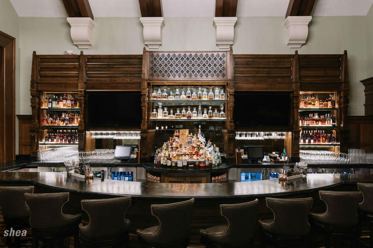
Careful selection of materials and finishes was key to this project, bringing the historic clubhouse into the 2020s while maintaining its grand feel and incorporating personal touches. The Bobby Jones Pub & Grille offers a twist on tradition in a less formal setting. The granite-topped bar features an Interlachen logo inlay, and a well-lit backbar shows off tiered shelves of high-end liquor and antique decanters. In the pub area, lounge seating and dining tables give the space a warm, intimate feel, while a herringbone-patterned hardwood floor, large curved booths, and nailhead-trimmed furniture make for a contemporary take on classic country-club finishes.
Separated from the Pub by a glass jewelbox wine room housing the club’s vast collection of bottles on custom-designed shelves, the Fairway Dining Room features expansive glass windows that give a view of the world-renowned golf course. A large, richly hued rug grounds the space, which features dark exposed rafters that maintain the clubhouse’s classic Tudor feel. Custom-branded tables and sleek leather chairs make up the center of the room, while booth-style seating (practically unheard of in most traditional country clubs) spans the perimeter. A captain’s table in the center of the dining room gives staff a chic spot to stay organized, and a two-way fireplace with a copper hood is the showpiece of the space.
It’s a far cry from the dark dining spaces that served Interlachen for decades, and membership has taken notice. In the five months after the completed renovation of the Fairway Dining Room and Bobby Jones Pub, Interlachen saw a 33-44% growth in food and beverage over previous years—huge for restaurants already pulling their guests from a limited pool. The entire repositioning has also had a hand in increased membership interest, with a waiting list growing at a rate that hasn’t been seen in years.
Fifth Street Towers
In the ferocious competition between best-in-class office buildings to acquire new tenants, having an outdated space is simply not an option. Zeller Realty Group and Transwestern partnered with Shea on a multimillion-dollar project to reposition the iconic Fifth Street Towers, making the 1980s building a player on the skyway scene again.
The twin buildings had begun to show their age, and it was no small task for Shea to reimagine their potential. The first order of business was to renovate the skyway level, where most tenants and visitors enter the building. Shea gave it a warm, boutique-hotel vibe with modernized entrances and elevator banks, a lounge atmosphere, and Sphere Kitchen + Bar, a rotunda bar smack in the center of the skyway—the only of its kind in the city. The new first-floor entry replaced red marble and brass railings with sleek wood paneling extending to the second story (and punctuated by ever-changing media panels), linear lights, and a clean new logo.
The third floor has been transformed into a tenant-centric space, with amenities centralized rather than scattered throughout the building, that combines the vibes from best-in-class coworking spaces with the comfort and vitality of next-generation hotel lobbies. It boasts a new fitness center and conference rooms, as well as a spacious lounge and wellness area. Tenants can use the space for informal meetings or as a third-workspace area, but it’s also a place to meet friends for lunch, catch up on e-mail, or stop for a breath in the middle of a busy day. Just steps outside the lounge is the amenity center’s showpiece: a new landscaped rooftop featuring comfortable furniture, a pergola, firepits, and a spectacular view of the city skyline. It’s exactly the draw that Fifth Street Towers needs to bring tenants together and remain at the top of the office-complex game.
For prospective tenants, the lounge, rooftop, and new first-floor bike hub are huge incentives, and are standout spaces on tours. In just a few months after Shea’s completed renovation, Fifth Street Towers increased their leased space from 55% to 85%, a massive leap in a market saturated with other office buildings. Furthermore, the building’s owners noted that the number of companies turning to Fifth Street Towers as a top option for office space has increased dramatically since the space’s reinvention.


