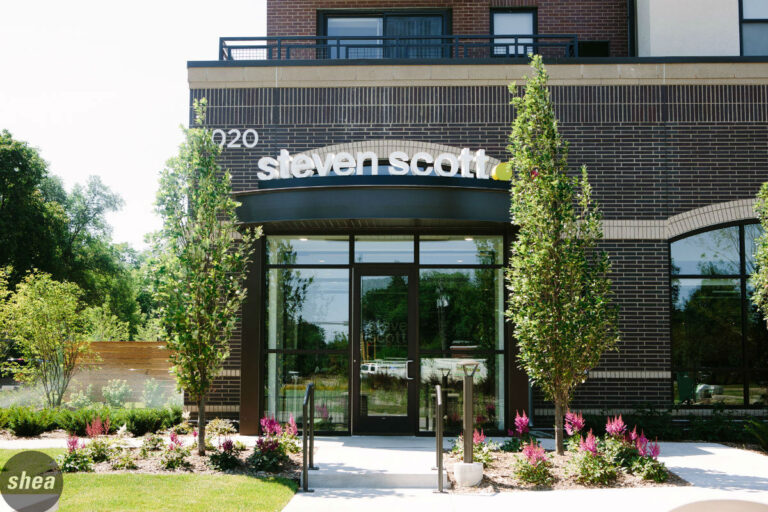
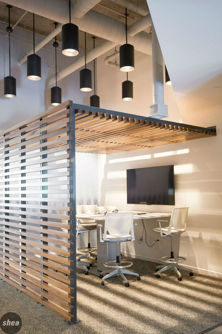
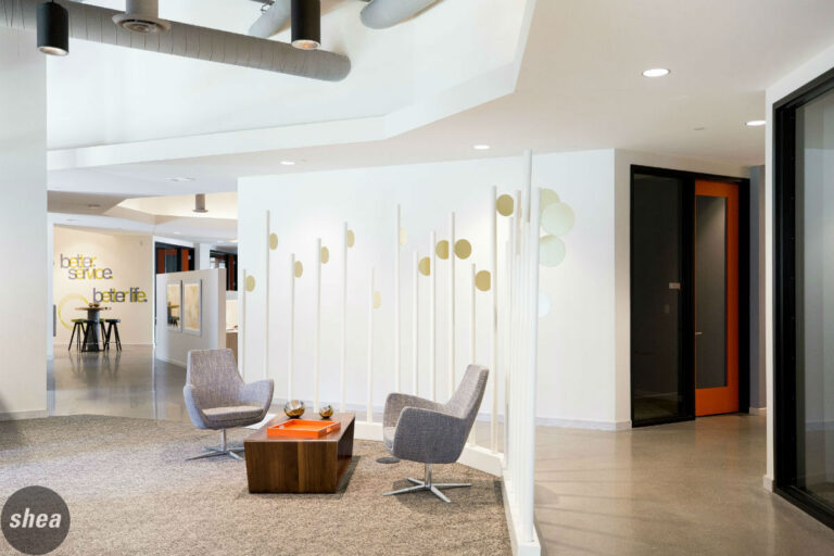
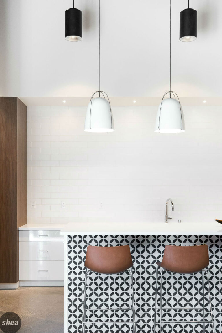
When rental-management company Steven Scott decided it was time for an overhaul, they didn’t stop with a brand-new office space—it was time for a complete brand refresh. Shea partnered with the longtime client to create a logo and brand identity that’s modern, simple, and bold, perfectly in keeping with Steven Scott and its buildings. We also created an airy office with plenty of open space, lots of third-workspace areas, and breakout areas conducive to individual work and team collaboration, with fun pops of pattern and color adding life throughout the space and an outdoor area ideal for basking in the sun at breaktime.
When rental-management company Steven Scott decided it was time for an overhaul, they didn’t stop with a brand-new office space—it was time for a complete brand refresh. Shea partnered with the longtime client to create a logo and brand identity that’s modern, simple, and bold, perfectly in keeping with Steven Scott and its buildings. We also created an airy office with plenty of open space, lots of third-workspace areas, and breakout areas conducive to individual work and team collaboration, with fun pops of pattern and color adding life throughout the space and an outdoor area ideal for basking in the sun at breaktime.
