There’s something about a restaurant in a historic building that gives it a certain sense of place—it has its own past, its own personality, and, usually, great bones to it. Shea has plenty of experience creating concepts and designs in spaces on national and local registers, but even when a space doesn’t have a specific historic designation, working in a building of a certain age comes along with its own quirks. Upgrades must of course be made in terms of codes and safety regulations, but there are also factors such as associated groups interested in preserving a certain aesthetic, nearby historic buildings that affect the new space, and taking into account the space’s previous use. Three recent Shea projects embraced their history and preserved the best features of their original spaces, while modernizing for what diners are looking for in a restaurant on today’s competitive scene.

P.S. Steak
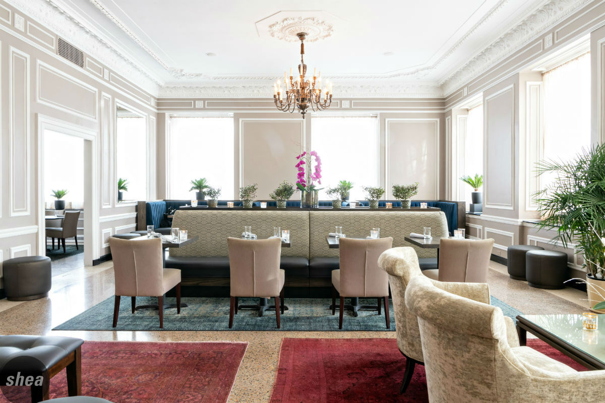
Housed in the iconic 510 Groveland building on the edges of Loring Park, P.S. Steak was a restaurant with big shoes to fill—the space was best known as fine-dining institution La Belle Vie (also a Shea design), where P.S. Steak’s Executive Chef Mike DeCamp had once been Chef de Cuisine Located on the first floor of a 1920s-era condo building, the restaurant space is as iconic as its luxe environs.
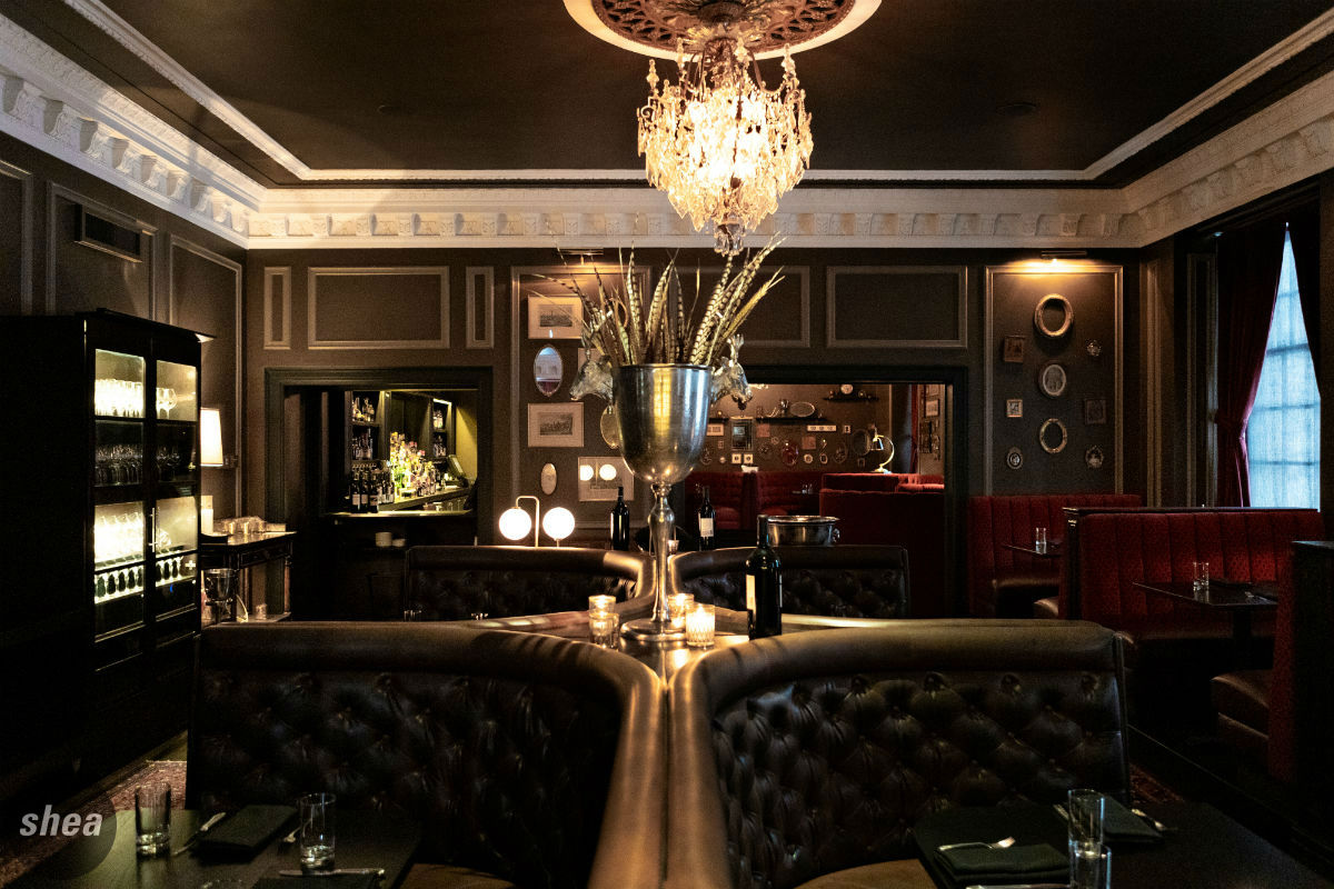 The Jester Group came to Shea hoping to create a modern steakhouse in the space, and taking the front lounge back to the glory days of La Belle Vie and transforming the former back dining room into a destination spot all its own—striking the balance of bringing something fresh while still appeasing the building’s board, which hoped to maintain the historic details and overall building aesthetic. The restaurant space had a brief interlude between its time as La Belle Vie and the new P.S. Steak, so Shea stepped in to create a design that would bring new energy to the space, maintaining its elegance and making optimal use of the different zones in the restaurant.
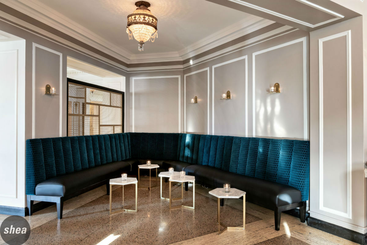 Creating a sense of space separating P.S. Steak from the building entrance was one major design challenge. A new, intimate lounge area with elegant gold partial screening bridges the gap between the residential and restaurant areas. Throughout the entire lounge and dining room, we maintained the stately crown moldings and chandeliers to keep the building in its era, adding new, fresh paint colors. The floor and fireplace in the lounge were preserved in accordance with the building association’s requests, and drapery in the dining room was used in lieu of a stained-glass effect to maintain a cohesive appearance on the outside of the building.
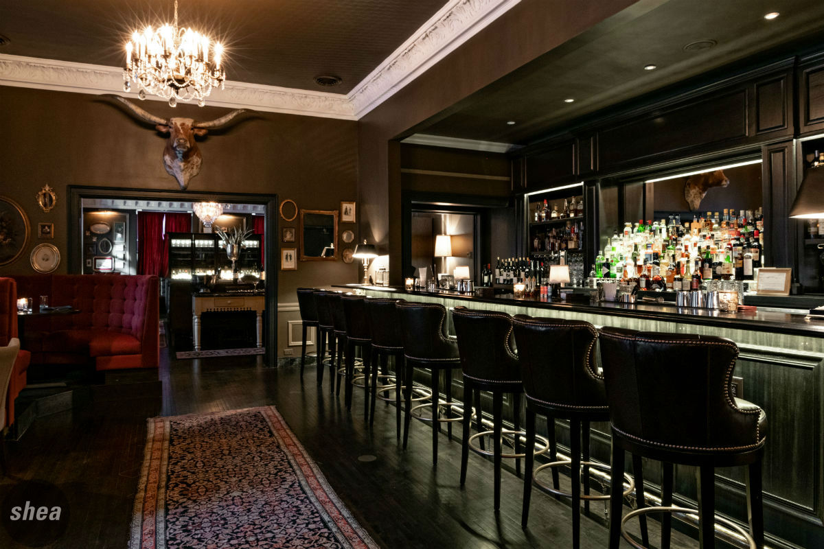
The greatest challenge came in create a space that would be functional but also serve as a bridge between the light, airy lounge and the rich, moody dining room. Shea achieved this by making use of a former service corridor to create a cocktail bar between the two that would lead into the dining room with a similar aesthetic. Careful attention to the millwork on the backbar and the finishes in the cocktail space give it the feeling of having been in the building since its construction—no small feat in such a grand, 100-year-old architectural icon.
Demi
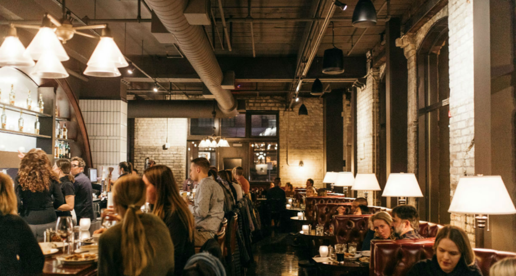
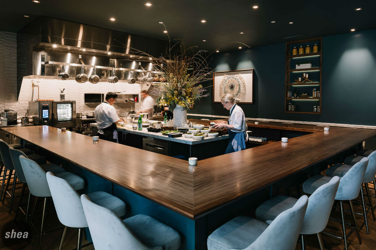
Chef Gavin Kaysen is no stranger to opening restaurants in historic spaces: Shea-designed Spoon and Stable opened in a former stable in Minneapolis’ North Loop, while Wayzata’s Bellecour combined several historic buildings into one French haven. Demi, completing the chef’s Twin Cities restaurant trifecta, is unique not only in concept (a 20-seat, tasting-menu-only chef’s counter), but its location. Adjacent to the back of Spoon and Stable, the Demi space was once home to the Barrington Hall coffee company, built in the late 1800s.
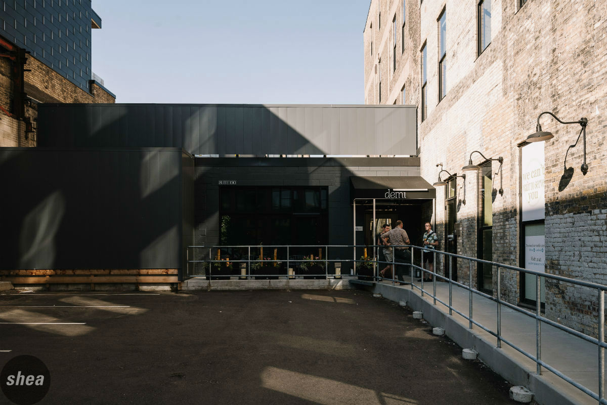 Although the building that Demi is in hasn’t been officially designated as a historic space (it was a room used for coffee production), it’s attached to and shares a parcel with a building that does have historic designation—so our team needed to pass historic review for the building’s exterior, which included submitting exterior signage plans and elevations to the State Historic Preservations Office, the Heritage Preservation Commission, and the National Park Service/Historic Preservation for approval. A few hurdles to be cleared included the addition of an outdoor storage cooler (with a curtain wall that matches Demi’s roof height for aesthetic purposes), which expanded the annex building’s footprint and the signage plan for the front and side exterior walls.
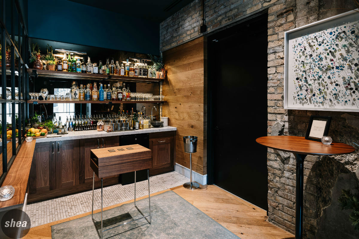 Although complying with historic guidelines can cause some challenges, a past life can open up great design opportunities for a new-concept restaurant. The design at Demi certainly gives due to the space’s past. One of the art pieces in the space was created from Barrington Hall invoices and brochures found during the construction process, and the sidewalk planters were crafted from coffee roasters—both clever nods to the story of the space.
July 1, 2019
Modernizing History: Creating new concepts in historic spaces

