If you hear “dentist appointment” and immediately conjure up images of drills and pain, you’re not alone. But two recent Shea projects, Camp Smile in Excelsior and Fiant Dental in Minneapolis, turn the traditional notion of dentists’ offices on its head. These brands and designs add color, texture, and joy to the same-old-same-old twice-yearly trip—while subtracting and distracting from the fear and anxiety. With Shea’s expertise in creating consumer environments, our approach to each project was to shift the health-care paradigm from clinical office visit to impactful patient experience.
Camp Smile: Kid-approved
It’s no secret that lots of kids get anxious about heading to the dentist’s office—but Dr. Bobbi Augustyn of Camp Smile says there’s no reason for it.
“A child shouldn’t have a fear of the unknown when they walk into an inviting, playful environment,” she explains. “They should be comfortable.”
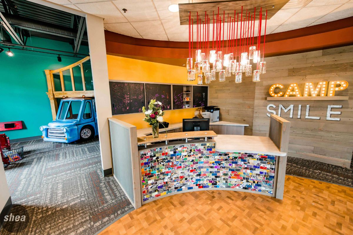
Enter: Camp Smile. With an existing Plymouth location, the practice, headed by Dr. Augustyn and Dr. Daniel Raether, turned to Shea to come up with a playful, practical design when it opened a second office in Excelsior. The dentists were looking to create an office environment as kid-friendly as their practice, and Shea stepped up to the plate with an overall brand refresh and a space that was fun without seeming cartoonish.
We wanted some reclaimed details so that we could really draw kids’ attention and have something new around every corner,” says Dr. Augustyn. We heard her—so we came to meetings with plans for incorporating tactile details, such as repainted tire swings suspended from the ceilings and a reception desk covered in tiles made from skateboard decks, all of which brought playful texture to the waiting area. “We’d meet with the whole team and give some of our ideas and they’d go and gather different options for us so that we could touch and see them—all we had to do was point to get exactly what we wanted.”
It was a whole-team effort to create some of the most unique elements of the space—when it came to crafting the custom-designed light fixture made of dental carpules, Camp Smile saved and sterilized the tools to send Shea for inclusion in the installation.
A pillar covered in paint-can lids brings a bold shot of color, and graffiti-inspired art covers the walls. Everywhere kids turn, there’s something to look at: a marquee-style “Camp Smile” sign lit up against a reclaimed-wood backdrop, colorful exam-room furniture, a custom-designed Mason jar chandelier. Even the open ceiling, with its exposed ductwork and pipes, serves as distraction for nervous kids as Drs. Augustyn and Raether prod their gums.
“The new office is so well-designed,” says Dr. Augustyn. “It reminds kids of some of the indoor playgrounds and places like that where they go with the purpose of having fun, so they start to feel that way about the dentist.”
Fiant Dental: Keeping patients joyful
But even full-fledged adults, ones who pay rent, mortgages, and health-care bills for their kids, can become anxious at the thought of sharp tools and drills breaching their molars. Enter: Dr. Jamie Graham at Fiant Dental.
Dr. Graham’s perpetual “glass-half-full” attitude is the cornerstone of his dental practice (which boasts the motto “Dentistry for the Joyful”). He brings a background in branding and marketing to his dentistry, making Shea the ideal choice for Fiant’s recent revitalization.
Our starting point was Dr. Graham’s positive brand message—we extended it to every touchpoint throughout the experience. We brought new life to Fiant’s existing building by removing the roof to raise the ceiling height, adding sawtooth clerestory windows to let in natural light and adding new windows and storefront. Inside, we refreshed the space to make it clean, contemporary, and, perhaps most importantly, approachable for clients.
Selecting bright colors for the entire office interior was an important way to bring Dr. Graham’s philosophy into the design—in a space painted in hues like “Carnival” and “Pizazz Peach,” how can patients help but grin? Oversized posters of his most smiley clients—the Minnesota RollerGirls—also bring extra vibrancy and positivity to the space. The influx of natural light soothes patients and gives the overall experience a more high-end feel—not necessarily what’s expected at a routine dental checkup. Plus, the iron beams and clerestory windows (two of Dr. Graham’s favorite features) lend an organic vibe to the space and give something for patients to look at while their incisors are shined to perfection.
“So much of what we do in terms of dental work is too small to evaluate visually,” explains Dr. Graham. “Patients tend to make evaluations of the quality of their dental care by other factors. When a patient walks into this office, they know immediately that we’re concerned about aesthetics, quality, and attention to detail, and we’re concerned enough about the patient to make the space very comfortable and relaxing.”
Now go out and flash those pearly whites.


