As more and more of our tasks are outsourced to online, from shoe shopping to booking Ubers, there’s one major task that, for the most part, remains steadfastly in the brick-and-mortar camp: grocery shopping. At Shea, we want to make sure that it’s not just one more thing to tick off a to-do list; we want grocery shopping to be an experience that’s an oasis in a desert of warehouse-like supermarkets.
We began working with Edina, MN-based retailer Lunds & Byerlys in 2004 to create that positive vibe for every shopper stepping through the doors—and we now collaborate with the team on all store design as well as creating much of the company’s signage and branding materials. With our help, Lunds & Byerlys turns the traditional grocery-shopping trip on its head, creating a respite for customers in the midst of their busy days.
Upscale design for a high-end shopping experience
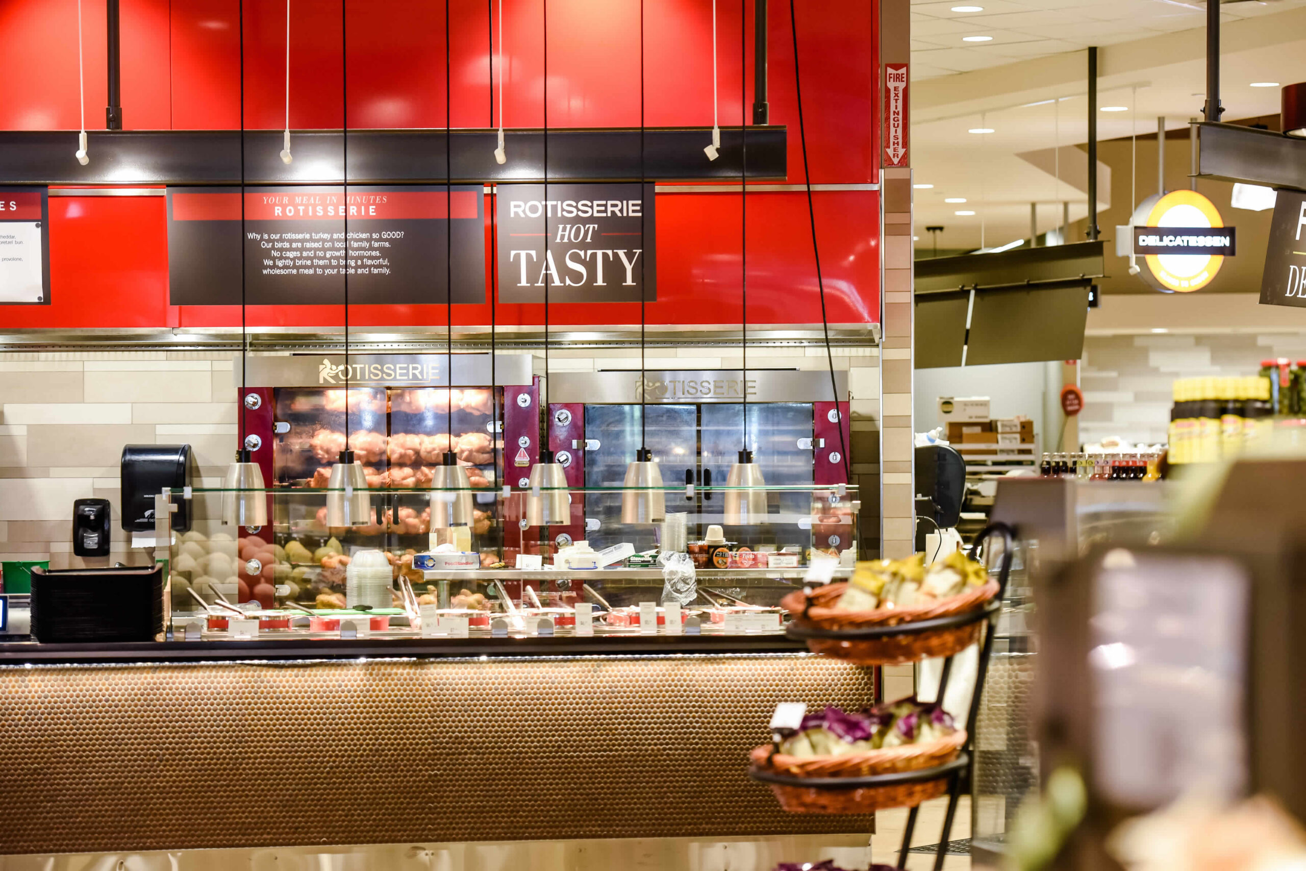
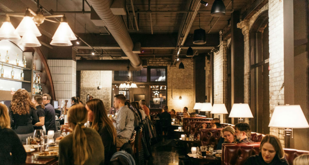
Let’s get it straight: The Lunds & Byerlys stores are not your typical groceries. Forget the dull concrete floors, the towering shelves that are never quite full, the harsh lighting. Replace with carpet and polished flooring, easy-to-access product, and light fixtures like modern chandeliers and pendant lights. Warm woods and sleek metallic signage replace plain, industrial interiors. And angled aisles, rather than straight, boxy lines, give the stores added softness and make for a more dynamic retail experience (one that doesn’t evoke a storage warehouse).
The Lunds & Byerlys core brand elements are those of Quality, Service, Expertise, and Innovation—and it’s our job at Shea to translate those values into design. By collaborating with the Lunds & Byerlys team, we ensured that materials, colors, and lighting work together throughout each store to create a full experience that transforms the chore of grocery shopping into a pleasurable experience. This doesn’t just happen in the individual departments; it starts with creating a welcoming entry space for customers that sets up the overall experience with staff, offers, and carts immediately at the shoppers’ fingertips.
Moving throughout the store, the superior Lunds & Byerlys products jump out at customers thanks to careful display and design. Clear delineation and signage between the departments makes it easy for customers to find everything that they’re looking for, and every section has its own personality while still fitting into the overall store design. In the produce section, Shea uses muted colors and materials so that the bright fruits and vegetables can stand out. In the butcher area, wood tones and strong, clean design evoke a modern-day butcher shop where the staff is knowledgeable and the product is top-notch. In the bakery, wooden shelves show of artisan breads, and glass cases let European pastries shine like jewels. Shea works to create backdrops that let every high-quality Lunds & Byerlys product take center stage, with exceptional (but understated) design to match.
Use of branding to build an easy, fun shopping experience
A strong branding program goes hand-in-hand with great design, and at Lunds & Byerlys, it’s a priority. The customer’s eye needs to be trained to immediately recognize what’s on sale, what’s a special deal for the season, and where favorite products can be found—so branding elements need to be consistent throughout every store. However, Lunds & Byerlys stores are also very neighborhood-centric—so special touches can be found in every store to make it unique.
A clear hierarchy of signage is key (with internally illuminated department signage) so guests can explore the store easily, moving from department to department and aisle to aisle to find what they need. Colors and fonts should be eye-catching but not distracting from the product, and some of our design pieces better highlight the items offered: Best-in-Class fixtures for coffee and oils, for example, are designed specifically to show off the high-end lines that the stores carry. Others give customers more information about where the product, such as meat or fruit, comes from, its health benefits, and ideas for using it in recipes.
One major facet of the Lunds & Byerlys experience is shopping the whole store. While most shoppers are drawn to the perimeter of a store, where the fresh produce, meat, and dairy are generally kept, we strive to bring them into the center aisles with several branding strategies. 


