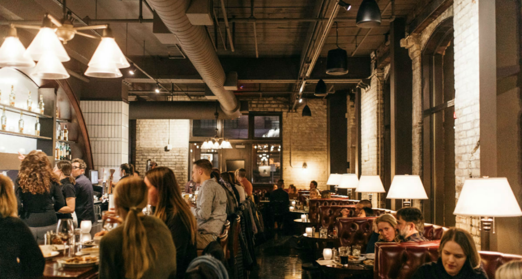
Brick and mortar retail has experienced a whirlwind of change in the last five years. With the importance of AI, digital marketing and social media, consumers demand more from a physical experience. Merchandising needs to be more creative than ever, with a focus on engagement, personalization and storytelling.
To that end, retail design needs to be more thoughtful than ever. The space itself needs proper, targeted lighting and efficient flow, but it also needs to effectively direct the guest journey. Successful retail design needs to create focal points, merchandising highlights and displays that elevate and differentiate specialty categories and increase consumer engagement. And these focal points and displays need to also double as effective social marketing tools to draw customers into the store.
Following are several examples of how Shea worked with individual retailers to create custom, branded solutions to raise their hero products, draw attention and build consumer loyalty:
Personalized, targeted expertise: Schmitt Music
Specialty Categories: woodwind, brass, orchestral string instruments, Steinway & Sons pianos
Schmitt Music is a 125+ year-old, multi-generational music store with an unparalleled selection of instruments, sheet music and accessories. Upon entering Schmitt Music’s Bloomington flagship, the experience is all about interaction and personalization. Guests immediately have clear sightlines into six individual galleries along the perimeter of the show floor: The Clarinet Gallery, The Brass Shop, The Sax Shop, The Paul A. Schmitt Violin Shop, The Flute Gallery and Steinway & Sons. Each gallery has a unique storefront display, and inside, its own unique design playing to the featured instrument’s personality. Expert educators, salespersons and repair technicians are brought together within each gallery as well, creating a one-stop-shop of specialized expertise customized for each unique musician.
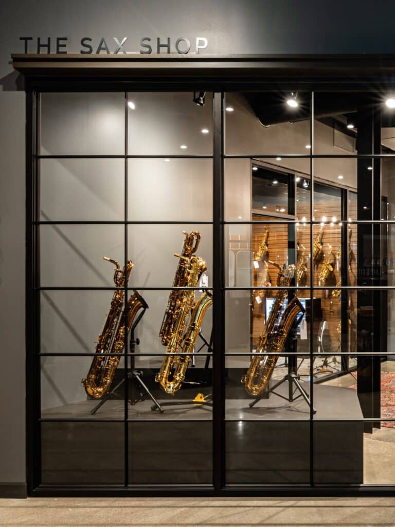
Their one-of-a-kind service model and onsite expertise, enhanced by the new gallery floorplans, has solidified Schmitt Music as the go-to music store for new musicians, professionals and hobbyists alike.
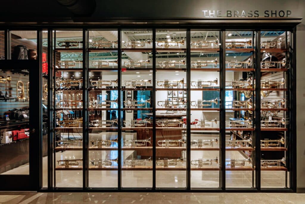
Individual Storefronts
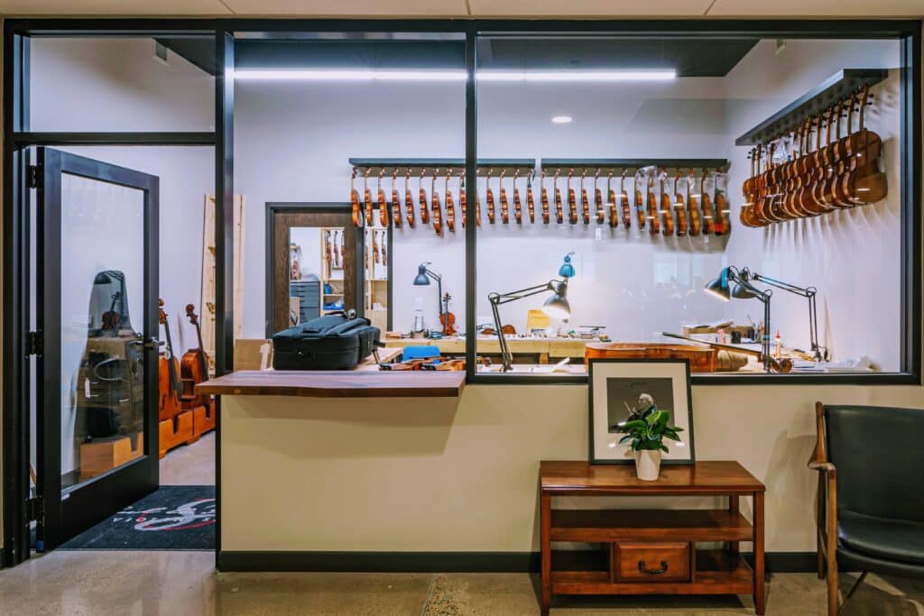
Luthier within the Violin Shop
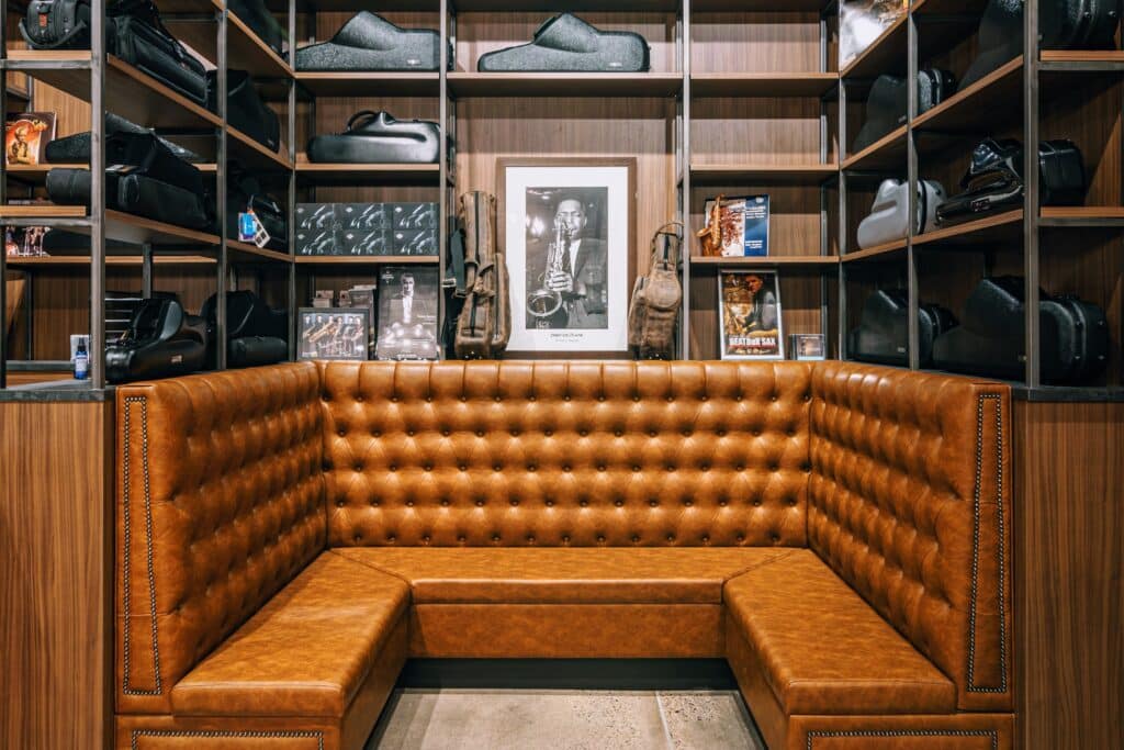
Unique Gallery Experiences
Offline interaction: Highcroft Home
Specialty Category: luxury linens
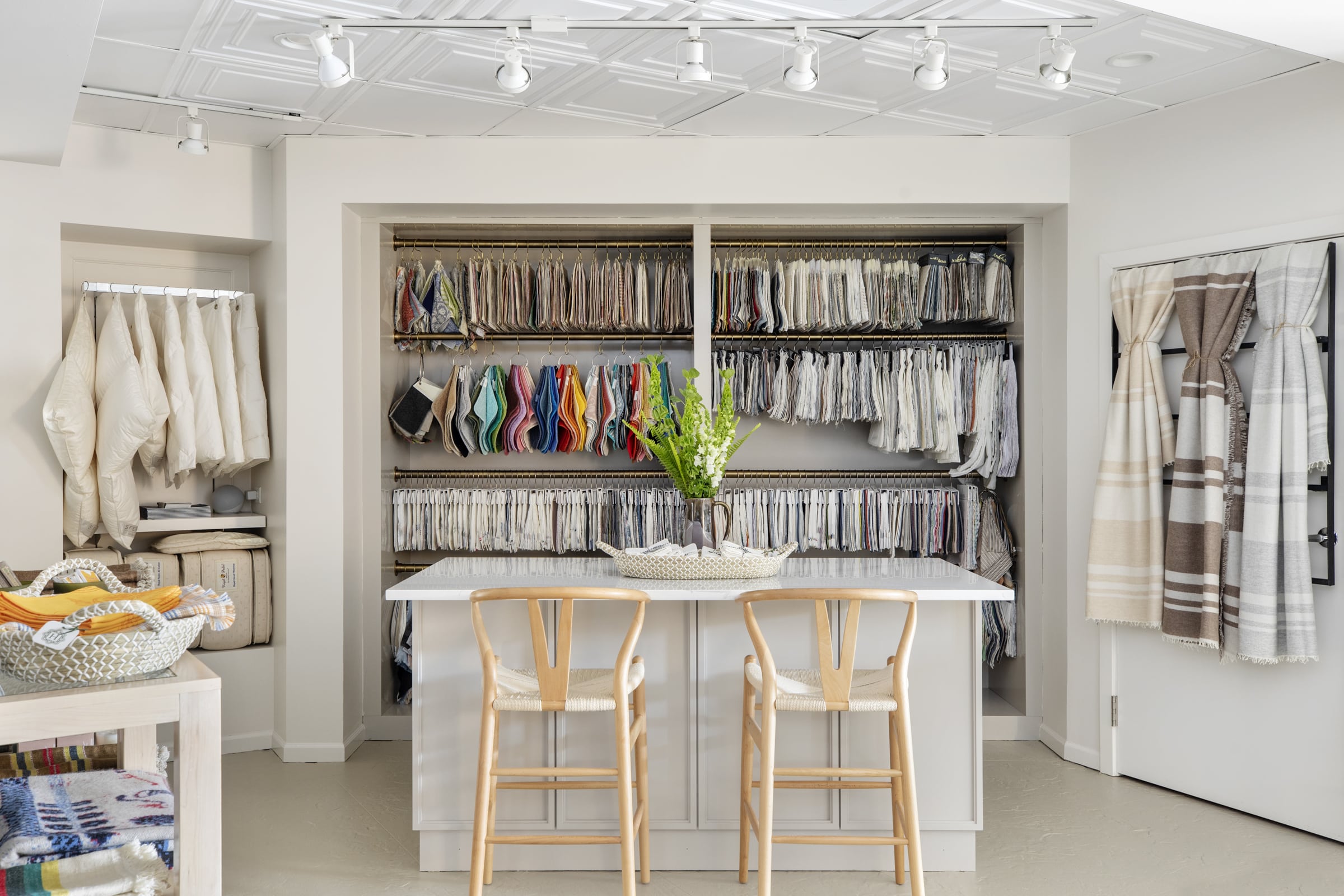
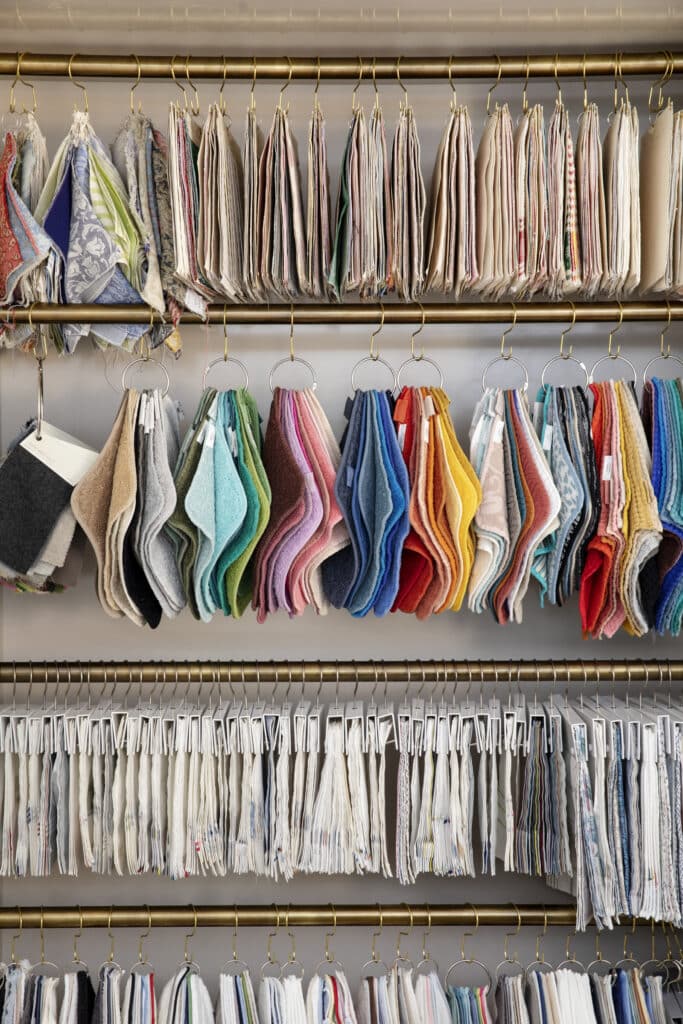
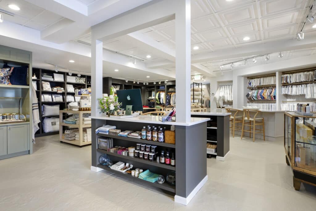
The high, continued growth of social media and digital commerce in retail is still dominant, but it can never duplicate physical touch – especially when it comes to linens and fabrics. Highcroft Home, a specialty home goods, clothing and perfume boutique, proves that an elevated, personalized shopping experience best takes place offline. Highcroft embraces the high-touch service approach, pairing a stunning display of swatches with a consultation counter to enhance their luxury linen specialties. With the ability to see and feel each fabric in a curated environment, guests can create their order with an in-store expert knowing every detail has been considered specifically for them.
Shea’s recent store refresh of Highcroft was designed with this personal interaction in mind with an instinctual store layout, spotlighting the luxury linens. Swatches clearly displayed on brass hooks elevate the fabric options for greater product interaction that can’t be experienced from a computer screen.
Storytelling: Lunds & Byerlys
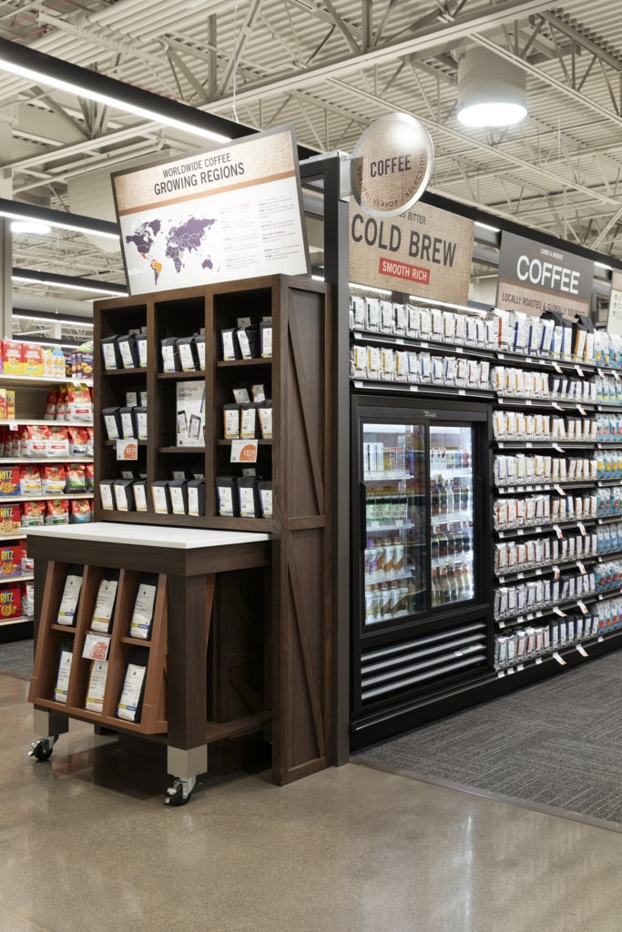
Specialty Category: while Lunds & Byerlys, a multi-unit Midwest grocer, features a selection of high-quality specialty products, we’ll keep it brief by highlighting their coffee as the example
Today’s consumers are as savvy as ever in understanding the source and the story behind the products they buy. Lunds & Byerlys knows the value of storytelling and goes behind the label to elevate their specialty products and categories, telling a narrative through creative signage and display design. The specialty coffee is visually highlighted by unique displays that stand out from the repetitive rows of shelving. Eye-catching signage tells the narrative and origin of the coffee products, starting with graphics of growing regions and further highlighting locally roasted selections and varied product backstories.
The coffee products are grouped together to keep focus on the specialty category in a curated area; for example, a small cold-brew cooler is incorporated into the display as opposed to sending guests away to search the main cooler aisles. Keeping the consumers focused on the curated display both eases the experience for guests, as well as drives sales on related nearby products such as coffee mugs, filters and accessories.
Focal-point features: Surdyk’s Liquor Store
Specialty Categories: Bourbon, whiskey and rye
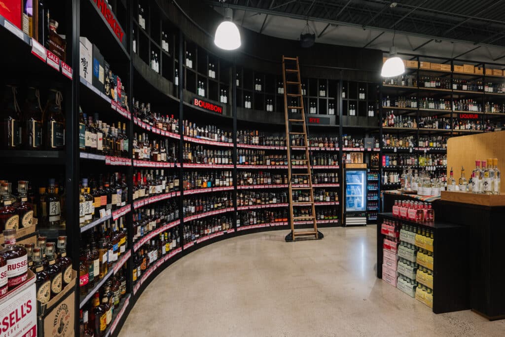
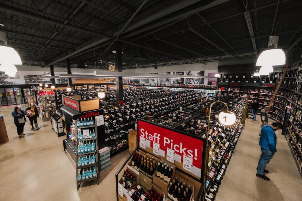
In high volume retail, such as grocery and liquor stores, grabbing attention and directing the consumer eye is even more critical. For Surdyk’s, a 90-year-old dominant liquor retailer, the key word was brown, as in brown alcohol. In a complete store refresh, guests are immediately drawn to the end of aisle one, following the giant curved wall that’s the new home to their specialty selections of bourbon, whiskey and rye. The curved corner with historic-library-style shelving (complete with a sliding ladder) may be the feature drawing guests over and showcasing the products, but the flexible set-up allows guests the interactions that further drives the sales.
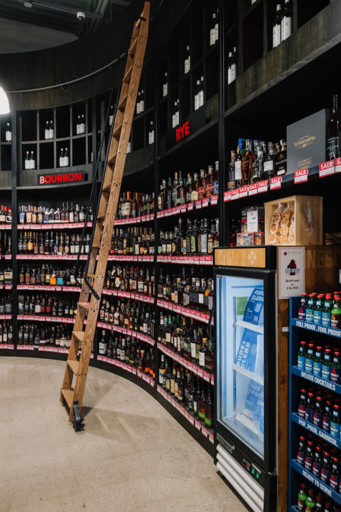
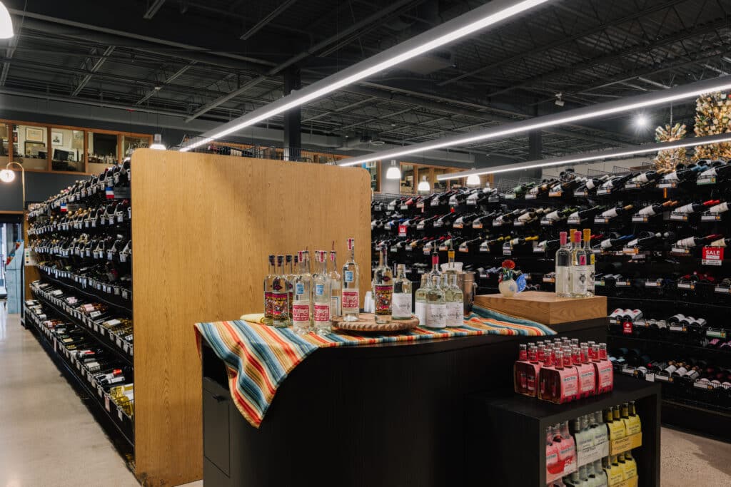
In the effort to introduce more personal connection and interaction, a SheaMakes custom display station offers Surdyk’s options to host tastings, set merchandise or partner with brands on temporary pop-up displays in line with the wall’s curve. The flexible station creates memorable experiences and unique connections for guests, and the varied uses keep the content fresh every week.
Reforming an experience: Mill City Running
Specialty Category: Running Bras
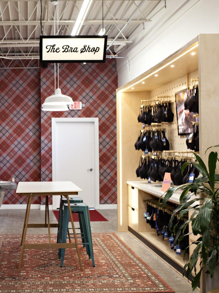
Mill City Running and sister store Saint City Running, both specializing in products for active and running lifestyles, have made it their mission to transform the running bra shopping experience and make it both comfortable and exciting, rather than simply a necessary (and sometimes daunting) task. Mill City Running’s refreshed store, designed by Shea, changed the category, creating a new Bra Shop within the store to showcase their service and commitment to the niche specialty category.
The Bra Shop offers a custom experience working with onsite Fit Experts and showcases unique displays of their inclusive range of options. The shop design draws immediate attention with energetic bold colors and patterns, bringing life to a category formerly thought of as mundane.

Mill City Running
Saint City Running
—————
The key to the above experiences was partnering with the retailer to create engaging designs built around driving sales and business results. Not every product within a store should receive the same design treatment, and by first understanding our partners goals and curated product lines, we’re able to design unique solutions that drive specialty product sales and establish their business as the go-to leader of those categories.
Whether a new store or a refresh, our partnerships were able to create results through designing:
- Displays and merchandising with a focus on interactions
- High-touch service showcasing expertise tailored for each guest
- Space plans and displays with key focal points
- Engaging storytelling
- Multi-use stations and spaces for product demonstrations, events and brand partnerships
These solutions build trust and loyalty and create the much-needed engagement critical to a retailer’s success. And, as a bonus, the creative design and features also become important content for digital and social media marketing, enticing guests to experience it firsthand, like The Brass Shop at Schmitt Music or Sudyk’s bourbon, whiskey and rye wall.


