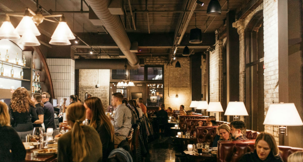
The word “Instagramable” should be banned. Not just in design—in everyday life. Although Instabait designs are all over the Internet and social media (a completely valid way to build up a restaurant’s public profile, by the way), at Shea, we put the aesthetics and function of the design ahead of what’s hot on Twitter at the moment. It’s our own spin on the chicken-or-the-egg problem: We put the design first, and that spurs the photos. It’s not creating an “Instagram moment,” it’s creating a design moment that calls out to be captured.
Tile Details
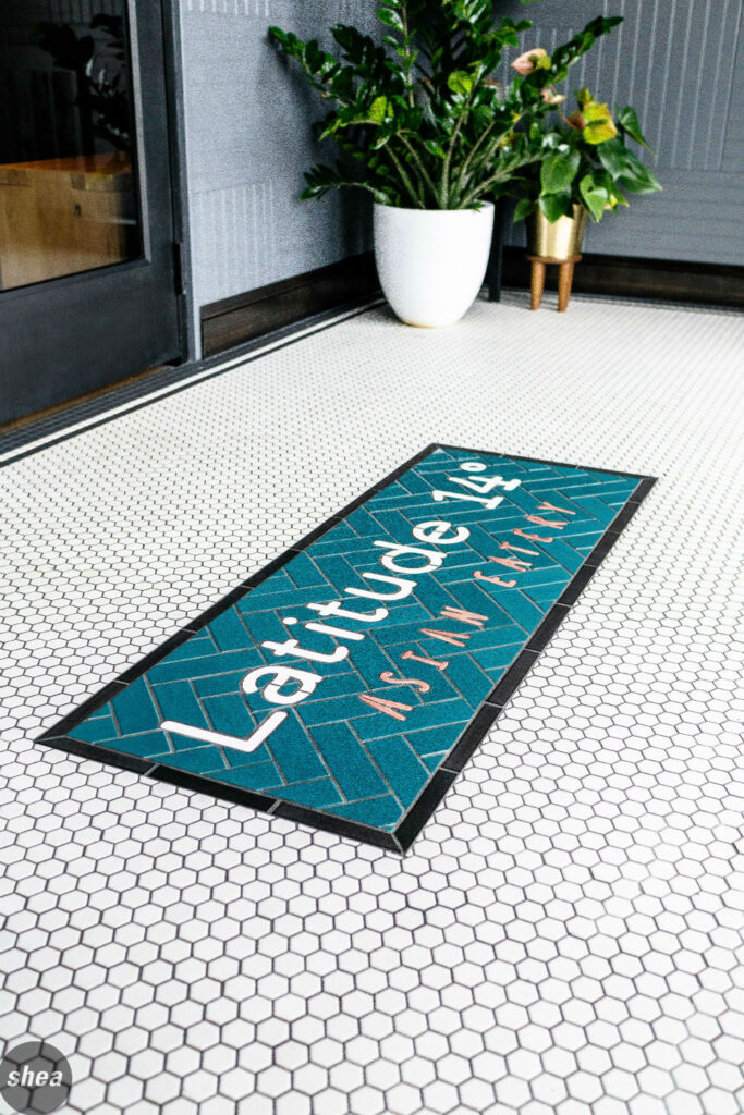
Mosaic tile is all over Instagram, but Shea uses it in an application that furthers the design. At Eastside, the black-and-white tile pattern was thoughtfully designed by us—intriguing, but not too busy. Tile designs set against the raw concrete floors at Lat 14 emulate area rugs in a sleek, inventive manner. And at Mercy in the heart of downtown, teal subway tile makes the raw bar pop, putting fresh oysters at the forefront.
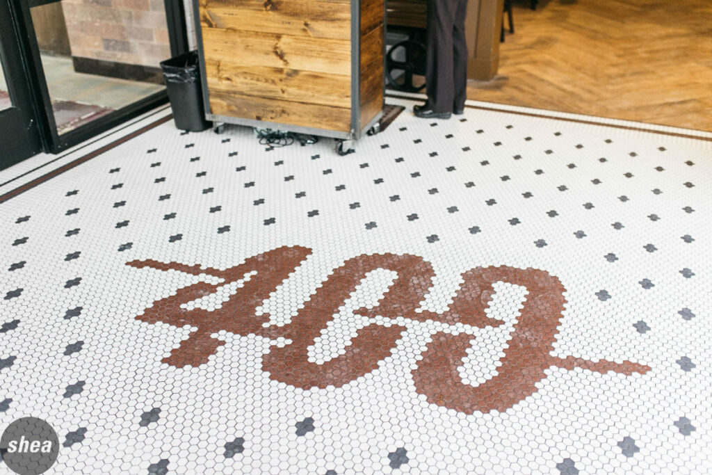
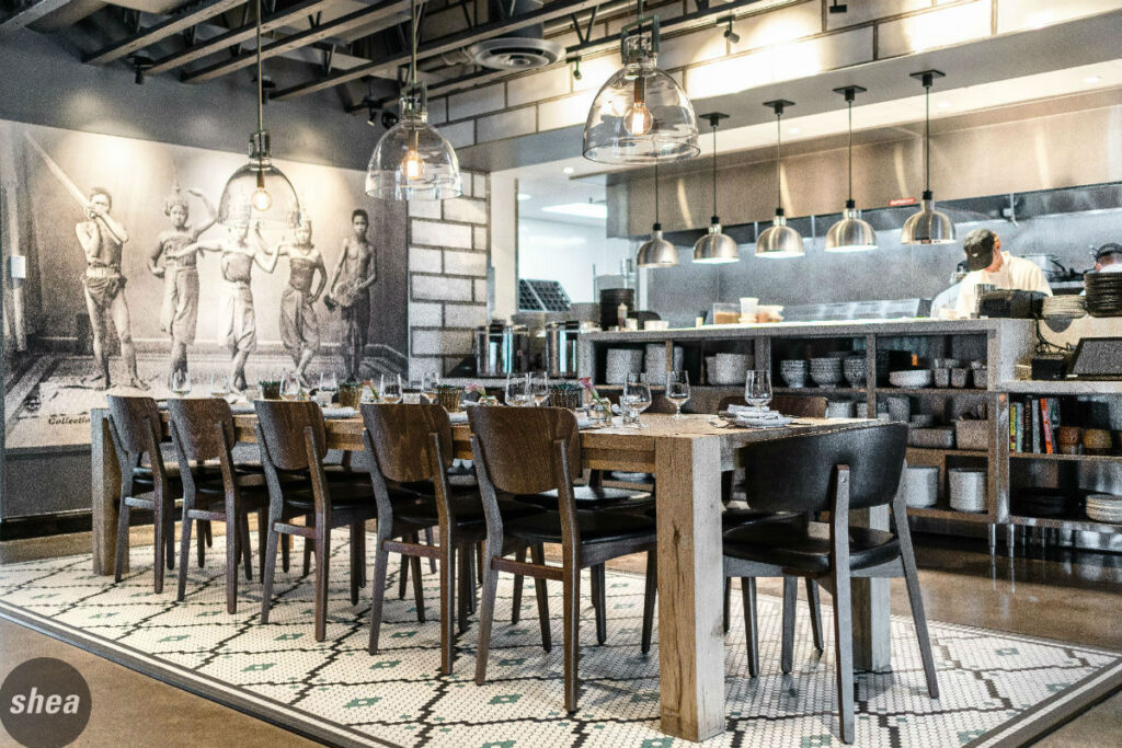
Of course, knowing that people love a tile design doesn’t hurt when it comes to furthering a restaurant’s brand. Our mosaic floors at Lat 14 and the Twin Cities 400 Tavern announce the restaurant’s monikers boldly, immediately telling the world where diners are when they snap a picture.
Neon Signs
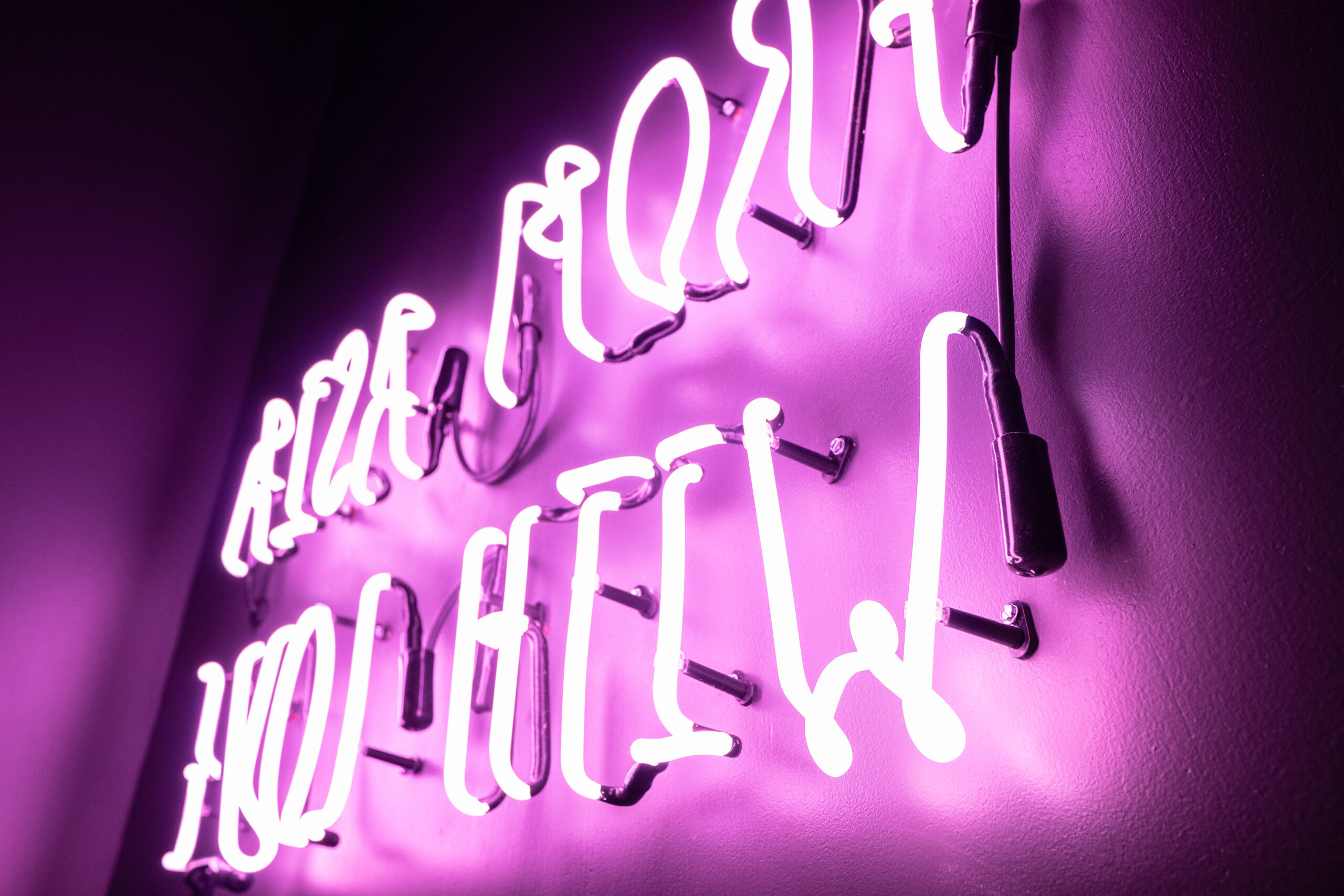
With the love of nostalgia and all things retro has come the influx of neon signs in restaurants around the country, but the trick is to choose a design and phrase that really adds wit and fun to the space, while enhancing the experience and extending the brand. It should have a place there even without the inevitable photography. At the same time, the addition of a neon sign brings a sense of cool casualness—bringing the relaxed vibe of a dive bar in a space where it’s decidedly more pleasant to spend time.
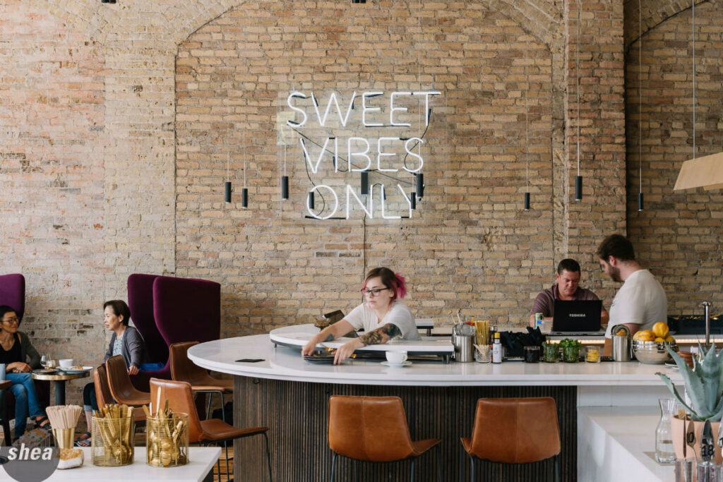
At Edwards Dessert Kitchen in Minneapolis’ North Loop, the “Sweet Vibes Only” neon sign not only serves to cement Edwards’ place in its own niche, as a dessert-centric bar and lounge, but it also provides a stark juxtaposition against the building’s original 1890s brick walls. At Lat 14, a neon sign that looks as if it’s been hand-scrawled in bright pink brings a pop of color to a dark restroom hallway, and epitomizes the chef/owner’s love of all things feminine and glamorous.
Light Fixtures
Whether it’s by way of custom-crafted fixtures (a la the industrial-inspired lamps that stretch out from the walls at Edwards) or just carefully selected ones, lighting has the ability to make or break a restaurant. The trick is to highlight hard surfaces (such as tables and bars), so that what’s reflected above them (think faces and food) is cast in a flattering light.
Of course, while lighting has to be functional and flattering, it can also be eye-catching. The linear lights at Surly Pizza Upstairs are a perfect example: They add a graphic quality to the space, and the way that they reflect off the bright red beer bar is spectacular. At Edwards, a vast variety of lighting fixtures, including sleek pendant lights over the bar or those overhead-arm lamps in the lounge space, all of the lighting has a sophisticated, modern feel that contrasts with its historic backdrop.
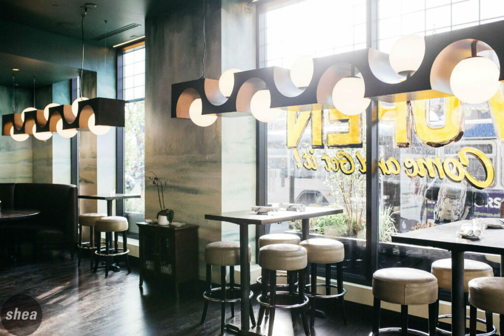
Custom lighting fixtures really add an element of uniqueness in a space’s design. Downtown Minneapolis’ Mercy boasts expansive custom metal fixtures with oversized globes. At Naples Ristorante at Downtown Disney in Anaheim, the lighting is comprised of individual works of art. Cloud lighting gives a “starry night” effect to the main floor, especially once the sun sets, and upstairs, a sculptural light fixture is inspired by pasta shapes but stops short of feeling kitschy. And at Café Carnegie in Pittsburgh, a tree-like light sculpture doubles as art, with branches featuring custom glass globes extending ethereally in every direction.
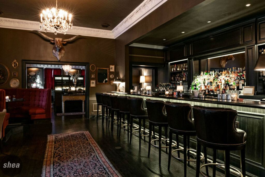
Back Bars
A great back bar is key to drawing guests into a space and creating an inviting atmosphere. And when it comes to building a successful one, lighting is key. At P.S. Steak, the newest restaurant in Minneapolis’ historic 510 Groveland building, a brand-new cocktail bar bridges the gap between the bright lounge and the dark, moody dining room. It serves as additional seating and lounge space, but also softens the distinction between the drastically different dining zones—and its backbar is one of the best-lit in town, a glowing beacon in the richly hued space.
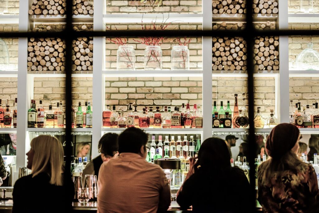
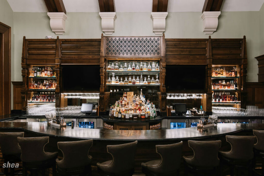
Similarly, the carefully lit shelves in the new Bobby Jones Pub at Edina’s Interlachen Country Club create a bar display to die for, with a vast collection of antique decanters taking center stage along with the extensive collection of bottles. At acclaimed Minneapolis restaurant Spoon and Stable, the back bar is set against an original brick wall. Its elegant grid-style framing lets bottles and décor stand on their own, while peeks of exposed brick glow throughout.
Art Installations and Murals
Art is key to a restaurant’s aesthetic—it can serve to further the brand, provide a pop in the décor where it’s needed and strengthen ties between a restaurant and local artists. Installations and murals are adored on social media, but their design purpose is about so much more.
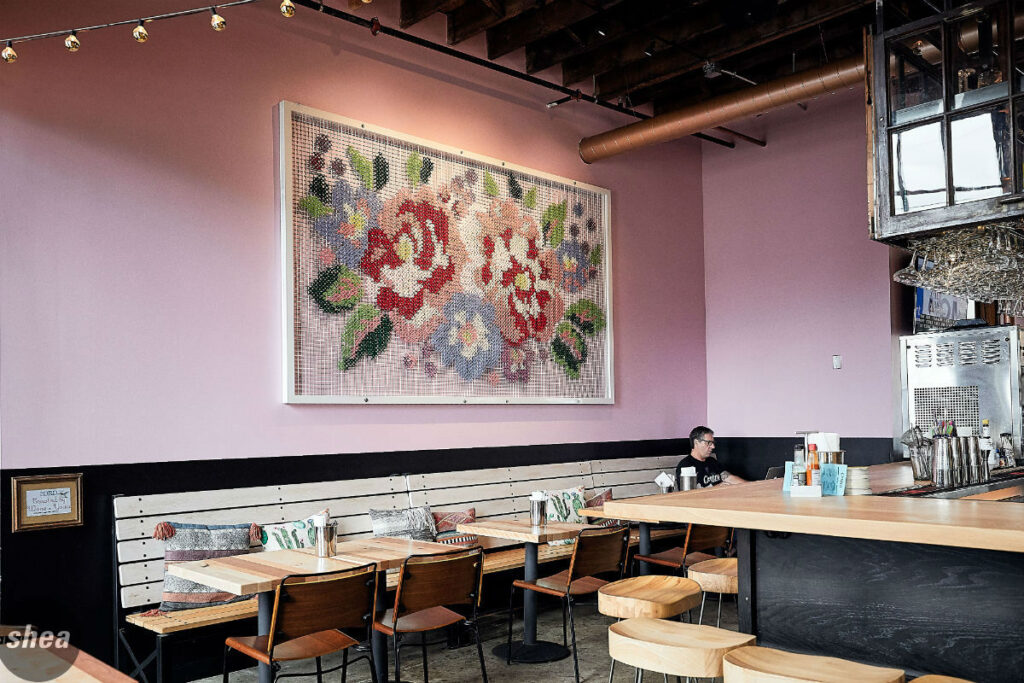
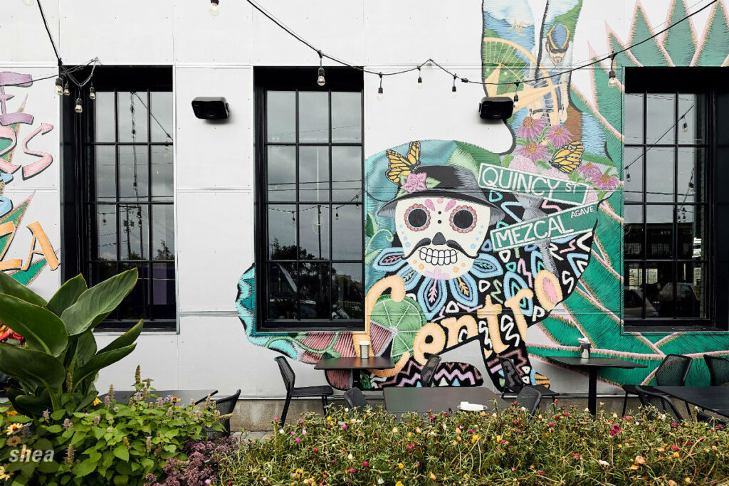
Centro and Popol Vuh, a duo of modern Mexican restaurants in Northeast Minneapolis, exemplify this notion perfectly. Outside the inventive taqueria Centro, murals that depict scenes from the Dia de los Muertos and Aztec legend announce its presence in town brightly and boldly, and are a favorite design moment for customers. And inside, a giant 10-foot cross-stitch installation by local artists adds a fun dose of color to the design. Next door at Popol Vuh, more subdued murals have been added to the walls, emphasizing the original arches and highlighting the restaurant’s historic beauty in a way that represents the restaurant’s elegance to a T.
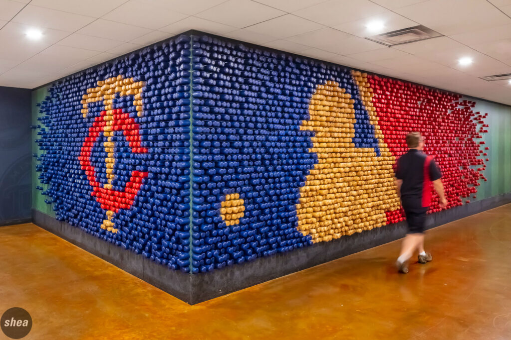
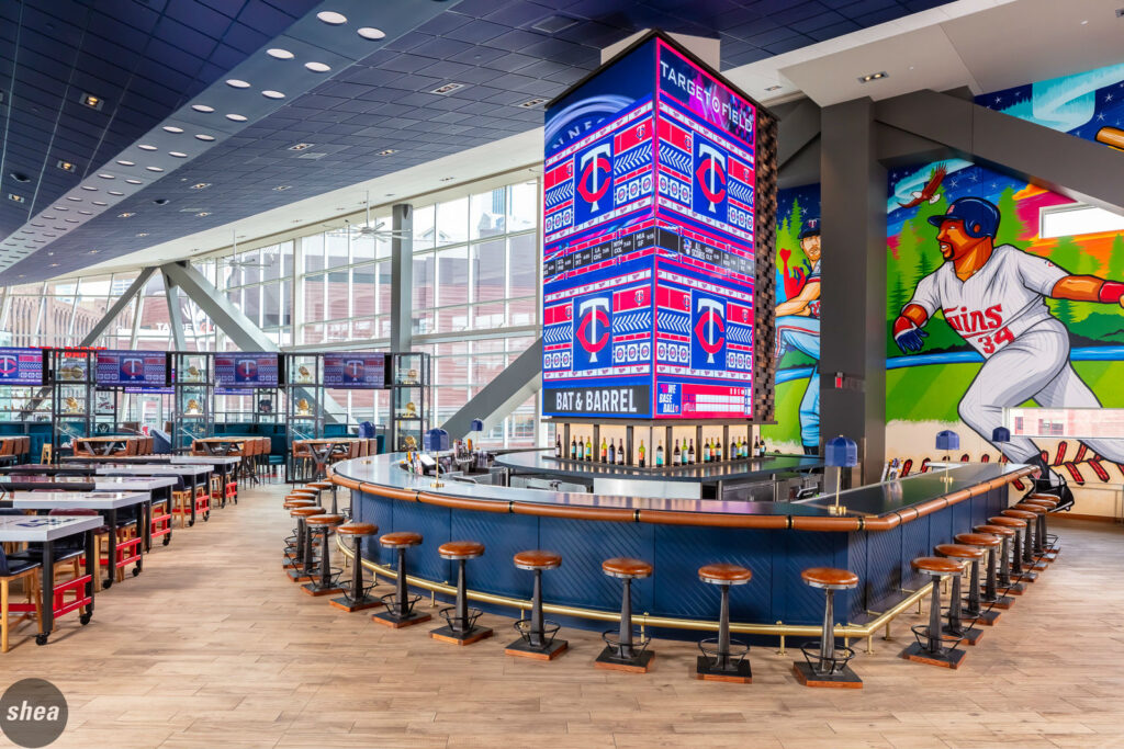
Making a strong first impression at Bat & Barrel at Target Field is the bat-wall installation, which shows off the iconic Minnesota Twins and MLB logos comprised of bat ends immediately as guests enter the restaurant. Inside the space, oversize murals depict historic moments in Minnesota Twins history as well as elements of the Minnesota landscape. Done by a local artist, these works of art not only provide a great visual pop, but they emphasize the Twins brand and its strong connection to local space and history.


