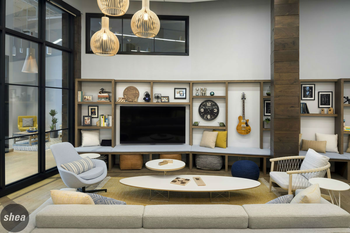
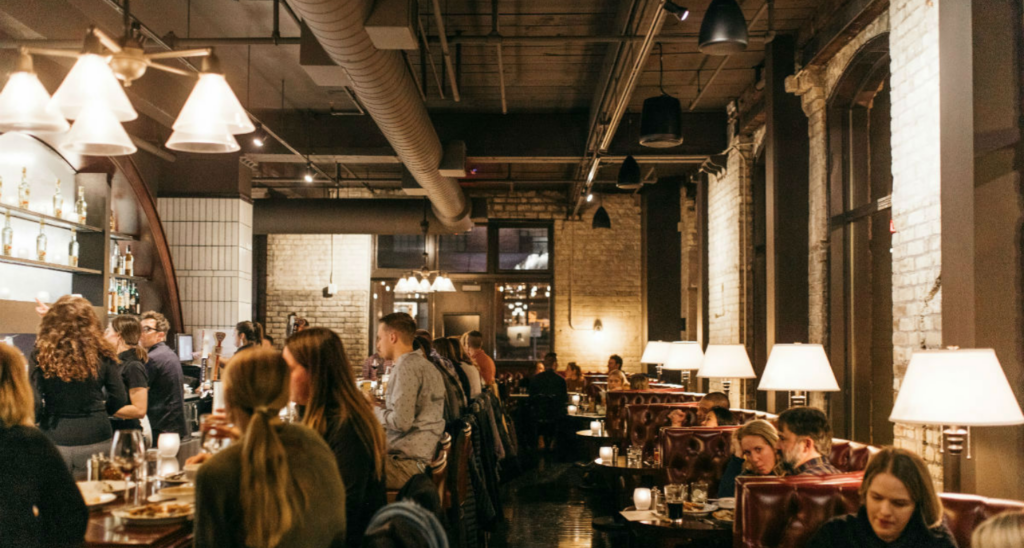
Walking into an office should immediately tell you exactly what that company’s about—from the signage to the colors to the carpet, that space is how the company presents itself, a physical extension of its brand. Basically, it’s the first impression, not just the front door. But it’s not just that a workplace’s design should reflect its ethos—it can impact that culture, too. Three of Shea’s most recent office renovations—at a next-gen bank, a fourth-gen family-owned company, and a property-management firm building the spaces this-gen wants to live in—have seen a significant impact on their companies’ cultures since the big redesigns. Check out their stories below.
Riverland Bank
Riverland is a bank like none other. There are no tellers, no lines, no noisy change machines. It’s a relationship-first business, where bankers really know each and every one of their clients. “We have a collaborative culture, with high expectations. We’re a pretty flexible, highly communicative company,” says CEO Rick Huckle. So it’s no surprise that when the firm was looking to expand from its headquarters in Jordan, Minnesota, to open a Twin Cities branch, the leadership wanted the new space’s design to reflect that personal, modern ethos.
The Shea team dove into the project, using the bones of the new office’s historic location in Northeast Minneapolis as inspiration. The Riverland team had specified a desire for a very open office that felt less like a bank and more like a private equity office, with plenty of glass to allow natural sunlight to spill throughout the space.
Immediately upon entering, clients know that Riverland is no ordinary bank. The traditional teller line is replaced by a statement-making Cambria desk, a stark contrast to the dark wood paneling boasting the Riverland insignia, used throughout the office. “It’s fantastic as a counterpoint to all the steel and the glass,” says Huckle about the dark wood tone. “I trusted the design team on that—they were great.”
Oversize windows let light in, and operable garage doors separate conference areas for privacy while still allowing for transparency. That privacy is, of course, important to bankers as well. Individual desks are shielded enough to keep information confidential, but glass panels still allow for an airy, open feel, and glass-paned doors can be closed for privacy in individual offices if necessary.
With the company headquartered in Jordan, top-of-the-line technology in the main boardroom and throughout the office keeps employees in touch between the two locations—a big draw for the many new hires at the Minneapolis location. A cloud feature in the center of the office is a sleek, functional way to bring in the acoustic and lighting support needed for the office to function, and islands and third workspaces throughout the office give employees further options for working. And the office kitchen, with its Cambria island and built-in keg taps, is as far from a traditional bank as it gets.
Not only was the Riverland design devised to reflect the culture that the bank wanted to promote, it’s giving the entire office a positive vibe. “Everyone loves working in the space,” says Huckle. “Staff from our other office love to come down and work from the branch, because we have all these landing spots they can work from.”
Customers are attracted to the bank by way of its design, further emphasizing the non-traditional company culture being built at Riverland. “I set up a meeting with a prospective client next week, and she said she could hardly wait to see the office,” says Huckle. “It generates a lot of enthusiasm.”
Marvin Windows
Curiosity and collaboration have been the work-culture buzzwords at Marvin Windows and Doors for more than 100 years. The family-owned company has seen its way through several eras of leadership, and a recent passing of the baton into the fourth generation was bound to come along with a new direction. Headquartered in Warroad, Minnesota (close to the Canadian border), the company also has a metro-area office in Eagan that was due for a refresh and re-set to keep up with the company’s dedication to creativity.
To design a space that would work best for the Marvin team, Shea turned straight to the source: the employees. We worked with the leadership at Marvin to conduct extensive interviews with employees from across the company, and delved deep into researching workspace needs of both individuals and teams. “The entire design process revolved around fostering our curious and collaborative culture, while providing a place for work to happen that also feels like home,” says Christine Marvin, the company’s Director of Corporate Strategy. Marvin’s products were also central to the overall design process, since for the first time, the finished office would also serve as a showroom for pieces from the entire Marvin family of brands—in fact, this would be the first time that any Marvin products would be used in the company’s own space.
Drawing inspiration from Lake of the Woods in Warroad, as well as the company’s heritage, the Shea team took a “Lake of the Woods Meets Modern Nordic” approach to the design, embracing a neutral palette with touches of lakelike blue and yellow (inspired by Marvin’s iconic yellow rose logo), with a resi-mercial feel. Our designers took into account everything that we’d learned from our research with the Marvin employees to create a workspace that would best work for them as the company grew. “Shea helped us frame our design vision, applying color and pattern and light and more, while shaping the ideal floorplan and vision for how teams would work in the space today and in the future,” says Marvin.
A big part of that plan was a division of “me and we” workspaces to inspire both creativity and productivity. “Me” space comprises roughly 70% of the office, including low cubicles that allow for heads-down individual work time, while the other 30% consists of a series of nooks, lounge, conference rooms and tables, and other third-workspace areas ideal for collaboration and creativity. The space incorporates not products from each member of Marvin’s family of brands, but also the work of other local makers, including a conference table by Wood from the Hood, Cambria countertops, patio furniture by Loll Designs, and a custom wall covering by SheShe that tells the story of the Marvin brand through its print.
In terms of technology, the office is on the cutting edge. Video conferencing equipment is key, since the Twin Cities team is constantly communicating with Warroad. For comfort, white noise is pumped through multi-purpose speakers that can be used for music or intercom announcements, and thermostats are adjustable via a phone app. Light-harvesting fixtures along the windows help reduce the amount of light and energy used when the sun is out, and all window shades can be dropped down via the flip of a switch to reduce sun glare and heat.
The new office showcases the Marvin products beautifully (the team now hosts tours to highlight the different window and door solutions, which they weren’t comfortable doing in the old office). And those positive design vibes have extended to the employees themselves, creating a totally new office culture. “People are enjoying the space so much, they don’t want to leave,” says Marvin. “It’s been very rewarding to see how the space impresses on first viewing, but also truly functions as teams fully utilize all it has to offer.”
Steven Scott
The leadership team at Steven Scott didn’t just want to renovate their office—they wanted to overhaul their entire brand. Shea’s long partnership with the property-management company has included branding for several apartment complexes across the Twin Cities, so it was a natural fit to bring in our team to not only design the new office, but to give the entire company a bold, fresh new look. “It made sense to look to Shea to re-energize and update the Steven Scott brand,” says Brenda Hvambsal, Vice President of Marketing and Communications at Steven Scott. “The process of updating our company brand really allowed us to evaluate our company culture and environment.”
The firm is known for its open culture, and we used that as inspiration for the new branding materials. First off, a big change was in order—the company officially changed its moniker from “Steven Scott Management” to just “Steven Scott,” a simplification that paved the way for a very clean design on the rebrand. A simple font and bold-colored dot against a white background comprises the new logo, and all branding materials now boast the clean contrast between white and bright.
Fully integrating branding and personality into a workplace can be tricky, but it’s also a Shea specialty—especially when we’ve also done that branding. “Utilizing Shea’s design services for our new office space ensured that not only were the typically branding messages incorporated, but, more importantly, the company culture,” says Hvambsal. It’s about more than just the application of signage—that Shea can provide clients with all of those services means that we’re also more familiar with the attitude they want their space to project. At Steven Scott, the balance of fun and professional is clear immediately upon entry, where a sleek, modern white-and-wood desk is set against a richly hued wall imprinted with the new logo. Midcentury-inspired furniture throughout reflects the simple lines of the branding, but the space has a very comfortable feel to it.
The space reflects a design that is fun and encourages collaboration,” says Hvambsal, and, as important, “It also is efficient and effective.” This notion is best exemplified by the new office’s café and outdoor patio, set at the heart of the space to engage and draw in employees from all departments. Both are collaborative-working areas where members from different teams can create and work together, but also serve an important socialization aspect in addition to providing space for team meals and casual meetings. Whether they’ve pulled up a stool at the tile-patterned bar or meeting in the “open-yet-closed” collaboration space, workers are inspired by the engagement. The common areas have really let employees understand and embrace the company’s dedication to a supportive, flexible, and fun workplace.
The new design is both noticed and beloved by all who enter the space. “To clients, it shows that we are current, on-brand, and value design. To renters, we are a friendly, fun property manager,” says Hvambsal. “To employees and potential employees, that we value them and want the time they spend away from their families to be in a great environment.”


