Macy’s Herald Square, the brand’s 114-year-old flagship store, embarked on a major remodel in 2012. On the agenda for the $400 million project were to bring in new brands, more luxury options, and a strategy to draw in more millennials—but at the very top was to add more dining and food options as amenities that would enhance the customer in-store experience. Shea was brought in early on by Macy’s and the Patina Restaurant Group to create three new dining spaces. The first was a full sit-down Italian trattoria, Stella 34, which opened in 2013.
The next order of business was to create two more restaurants, slated to go into “one below,” the new lower level: a sit-down spot and grab-and-go area, both keeping in fitting with the Macy’s brand while exemplifying the store’s new goals—no small feat considering the icon’s history and status.
The two required different strategies to achieve their goals. As the go-to bar and grill for the store, the restaurant had to meet the needs of all Macy’s shoppers. The food court area needed to appeal to everyone as well, but with a focus on celebrating the Macy’s Culinary Council celebrity chefs and creating an entirely new way to serve food in a retail environment.
Bringing the Streets In
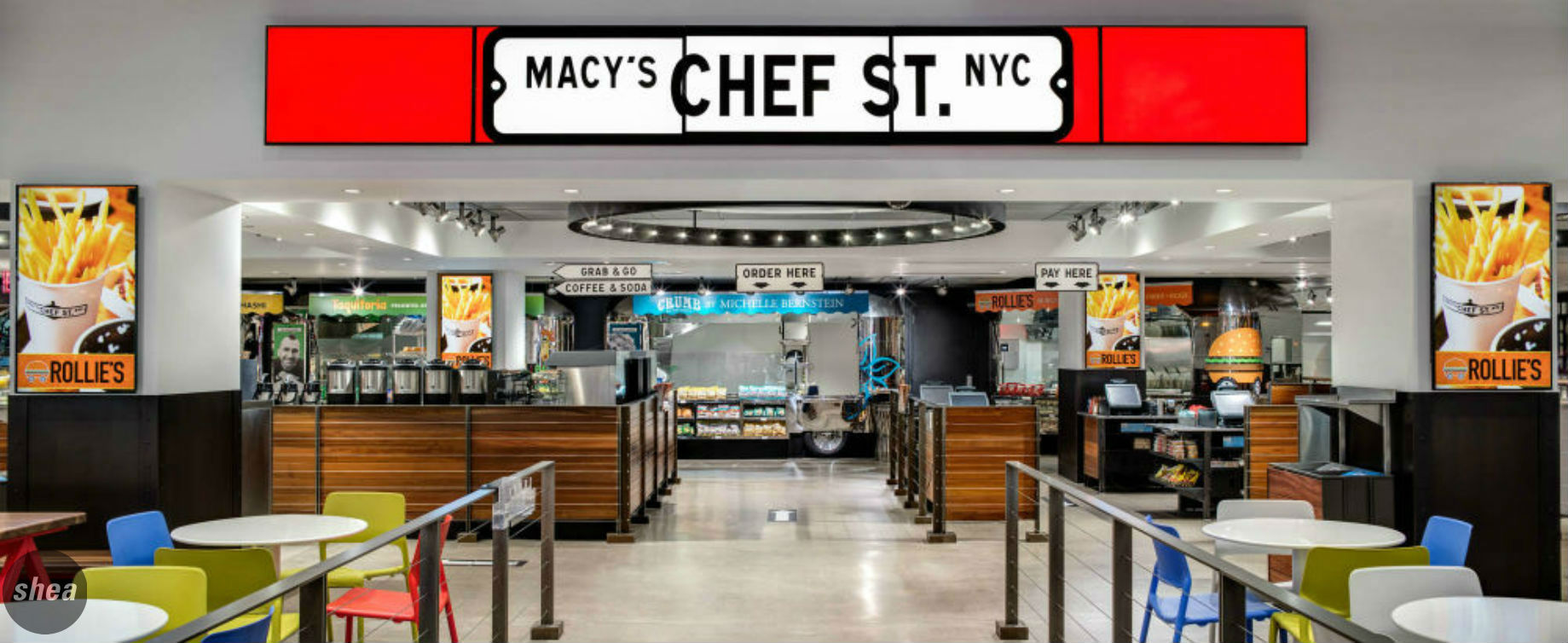
Part of the one below concept is the celebration of city streets. We loved the idea of bringing the vibrancy of New York into the store, and brought the idea of revamping the typical “food court” notion into one that used indoor food trucks as fast-casual stations. The idea was a hit, and Chef Street was born.
So just how can you get food trucks into the basement of Macy’s Herald Square?
Well. You can’t, despite that Shea tried everything. But you can build new ones! Our initial instinct was to retrofit Airstream trailers into the space—they’re classic American turned hipster cool. But again, the low ceilings and space constraints made that impossible. So we had to find a builder and create a strategy to build food trailers that draw upon that unique, classic piece of Americana.
We created four food trailers with custom-designed facades and small—but fully-functional and self-sustaining—kitchens in them, each with a food specialty from a renowned chef on the Macy’s Culinary Council. There’s Taquitoria, serving up tacos by Marc Forgione; Crumb on Parchment, specializing in healthy fare from Michelle Bernstein; Tabo Noodles, where Takashi Yagihashi’s ramen and more take center stage; and Rollie’s, for sandwiches “on a roll.”
We designed custom tables with fun, fresh shapes with the same “outside-brought-in” vibe: colorful new takes on the classic American picnic table, as well as perches and high-top tables for those looking to eat and get back to their shopping quickly.
We love cool design, but we have to think about the practical aspects of every project, too. When it came to balancing so many restaurants in such small square footage, we needed to consider what spaces they could share. For example, the trailers share a common back-of-house prep space, but each prepares food in-trailer to fill its own orders.
Next-Gen Appeal
The one below sit-down space needed to contend with the same space constraints as the Chef Street zone—just across the store aisle from its quick-service counterpart, Rowland’s Bar and Grill shares the same prep space, but its vibe is completely different.
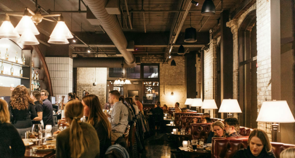
Named in honor of Rowland H. Macy (guess what store he founded in 1914?), this restaurant has strong ties to Macy’s history, and it was only right to look to the past for inspiration. In digging through old photos, illustrations, and articles, we learned that dining has always been a big part of the Macy’s experience, from glamorous sit-down restaurants to bakeries and butcher shops. We wanted to continue that tradition with a restaurant worthy of the epochal brand and building, while still creating a modern, next-gen bar and grill space.
Our historic research inspired us to create a space that’s both comfortable and classy, bringing in some classic New York-style design finishes emblematic of a historic-but-high-end city loft. Exposed brick, wood floors, and ceramic subway tile make for a design that’s clean and modern but not cold and still gives a nod to the past.
In creating a full restaurant, the architecture of the lower level posed a few challenges—most notably, the exceedingly low ceilings. We kept the space as open as possible by designing a long, narrow format, moving seats close to the glass mullion storefront, which balances privacy with light, to eliminate cold corners. And coat racks, soft banquettes, and sconces make the restaurant seem cozy instead of closed-in.
With the renovation complete, Macy’s Herald Square is ushering in a renewed sense of experience for shoppers. One that looks toward the future but gives the past its due credit, one that lets people eat and move on or stop for a respite from their shopping. It’s exactly the kind of thing we specialize in.
And we love being a part of history.


