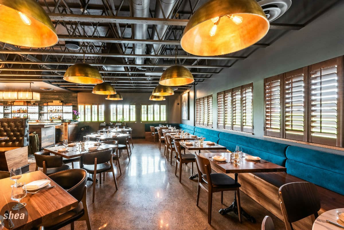
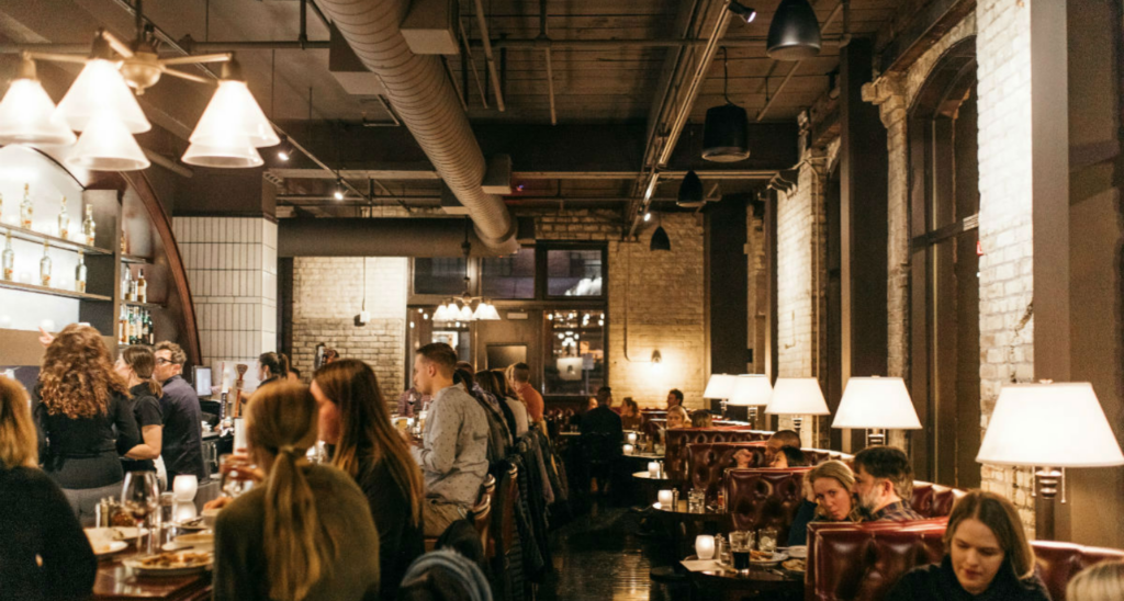
It’s easy to be tempted to build a restaurant space completely from scratch. But creating a restaurant is costly, and most of those costs are hidden from guests—range hoods, venting, kitchen appliances. For a first-generation restaurant space, these items are, by far, a majority of the budget.
Because of this, finding a second-generation space makes the most business sense—but you need to do it with brand in mind. The key to designing in a second-generation restaurant space is knowing what to keep and what to lose—maintaining its bones and expensive infrastructure while wiping the slate clean of everything else. Shea has mastered transforming shuttered restaurants, utilizing existing electrical work, kitchen equipment, HVAC, plumbing, and more to give the restaurant its necessary infrastructure while creating a totally new experience for diners.
Opening a restaurant in a second-generation space is a delicate balance of creating enough change from the previous restaurant and keeping some of bones that most affect the cost of buildout. Do your due diligence with the following, and ask these questions–and then get some inspiration with our transformation of Lat 14, below.
Kitchens:
- Kitchens are the most expensive part of developing a restaurant, so if you’re taking over a restaurant space, that’s where to start. Have a mechanical engineer, along with a kitchen equipment specialist do an assessment of the HVAC system and any equipment that may remain—attempt to have this done on the landlord’s dime.
- Don’t assume that anything works or that it’s in compliance of codes. Hoods, in particular, need a thorough inspection.
- Will the size and location of the kitchen work for the intended operational model? Modifying the kitchen to create an open kitchen can be easy to accomplish, but major changes to the size and overall layout (for example, transforming a fine-dining kitchen into one suited for quick-service) can really start to add up
- The amount of money and work that needs to go into the kitchen will dictate much of your budget.
 Bar:
Bar:
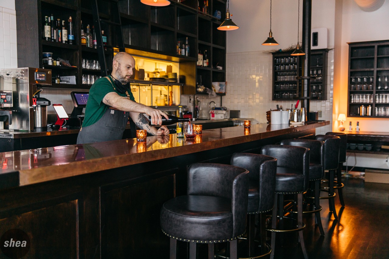
- Does the location and size of the bar work for your operations?
- It can get costly to demo and relocate the bar, considering plumbing and power.
- Modifications such as changing the bartop and die-wall materials can be fairly easy. Sometimes, it can also be straightforward to increase or decrease the size of the bar.
Restrooms:
- Are the restrooms a complete redo, or are the fixtures and partitions still current?
- Do a code check on the existing restrooms—these change frequently. If they don’t meet current code (and you need to pull a permit for your remodeling work), they will be required to be brought to code through numbers of fixtures, turning radiuses, etc.
 Exterior, Storefront, and Entrances:
- Do entrances need to be moved or modified?
- Is the exterior material in good shape, or in need of repair?
- Is the storefront glass in need of replacement?
- Is there a vestibule (especially important in cold weather markets), or an opportunity to put a temporary or permanent vestibule at the entrance?
- Pay attention to the site itself to make sure you’re not inheriting a lot of site work, especially with walkways and parking lots. Some patio and site work can be tackled later, depending upon your priorities for opening; for example, if you’re opening in spring, make sure you have an outdoor-dining space ready.
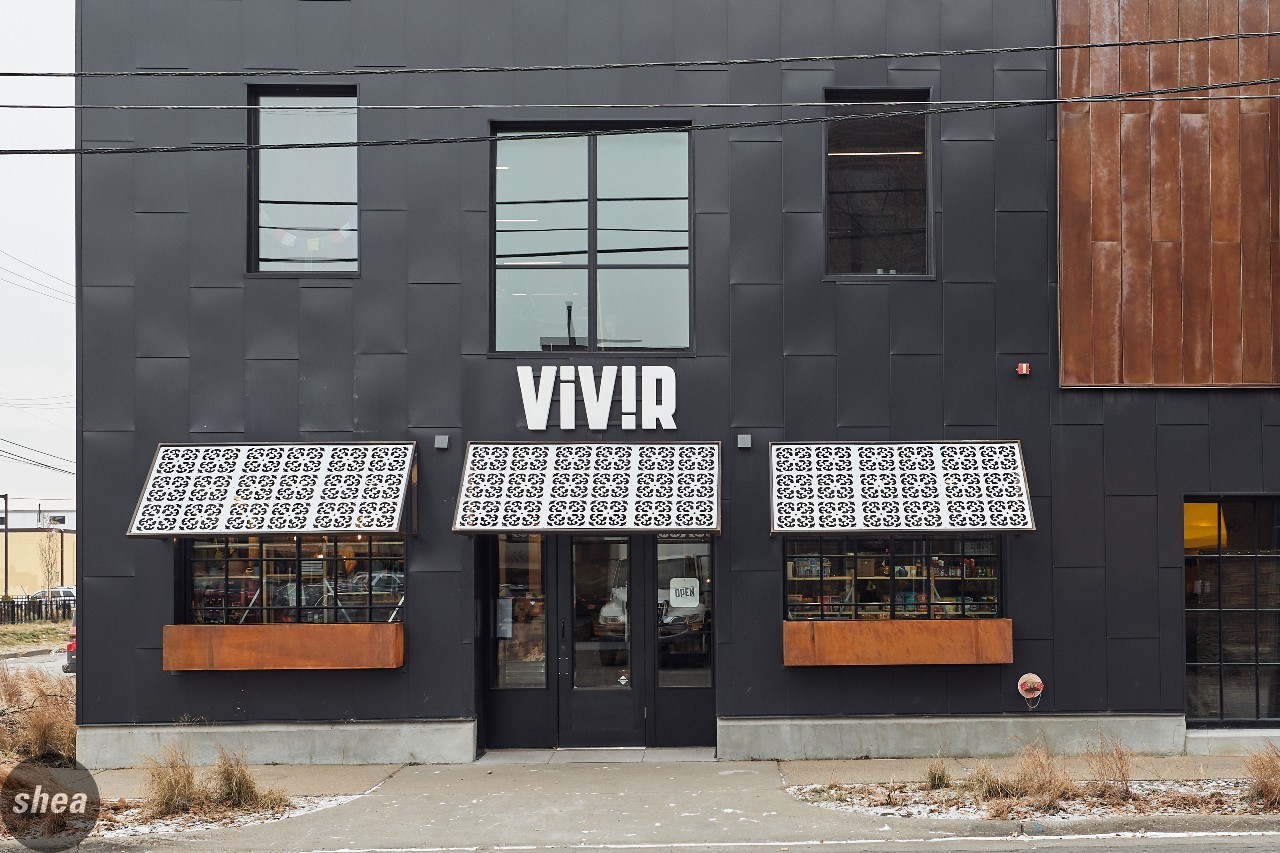
- If the exterior and storefront are in good physical shape, simple modifications like paint, awnings, signage, storefront lighting, outdoor seating, and graphics can make a pretty dramatic change for their costs. But make sure to assess the opportunity and space for an outdoor-dining option (this is and will continue to be more important than ever), and any city or physical limitations on awnings and signage.
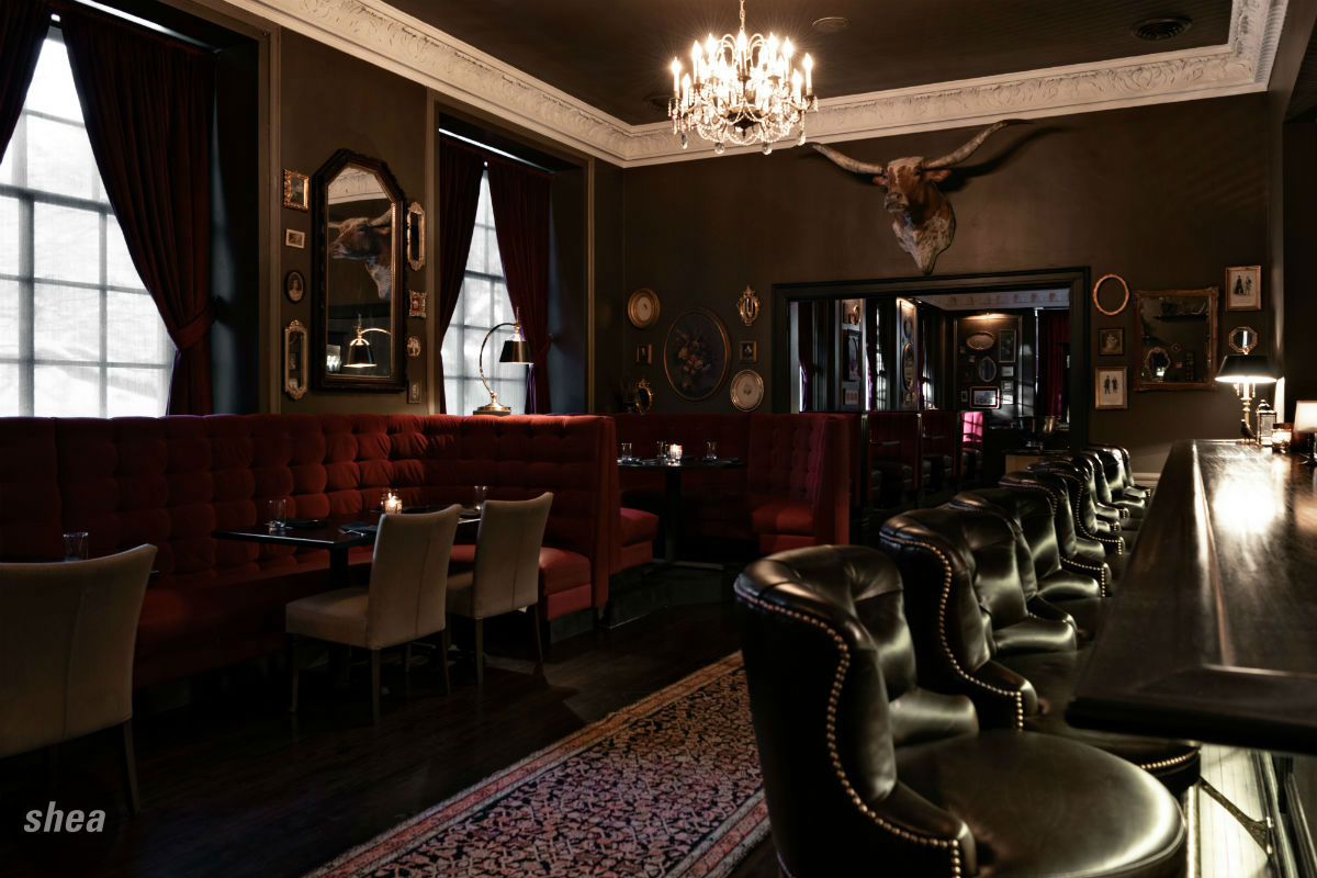 If all those big factors are assessed and the space still makes sense, the interior transformation will go much more smoothly. First, start with a brand and a concept that differentiates you, not only from local and national competition, but certainly from the restaurant that was in the space previously. Use that as a starting point to find color palettes, furniture styles, layouts and seating arrangements, graphics, artwork and window treatments, miscellaneous décor and greenery, tabletop items, and smallwares. Many times, we will also reuse furniture in a second-generation space if it meets the criteria, because furniture can be customized and look very different in new surroundings.
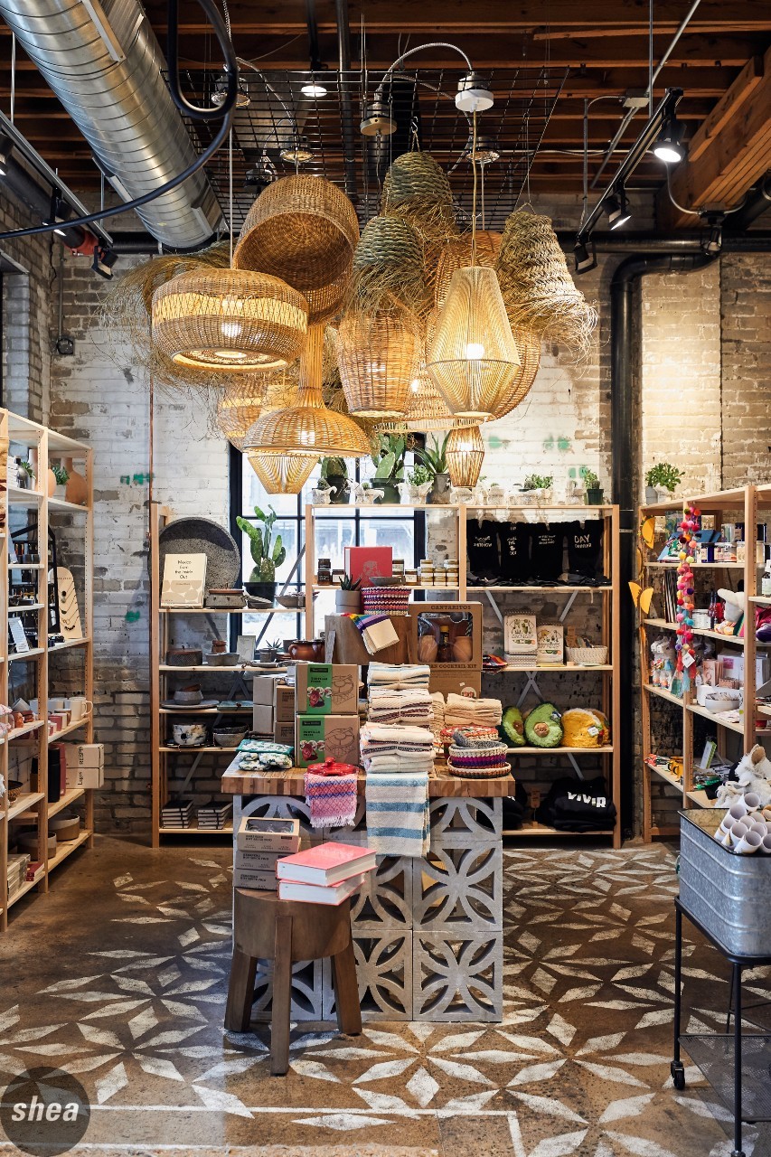 Perhaps the most important element in any restaurant design is lighting. Decorative light fixtures and temperature of bulbs are easy, but what is critical in a restaurant space is a lighting system that has zones and dimming options. If that doesn’t exist in the space or isn’t in keeping with the new concept and feel of the space, it’s a necessary and noticeable investment.
Another thing to think about is doing your research on the previous tenant—were there any space or design features that were frequently called out by guests as issues that could resurface for you? Look especially into acoustics, wayfinding, and layout here, and consider potential design solutions for those problems.
Finally, creating a space for additional operations may be worth considering. Many restaurants have had success with market components selling housemade products or meal kits, and customers now expect takeout to be seamless, so it’s important to have a designated space for it.
Lat 14
It’s particularly hard to create a new guest experience when a restaurant is taking over a space with a well-known everyday brand. Lat 14, Chef Ann Ahmed’s venture celebrating food from southeast Asia, overtook an existing Perkins restaurant in Golden Valley—meaning that it also inherited the classic Perkins design. When that’s the case, the alternative to reuse is to maintain the shell, but otherwise start from scratch (minus a couple of sinks and a walk-in cooler), which is exactly what the Shea team did to make each guest shocked to discover that the restaurant was once a casual-dining chain eatery.
The renovation was truly a top-to-bottom affair, keeping important structure in place—beginning with tearing out the ceiling to expose the metal truss roof and painting it a deep, elegant charcoal color, right down to stripping the floors to expose the original concrete and add thoughtful mosaic tile accents for a pop of color. Dividing walls were torn out to create one large space, and in the flexible private-dining space, rafters were stained a darker wood tone for added richness.
Adding focal features was also key in this space’s overhaul. The first order of business was to create different dining zones within the open space for different experiences, including a bar that would support the cocktail program and make for a lively atmosphere. Covered in sleek-but-rustic wood and topped by granite, it adds a sense of elegance that makes diners completely forget about the Tremendous Twelves formerly served in the space. The rest of the space is glam-meets comfort, with rich furnishings in woods, leather, and velvet, with bright throw pillows lining the banquettes and a hefty chef’s table just outside the open kitchen. Large-format artwork and vibrant pops of teal, lime green, and pale pink add an extra dose of fun and life to the space, while carefully chosen metallic details and chandeliers bring an element of luxury.
In terms of functionality, the former restaurant’s equipment and fixtures just weren’t up to snuff for a high-concept eatery. With the exposure of the kitchen (covered only by a half-wall stocked with carefully stacked dishes and larder), the equipment and layout needed an overhaul to stay sleek. The restrooms also benefitted from a total renovation, now flanked by chic wallcoverings and tiny tiles. Outside, the biggest transformation was in changing the instantly recognizable Perkins exterior into something with no relation or resemblance to the breakfast brand. The addition of patio seating, a coat of rich charcoal paint, and bold, clever signage disguise the building’s Magnificent Seven and pie-case roots—announcing its presence and bringing fresh new flavors to the ’burbs.


