As the traditional 9-to-5 office has disappeared, so, too has the traditional office culture: high-walled cubicles, standardized break rooms, and spaces devoid of visual and textural interest. Today’s workplaces—at least, the ones that Shea’s been dreaming up—are vibrant reflections of the people in them and their product. Our recent collaborations with Little, Scott Petinga Group, and 10 Missions, headed by Shea design director Cori Kuechenmeister, prove that it’s becoming vital to fulfill all employee needs, providing a variety of productive workspaces as well as areas for social and personal use.
Scott Petinga Group
After being diagnosed with cancer over a decade ago, entrepreneur Scott Petinga set out to build an empire, creating a handful of small companies specializing in everything from communications to real-estate development. The empire quickly exploded, necessitating a new office space and location centered around Scott Petinga Group, a data-fueled communications agency. Petinga tapped Shea to design the third floor of a historic North Loop building, merging the space’s storied past with his company’s modern sensibilities.
An opposite-of-ordinary environment to inspire creativity and foster strategic communication was the goal. “We spend a third of our lives at work, so I wanted the space to feel more like a boutique hotel lobby—truly the heart and soul of the office,” he explains.
The project was an exercise in dichotomy throughout its duration. Shea created an initial presentation with two options for Petinga. Dubbed the “Hi/Lo Presentation,” it included one concept that pushed the parameters of Petinga’s creative vision and one that highlighted more of the original character features of the building.
Shea’s workplace design really brought together opposing forces. It mixed pieces owned by Petinga with new furnishings and brought in high-tech digital equipment against a backdrop of reclaimed-wood floor and timbered columns. The space also needed to serve dual functions: a space where Petinga’s companies could interact while maintaining their own identities and team spaces.
The Shea-crafted solution was a central common area with a fully-equipped kitchen and several soft-seating nooks for breakout meetings, with adjacent rooms for individual workstations salvaged from Petinga’s old space. Quirky egg-shaped chairs and an igloo-inspired seating area give inventive and unexpected places for brainstorming, and exposed beams and restored arched windows maintain the building’s original character. The clean palette is punched up by bright details: graphic murals featuring Superman, astronauts, and the city of Minneapolis accent the walls, while skateboard tiles backspash the restrooms. It’s an ideal setting to let creativity flourish.
10 Missions
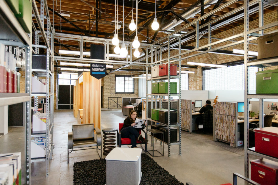
St. Paul-based 10 Missions Media is no stranger to great design—it’s incorporated in every publication that the company pumps out. When the group outgrew its space near St. Paul’s Prospect Park, it was time to make a move to the Hamline neighborhood for more open space. “The time came for us to make the investment for a long-term home. I needed a space that would allow us to scale up as we grew,” says Jay DeWitt, president of 10 Missions.
This wasn’t just a company move, it was a reinvention of the philosophy that had built the original 10 Missions space. “We went from having a number of private offices to a more open newsroom environment. The real goal was to improve team collaboration within groups and among those who work closely together, like edit and art,” he explains.
Enter: Shea. Cori and her team dove in headfirst to make that happen, crafting two concepts for the 10 Missions team to choose from—both of which emphasized an open floor plan, workspace flexibility, employee amenities, and strategic zoning to make the work process more collaborative and efficient. The first was a “Home Base” concept, which focused on the team behind the product, inspired by DeWitt’s desire to make the workplace a comfortable resource for employees rather than just a destination. The most emphasis in this concept was placed on employee experience, an open floorplan, and workspace flexibility between desks, breakout meeting spaces, and soft seating workspaces.
The second design concept presented by Shea was a “Checker Board” space, which focused on the product the team creates. This concept placed design emphasis on an open floor plan and strategic zoning to maximize collaboration between departments and give all areas of the organization access to the publication process. This streamlined, high-energy design was all about open circulation of people and ideas, and was the ultimate choice for what became known as 10 Missions Place.
The strategy was to create clusters of desks for each department, with “huddle up” areas between for gathering and collaborating, plus conference rooms for more formal meetings. Innovative technology was also incorporated—DeWitt’s favorite feature being the monitors throughout the office connected to Chromecast, meaning that any team member can access a bigger screen at any time. To create a well-rounded employee experience, Shea added a large kitchen, gym and yoga studio, and shower area.
Textural elements such as tire-tread wall coverings, a coffee table crafted from an engine and pistons, and chairs covered in newsprint fabric bring visual interest to the creative space and make spending time there a complete sensory experience, while tying in the company’s work with automotive publications. Locality has also been brought into the design—each “zone” in the open floorplan is named for one of St. Paul’s diverse neighborhoods. The finished office provides plenty of creative space for employees to bond and work collaboratively and wall graphics highlight the company’s personal ethos: the “10 Missions” that keep the presses going.
“Now our space is set up with the way people work in mind, rather than our having to deal with the existing structure as we grow,”says DeWitt. “You may not be working with everyone directly, but you’re seeing people in the group spaces more than ever, and you can have a relationship with all your coworkers. From a cultural perspective, that’s a big benefit.”
Little
Designing for clients who are designers is always a treat. When Cori and her team met with Little advertising agency’s CEO Joe Cecere, he had mood boards at the ready, filled with inspiration from restaurants and offices that he loved—a jumping-off point that led to a firm design direction. But the nuts and bolts had to come first—learning what the company needed in a space beyond the aesthetics.
“We’re much more collaborative now than when we moved into our old space, says Cecere, noting that Little’s former office, filled with private workspaces and partitions, was often referred to as “spa-like” and mistaken for a law firm. The agency needed a space where people could see the work being produced. A move was in order, to the 100 Washington Building, where open space would take precedence over closed spaces.
Shea devised a strategy incorporating two design zones: a high-energy public sector with communal meeting spaces and conference rooms, and a heads-down area for more focused individual work. The workspace is separated by an activity aisle outfitted with islands for impromptu meetings and writeable pinup boards to keep the creativity flowing.
“Our best work happens when there’s a lot of feedback,” says Cecere. “When we’re doing creative work, we put up sketches and ideas. The idea is that things will be pinned up in the central area and people will pass it every day.”
Cecere also wanted to bring elements of his company’s personality into the design. “The new space has a little more edge,” he says. “I showed Shea some of our Little materials, with a lot of black-and-white elements and a lot of contrast, and those ideas were incorporated into the space.”
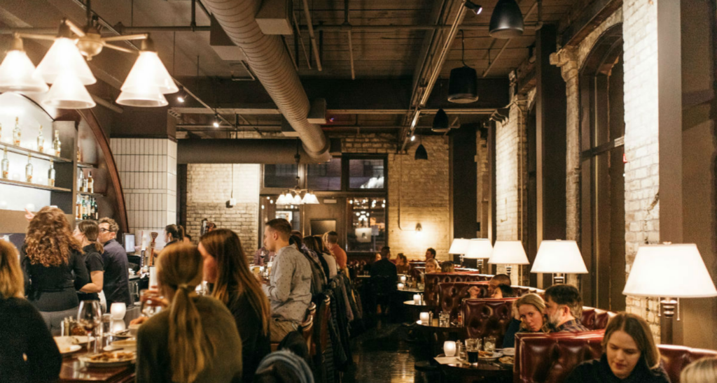
The core of the design includes industrial materials, such as concrete, raw wood, glass, and metal, as well as a masculine color palette to bring the edge that Cecere was looking for. A bold contrast comes through in the design as well—for example, the kitchen features dark walls against an exposed white ceiling, while the office area has a charcoal-colored ceiling and white walls.
As in most of Shea’s recent workplace designs, a variety of workspace options was vital. “Office spaces are feeling less like offices spaces now,” he explains. “It’s about taking bits of home—kitchens, living rooms—and incorporating them into the workplace.”
Adding interactive, energetic common space was important for Little. We dreamed up a kitchen featuring a communal table (a nod to Cecere’s Italian upbringing) and “Kickass Bar” stocked with libations, both with plenty of workspace and opportunities for employees to collaborate in an informal environment. The new office is sleek and hip with striking contrasts, a perfect representation of the company.


