A strong brand is the cornerstone of any business, and translating and extending that brand into a physical space is a strategic balance. It should never be directly literal (logos everywhere), but needs to inspire the vision, the tone, and the vibe, as well as setting the scene for the emotions and energy felt there. It’s the job of a designer to translate that, and create a differentiated environment, whether it’s a workplace, retail store, hotel, or restaurant. From the lighting to the color choices to the fixtures, finishes, and furnishings, every design aspect must be carefully considered as to how it not only incorporates the brand story, but contributes to it in a fresh, authentic, and consistent way.
Moxy Hotel
Moxy is one of the newest brands by Marriott, and Shea interpreted it in the recently opened downtown Minneapolis location with plenty of local flair. The Moxy brand is all about evolution from city to city, embracing current-day design and not just rolling out a defined direction. Our design had to be clever, cheeky, and functional, with an inviting vibe and a sense of place at every turn.
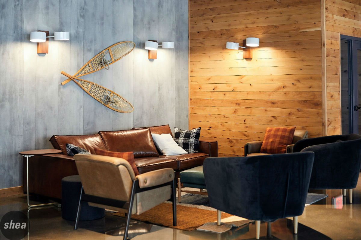
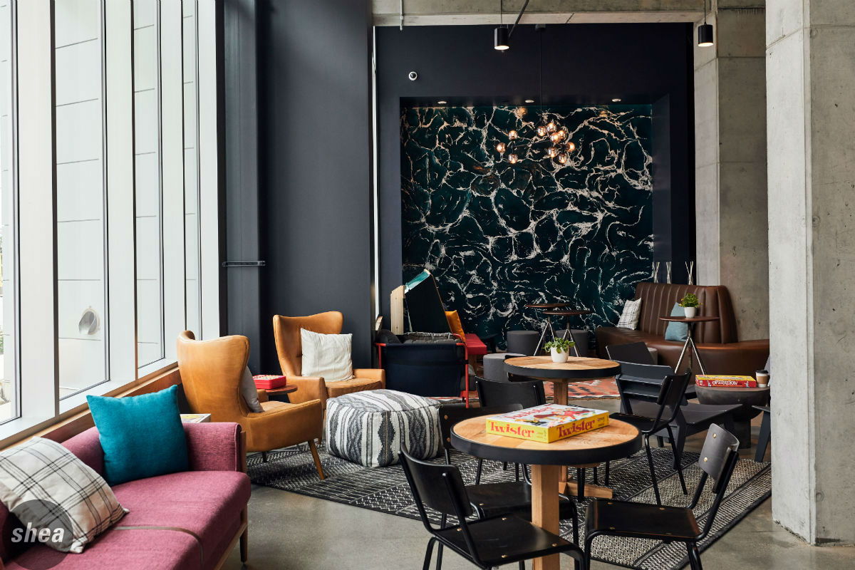 The Moxy Minneapolis experience kicks off the second guests step through the front doors into an entryway sheathed in plaid wallpaper and boasting a light fixture lined with a graphic of Northwoods trees, a welcome to modern Minnesota. The lobby is a do-it-all hub for social work and play, with a central bar that beckons with candy jars and a well-lit liquor display, as well as nooks and corners scattered throughout, with comfortable seating that invites settling in and chatting.
 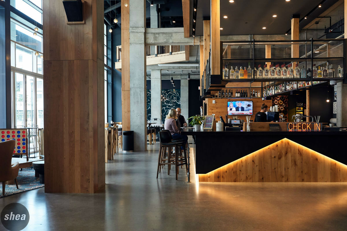 Board games and oversize favorites (giant Jenga and Connect Four are crowd-pleasers) almost guarantee socialization, while a quieter zone with a library table and power ports is the perfect place to tap away on a laptop. Classic woodlands touches in the artwork and rustic materials further the sense of place without crossing into kitsch–nothing says Minnesota like snowshoes, but vintage ones mounted to a gray wood-plank wall are chic rather than cheesy.
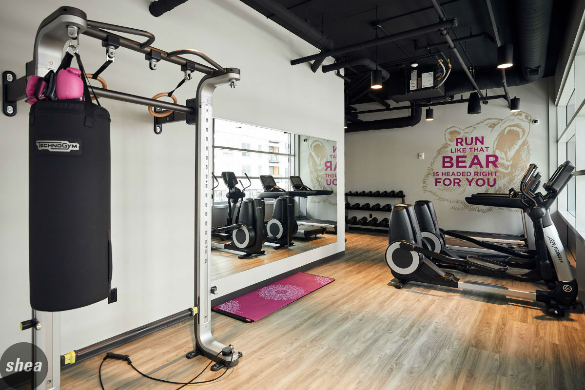
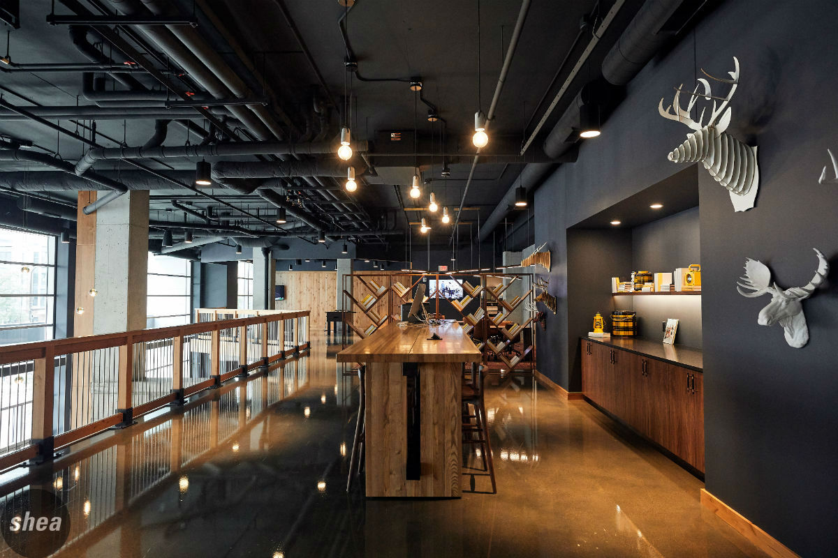
Moxy’s playful spirit is scattered in design details throughout the hotel, too. Upstairs in the mezzanine, foosball and shuffleboard bring more fun, while modern iterations of wall-mounted moose heads are a nod to the lakeside life. In the bathrooms, a cheeky message in spelled out in neutral tile mosaic, and Minnesota-centric graphic messages in the fitness center encourage guests to keep moving.
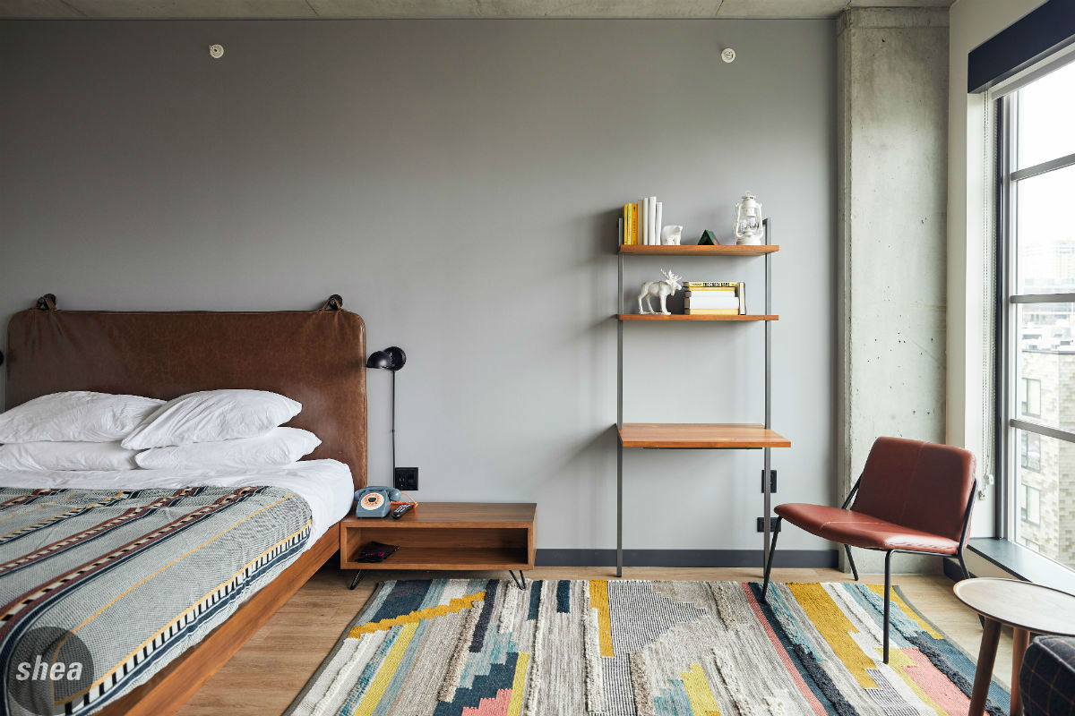 The guest rooms at Moxy also bring that fun spirit, beginning with the feature graphic walls in the hallways. Through the doors, the rooms blend color and print in a way that combines whimsy and heritage in a still-minimalistic space. With finishes ranging from warm wood and cozy rugs to industrial details, it’s impossible for guests to forget that they’re at the Minneapolis Moxy—with nary a logo in sight.
So Good So You
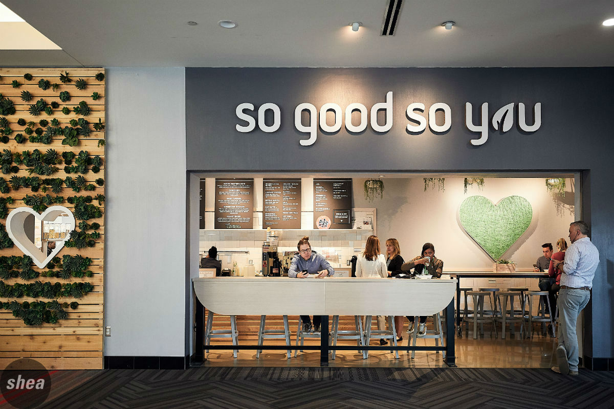
The Shea-designed So Good So You brand has a very specific mission in mind: encouraging self-love and whole-body wellness, with fresh ingredients, good food, and a brand vibe to match. Designing the flagship store was an exercise in bringing that life and freshness to the space holistically, with every touchpoint making guests and their bodies feel good.
 With a flagship location located in the Minneapolis skyway, the first order of branding business was to bring living elements to the space. This meant not only hanging plants, but creating a succulent-studded palette entrance that not only brings color and energy, but makes the entrance impossible to miss as busy patrons pass through.
A clean, minimal design with special brand touches was key in this design, with soft wood tones and neutral finishes, including a patterned back-of-house subway tile—it’s a calming, feel-good place to be. The simple backdrop lets pops of green, such as the string-art heart, and bright, fresh juices and salads shine, giving diners the chance to do their bodies some good.
CoPilot Dog Outfitters
CoPilot Dog Outfitters is an adventure: Man and his best friend, taking on the world together. Shea concepted this as a dog-centric space offering goods and services for pups with that same sense of brightness, fun, and embracing of the outdoors as the brand. Shoppers (and their dogs) feel ready to take on the world when they were in the space.
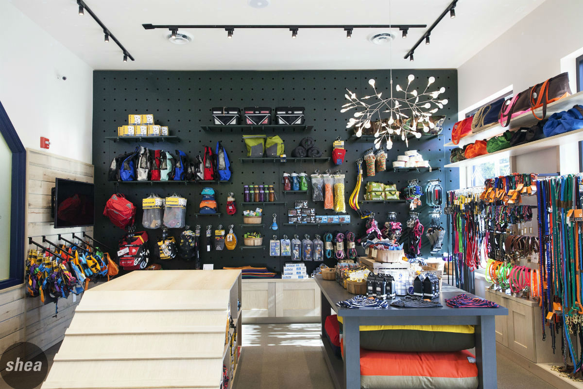
 Sleek signage and window graphics outside the store draw customers in, but once they’re inside the shop, they find a true embodiment of the brand. Every major design feature also serves a function: A charcoal-gray pegboard is a feature wall to show off the bright merchandise, and a dog ramp for pups to play also houses product for sale.
The love of nature encompassed by the CoPilot brand is also cued throughout the space, with weathered shiplap lining the walls and an abundance of wood in the shop. A leaf-inspired light fixture focal point that highlights a ceiling full of graphic constellations. Vintage oars mounted over the door to the grooming space encourage that feeling of adventure and possibility—while a bone-shaped handle on the door reminds shoppers that design and dogs can go hand-in-hand.
Colle McVoy
Minneapolis creative agency Colle McVoy is known for its brand and what it stands for—a company culture that’s energetic, creative, progressive, and empowered. Taking that ethos and translating it into a reimagined workspace that inspires collaboration and productivity was no small task, but one that Shea took on to create an office as vibrant and innovative as the company itself.
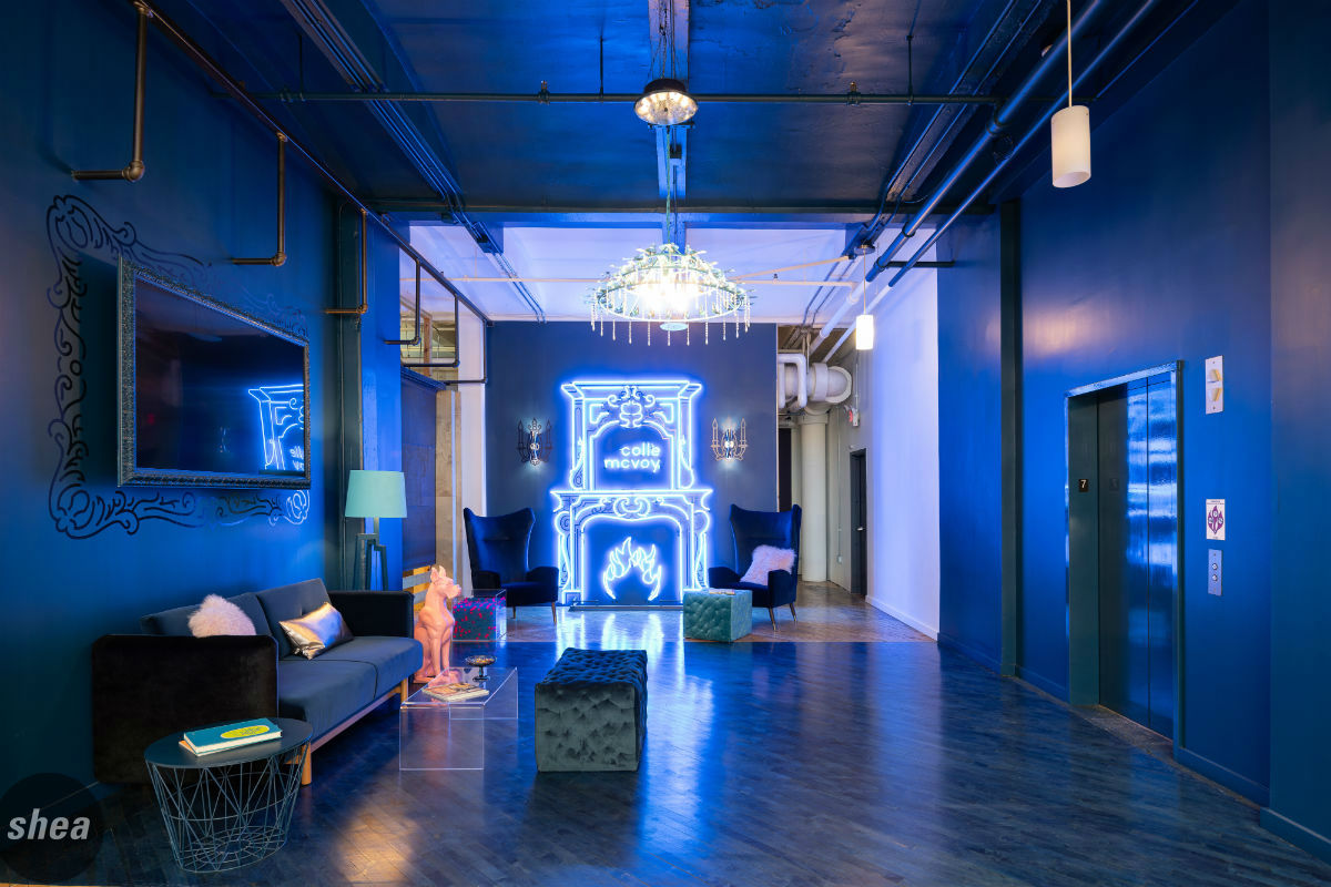
Set in the heart of downtown Minneapolis, the new office needed to make a bold statement the second the elevator doors opened onto the sixth floor of the Wyman Building. The new lobby does just that, with luxurious navy furniture, a blue-tone wood-plank floor, and navy walls and ceiling—all highlighted by an artisan-made chandelier and an unexpected take on a fireplace: a flickering blue neon one, proudly displaying the Colle McVoy moniker. Right away, employees and visitors know that they’re somewhere special and inventive, where fun and creativity also take priority.
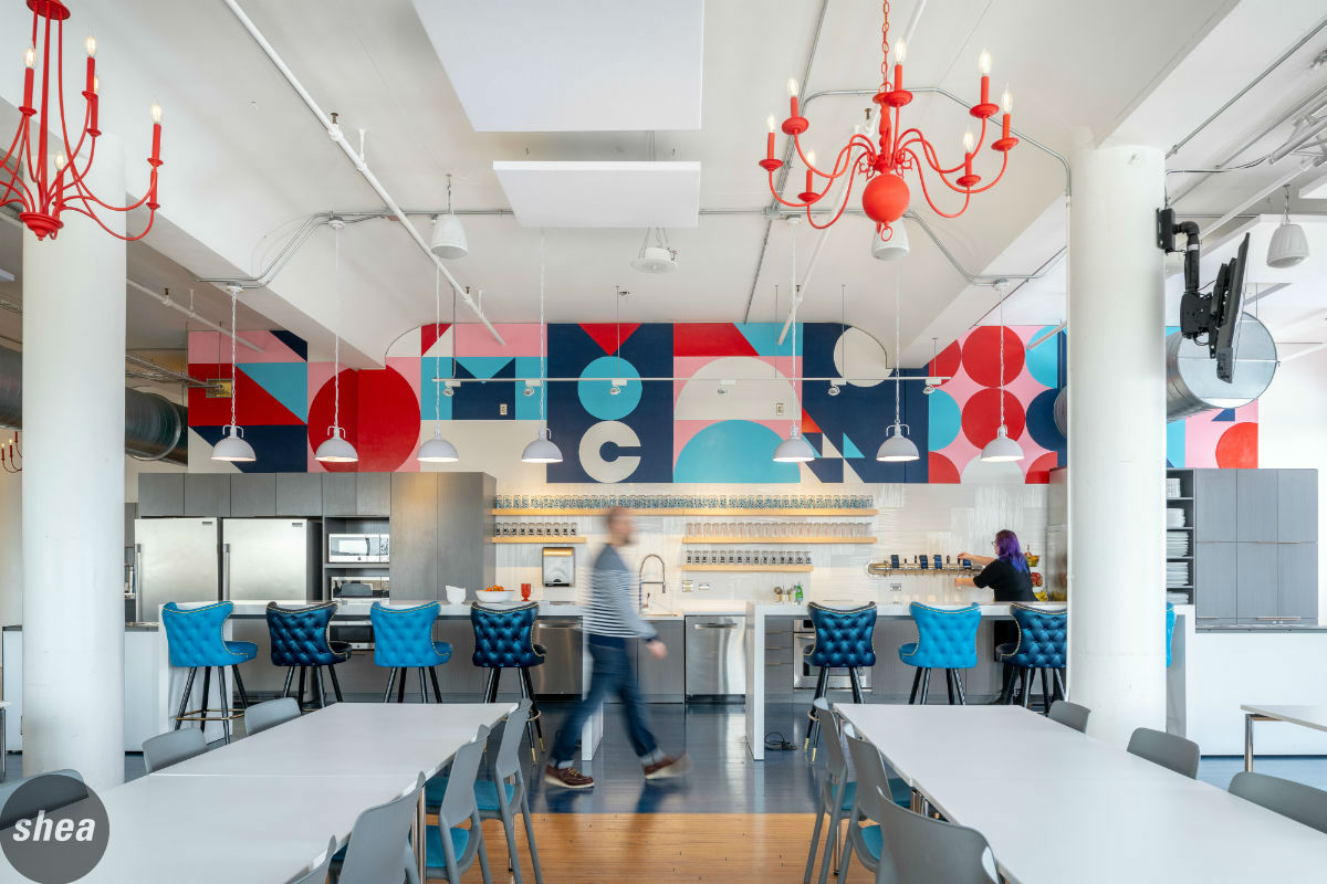
Liberal use of color was important in the revamped office space to maintain Colle McVoy’s spirited vibe. From window graphics that add life to the heads-down workspaces to the design accents in the conference rooms, every area is touched by a dose of brightness to keep things lively—nowhere moreso than in the café, where whimsical chandeliers and blue-upholstered chairs add just enough color to keep the space interesting, without overwhelming it. The brand wall in the kitchen is a feature that incorporates elements of Colle McVoy’s visual brand while still keeping considered design as the main focus of the space.
 The kinds of spaces within the office are also an extension of the brand. Colle McVoy is all about collaboration and innovation, which means that the workspace needed a variety of spots for employees to gather for brainstorms, to spread out and show off work. Long community tables and high-top counter and table seats in the café are perfect for pulling together projects, while pinup boards show off in-progress designs and campaigns. Soft-seating nooks throughout the office are ideal for individual work and informal meetings, and in the conference rooms, branded “Minneapolis” and “St. Paul” to highlight Colle McVoy’s dedication to their hometown, expansive tables and extra seating mean there’s room for everyone and their ideas.