The fast-casual restaurant market is the fastest-growing segment in dining. So now more than ever, quick-service restaurants need more than great food to stand out among the crowd when it comes time for guests to choose where they’re going to pick up dinner or head out on a lunch break. Great design is a must, and that means not only visually, but in terms of function—because if your quick-service spot isn’t quick, you’re not going back. Shea has mastered the art of designing QSRs that serve great food to thousands of customers a day, and they do it swiftly and in style.
One Two Three Sushi
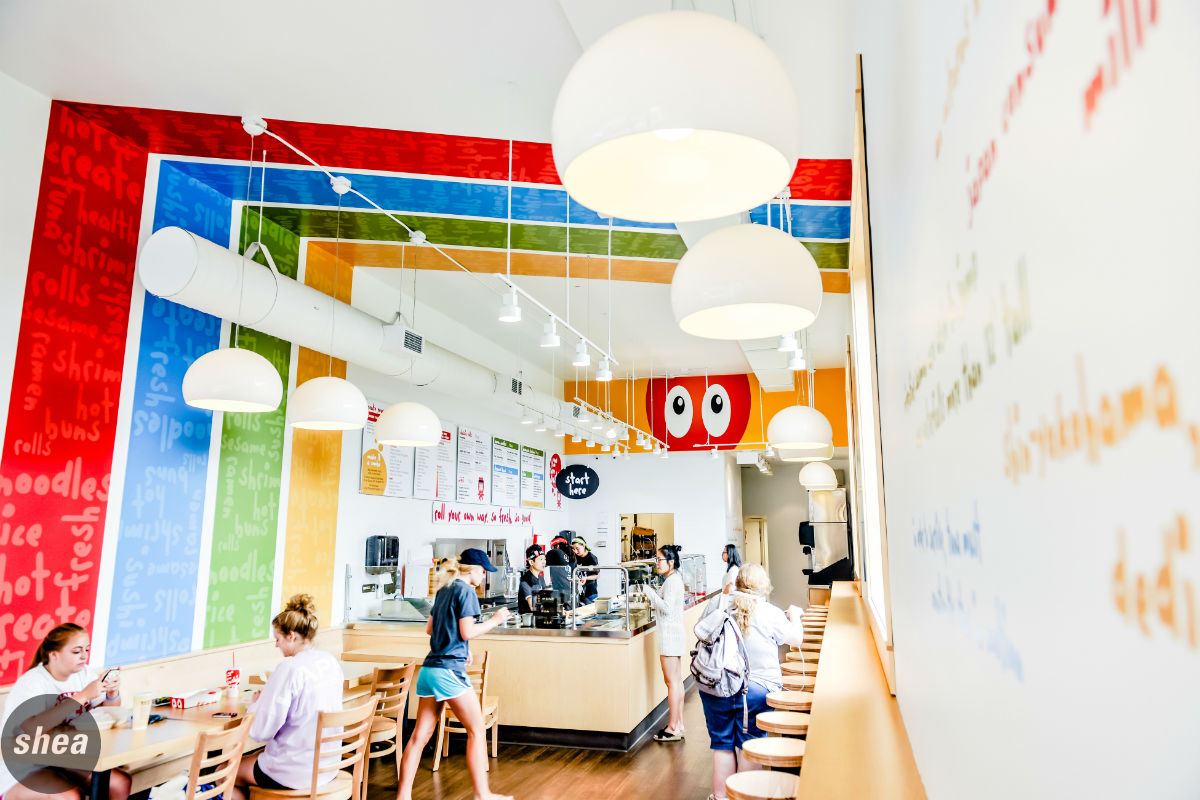
One Two Three Sushi is a fast-growing quick-service brand catering to sushi, ramen, and steamed-bun aficionados in the Twin Cities, with locations quickly expanding nationwide. Shea worked with longtime client Sushi Avenue to design the concept, which blends the freshness, quality, and chef interaction found at high-end sushi spots with the convenient, fast nature of a quick-service restaurant, plus the opportunity for the guest to customize sushi any way they’d like. This idea means that a very specific service model is necessary in order to keep a customer flow going in the restaurants, especially during peak hours—when each location can serve hundreds of people.
With so many sushi combinations (not to mention ramen and steamed-bun choices), restaurant operations needed to be especially clean and organized—particularly since, as at many quick-service spots, all preparation would be on display. Shea designed a service line to work in multiple locations, with sushi pros behind the counter to shape, fill, and slice sushi rolls in a super-efficient way: Customers work their way down the line to select their fillings and sauces, paying at the end. When lines get long, there’s no shortage of visual stimulation for guests, with brand extensions, bright colors, and fun slogans sprinkled throughout the space to hold their attention.
One key to brand growth is to create a high-impact space with a low-impact budget. At One Two Three, we made the operations at maximum efficiency and made the box simple, creating dynamic spaces by making the fun brand come to life through color, messaging, and packaging. At the Dinkytown location in Minneapolis, seating is designed strategically to make the most of the long, narrow space: In addition to a handful of tables near the entrance, an extra-long wall-facing bar is ideal for seating single diners and duos (the most likely to sit down at a quick-service spot). In the IDS Center location, a short community table with high stools splits the small, square space and gives a clear boundary for the queue. It’s a design that’s as efficient as the sushi masters wrapping rolls and is as easy as one, two, three.
Nadia Cakes
It’s no secret that people love their sweets, and few treats are more popular than cupcakes—a fact that the Nadia Cakes team was counting on when they worked with Shea to design their second Minnesota location in Woodbury.
“In our Maple Grove store, we didn’t anticipate how many people would be waiting in line,” says Nadia Cakes owner Abby Jimenez. “In Woodbury, we made sure to think about the volume of people coming through.” Depending on the day, the shop sells anywhere between 1,500 and 5,000 frosting-covered confections—and that’s a lot of customers for the 2,700 square-foot space to handle.
Shea created a design that would provide the line management that Nadia Cakes needed, in keeping with the glamorous Nadia Cakes style and giving customers plenty to look at while they wait. A double-lined queue system, separated by a decorative wrought-iron railing in lieu of the standard velvet ropes, allows customers to view confections and menus from a distance before it’s time to order, meaning that they’re prepared when it’s time to step up to the counter. Installing a pastry case that curves slightly on the ends, rather than a straight-across one, envelops patrons and give them a better view of the cupcakes. And as they wait to order, customers take in the space’s jewelbox qualities: sparkling chandeliers, glossy marble countertops, and lush finishes on par with the incredible detail of the cupcakes resting behind the glass case.
Once people have moved through the queue area, many take their cupcakes to go—but ample seating throughout the rest of the Nadia Cakes shop also helps funnel people through the space. A long pink banquette, several small tables, and a community-style table make a sweet seating area, and through a cozy fireplace are a handful of vintage armchairs and settees for curling up with a cupcake and cup of coffee.
New Bohemia
As one of the Twin Cities’ fastest-growing collections of quick-service restaurants, New Bohemia already had several locations when Shea stepped in to design its seventh, on a historic St. Paul corner. The team was happy with the performance of its efficient fast-casual system, with counter ordering and table delivery, along with a beer bar, but was looking to create a stronger brand and improved customer space to match.
Shea put together a design maintaining New Bohemia’s fun, laid-back spirit, but with a more cohesive vibe. The brand’s signature beer-hall-style seating and string lights stayed, but we added condiment dividers to accommodate for different group sizes and designed the lighting patterns for maximum effect. We also brought in more sophisticated historical and local touches with art pieces and unique imagery, like bottlecap brand signs and vintage St. Paul graphics. Hockey-inspired details, like the wall installation of sticks and pucks that backsplashes restroom sinks and a popular “Penalty Box” chair, nod to the nearby Xcel Energy Center, where the Minnesota Wild shoot their goals. The overall space has an easy communality to it that meshes perfectly with the on-point service.